| Image |
Comment |
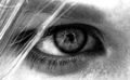
| 07/16/2006 04:08:03 PM |
The Camera's Perspectiveby film_de_verreComment: Well executed. Didn't really need the title to find the photographer in the model's eyes. I like the wisp of blond hair dropping in front of the eye, as it adds a nice balance to the composition. |
| 07/16/2006 04:03:34 PM |
Nap timeby YorinaComment: The perspective and lighting in this image are very dramatic. The background almost looks like the child is outdoors, while at the same time the child appears to be lying on carpet indoors. I�m giving this a healthy bump since I came back to comment, as I do believe the child fell asleep indoors and you captured your intent as well as you possibly could without waking the little one. |
 Photographer found comment helpful. Photographer found comment helpful. |
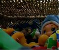
| 07/16/2006 03:59:55 PM |
Of Toysby oravsky123Comment: I not sure what to say about this image. The perspective in the toy box should be dark but it is hard to see the wonderful colors and details of the toys. I like the creativity here. |
| Photographer found comment helpful. |
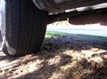
| 07/16/2006 03:57:31 PM |
Roadkill's Prespectiveby akuma508Comment: A different take on this challenge that�s for sure. With the title you have choosen; the tire appears to be the main subject of this image. The problem as presented is that the tire shows very little detail (Tread, etc.). This image could use a bit more post processing work (Levels or Curves) or you might consider reshooting and using a fill flash. |
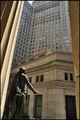
| 07/16/2006 08:08:57 AM |
Lookoutby atsxusComment: The concept here is really good but the picture looks a little unbalanced. The columns used in the foreground as framing lack symmetry and tend to lead the viewers eyes to the bottom of the image instead of to the top. I like the lighting on the statue, as the highlights and shadows work well in producing depth to the statue. |
| 07/16/2006 08:03:28 AM |
Classic one point perspective...by bussyComment: This is a nice example of the classic one point perspective; however, the shadows are not dramatic enough to hold the viewers interest allowing their eyes wander around and find the stuff located behind the windows (Which have way too much light on them). You might want to reshoot this at a different time of day when the windows and columns are more in shadow, allowing the light between the columns to become the main subject. |
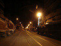
| 07/16/2006 07:57:43 AM |
From My Running Carby balmikiComment: The perspective (leading lines) of this image makes the cars behind you the primary subject. However, the bright light on the right dominates the image and draws the viewer�s eyes away from the main subject and out of the image. I don�t see how you could crop the light and still maintain the mood of this image produced by the movement and the darkness of the parked vehicles and buildings. If you can find a street with a little friendlier lighting, it would be worth reshooting this for your portfolio. |
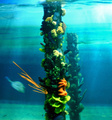
| 07/16/2006 07:48:18 AM |
Underwater Fence Post?by MelicityComment: The lighting conditions must have been pretty dark for this image, as it appears to be suffering from camera shake. You might want to crop this to eliminate the negative space on the right (empty water area). This would also help the image by moving the main subject off center (rule of thirds). |
| Photographer found comment helpful. |
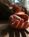
| 07/16/2006 07:44:59 AM |
|
| Photographer found comment helpful. |
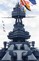
| 07/16/2006 07:41:49 AM |
Battleship Texasby vencapComment: You did an amazing job capturing the various shades of gray in this image. The flags at top are really distracting, as the wind has made them a tumbled mess of color. This would be a fun subject to revisit on a calm day to see what could be done with those flags. |
| Photographer found comment helpful. |
Home -
Challenges -
Community -
League -
Photos -
Cameras -
Lenses -
Learn -
Help -
Terms of Use -
Privacy -
Top ^
DPChallenge, and website content and design, Copyright © 2001-2025 Challenging Technologies, LLC.
All digital photo copyrights belong to the photographers and may not be used without permission.
Current Server Time: 08/22/2025 07:36:01 PM EDT.