|
|
|
Showing 641 - 650 of ~1260 |
| Image |
Comment |
| 08/23/2006 05:17:37 PM | water water...Am I the cutest camera?by honikumComment: Anil,
Per your PM, I’ve taken a stab at your Camera Self Portrait entry (Click on the thumbnail below). Just so you know, the file size was kind of small (99kb), so the results are not a good as if I had the original to work with. First thing I did was to crop the photo so the framing from by the pot was uniform on the left and right side of the image. Second, I adjusted the contrast using Levels. My levels settings for the input were Black 21, Gamma (Middle) 1.6, and White 221. I use Paint Shop Pro X but I think the Photoshop uses the format for levels. I also used USM (Radius 1, Strength 60, Clipping 5) before saving the image. As you can see there is a lot more detail in your face and the camera with this simple adjustment.
As I stated in my PM, I highly suggest you play with the fotomann tutorial for B&W conversion on this image. It works a lot better than desaturation.
Tim
 |  Photographer found comment helpful. Photographer found comment helpful. |
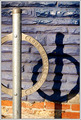
| 08/22/2006 08:06:37 PM | parkingby agenkinComment: Hello from the Critique Club.
Welcome to the world of Does Not Meet Challenge. As you can tell by your score, your choice of subject was not well received. Most of the voters were looking for things that moved. In my case, I gave you a 6, as I thought your entry was rather well thought out and fit the challenge. Interestingly enough, the words on the bike rack, the color of the purple wall and shadow were a strong enough focal points that I didn’t even notice that the bike rack post had blown highlights down the center. Overall, I think you found an interesting view of an everyday object but it just didn’t say Transportation to the majority of voters.
Tim | | Photographer found comment helpful. |
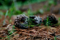
| 08/22/2006 01:39:43 PM | Growing up in a forestby photom1946Comment: Hello from the Critique Club.
You received a lot of useful comments during the challenge on this image. In summary 1) Small image: the maximum size for images is 640 pixels on the longest dimension. Yours was 416 pixels. 2) Background: the pinecones in the background tend to overpower the impact of the seedlings. You could have easily have removed a couple and not hurt the perspective you were trying to achieve.
I think your score also suffered because seedlings are not the strongest subject for a From The Ground Up challenge. Even if you laid flat on the ground, which it looks like you did, the perspective will be even with the seedlings and not really looking up. The nine 1's and seven 2's you received show that many voters didn't perceive your image as meeting the description of the challenge.
Please feel free to PM me if you have any questions regarding this critique.
Tim
|
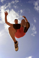
| 08/22/2006 11:51:23 AM | JUMPby nikmaticComment: Hello from the Critique Club. I thought you picked a very good subject for this challenge and I gave it a 7. The issue with shooting into the sun is that the colors of your subject tend to look flat. This image could have used a bit more saturation to make the jumper stand out more. However, just bumping the saturation would have made the jumper's skin look too red so you would need to play around to determine which colors to selectively saturate (Blues and greens probably).
If you have any questions regarding this critique, please feel free to send me a PM.
Tim Message edited by author 2006-08-22 11:52:48. |
| 08/22/2006 11:13:08 AM | Untitled (Peas and Black Calla)by betsypdxComment: Betsy,
Loved the colors in this photo and I gave it a 7. I agree with thomaspeople in that I would have like to have seen a couple of more peas in the image. That FA 100 macro lens looks like a keeper for sure.
Tim | | Photographer found comment helpful. |
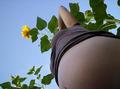
| 08/22/2006 08:01:38 AM | Belly Upby HoochieComment: Hello from the Critique Club.
As you can gather from the comments left during the challenge (mine included), this image definitely was a little out of the box for this challenge. On the technical side, you did a very nice job with the lighting. The sunflower is nicely lit without having blown highlights and the woman has good skin tones and no harsh shadows. As for the composition of the image, I found the placement of her elbow and the sunflower a bit awkward. One suggestion would be to have the woman facing the sunflower. That way the sunflower would have been a complimenting subject instead of a competing one. I'm finding that when shooting for these challenges that I need to try slight variations in the composition when shooting. Two of my top three scores were second efforts, as they ended up being stronger images than my original setup. You're making progress and keep shooting. Feel free to PM me if you want some constructive comments on any of your future entries.
Tim
| | Photographer found comment helpful. |
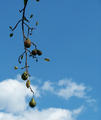
| 08/22/2006 07:37:46 AM | Pearsby Shea927Comment: Hello from the Critique Club.
I like your subject choice for this challenge and gave you a 6 on this image because I thought the subject met the challenge and you executed your idea well. The only suggestion I have to improve this image is to try using a square crop to eliminate some of the dead space at the top of the image. As presented, the section of tree branch without any fruit and the section of sky without clouds at the top of the photo act as negative space with no real purpose. I would suggest cropping the top of the image down to just below the node where the branch holding the top pear meets the main branch. Give it a try and see how this changes the balance of the image.
PM me if you have any questions regarding this critique.
Tim Message edited by author 2006-08-22 07:40:35. | | Photographer found comment helpful. |
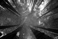
| 08/22/2006 07:22:09 AM | Mighty Redwoods in Infraredby madhaleComment: Hello from the Critique Club.
First, congratulations on entering your first challenge and achieving a very, very good score. Second, I have to compliment you on your choice of camera. And now, on to your challenge entry. I scored this one a 7 because I felt it was a strong subject choice for the challenge and that you executed your idea very well. I've never shot infrared and have seen very few of these types of images but if you scan through the challenge archives, you will see that infrared images are not the norm at DPC. Comparing your entry to some of the other infrared images submitted in other challenges, your image doesn't have nearly as much contrast as the higher scoring images. I think if you could have made the leaves look a little whiter, it would have met the infrared expectations of the general DPC population a bit more. Is that possible in this image without blowing out the sky? If not, then shooting during a different time of day may have produced a stronger infrared result.
PM me if you have any questions regarding this critique.
Tim
|
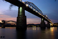
| 08/22/2006 07:04:36 AM | Two Bridgesby photoneerComment: Hello from the Critique Club.
This image is very well done and a good subject choice for this challenge. I remember when I voted on this image that I liked the bridge and the technical aspects of the image but that there was a lot of other stuff competing for attention. The part of this image that grabs my attention first is the under lighting of the bridge. This part of the photo shows great texture and really addresses the subject of the challenge. From there, my eyes went to the far right side of the image to the lights reflecting in the water. Then I glanced over to the colors in the sky over by the second bridge. As you can see, the great from the ground up perspective was lost by all of the other pleasant looking things in this image.
Here are a few suggestions you could try to see if they help bring focus to your image. I suggest you crop off the reflected lights on the right side of the image, including the two bright lights that are under the bridge. Since the eye naturally looks from left to right, this crop would eliminate the competing subject of the reflected light and make the second lighted bridge support a complimentary secondary subject. I would also suggest cropping some off the left side of the image so the bridge bisects the upper left corner. This will let the bridge act as a leading line to the wonderful lighting underneath. If you feel like re-shooting this image, I would suggest staying a little longer and see how it looks when there is less color in the sky on the left. This bridge has so much texture and character that it should be able to stand on it own merit.
If you have any questions regarding this critique, feel free to send my a PM.
Tim
| | Photographer found comment helpful. |
| 08/19/2006 09:20:54 AM | Essence of Graceby WeefanComment: Hello from the Critique Club:
I didn’t vote on this challenge so this is the first time I’ve looked at your entry. Let me congratulate you on a great looking image for your first challenge. My first impression was Wow. As you can tell from the comments made during voting, this is not the strongest subject choice for a Stopped Action challenge. However, chasing a butterfly is not easy and you surly did a nice job capturing this one. One suggestion I can offer is to crop just a little bit off the top of the image. If you crop the image so that the purple flower intersects the upper left corner, it becomes a very strong leading line to your butterfly. As cropped, the flower acts more like a leading line out of the image. This is an image that you should be proud to have in your portfolio.
Tim Message edited by author 2006-08-19 09:23:03. | | Photographer found comment helpful. |
|
Showing 641 - 650 of ~1260 |
Home -
Challenges -
Community -
League -
Photos -
Cameras -
Lenses -
Learn -
Help -
Terms of Use -
Privacy -
Top ^
DPChallenge, and website content and design, Copyright © 2001-2025 Challenging Technologies, LLC.
All digital photo copyrights belong to the photographers and may not be used without permission.
Current Server Time: 08/24/2025 11:52:44 AM EDT.
|