| Image |
Comment |
| 08/17/2006 07:12:50 AM |
Toastyby ShermyComment: Creative idea, great lighting. This would have been a 10 if the camera was mounted on tripod. |
 Photographer found comment helpful. Photographer found comment helpful. |
| 08/17/2006 07:11:26 AM |
|
| Photographer found comment helpful. |
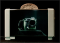
| 08/16/2006 02:14:13 PM |
Tail Spinby JacquiDComment: Hello from the Critique Club,
I didn't vote on the Stopped Action II challenge so this is the first time I've looked at your entry. From reading the comments left during the challenge, I see they hit most of the major issues with this image, the hot spot from the flash, your choice of background, and the high noise. The hot spot on the edge of the coin could have been reduced if you used a diffuser on your flash or bounced it off the ceiling. A solid colored background (Poster board or heavy card stock) definitely would have helped the coin to stand out more and would have been less distracting than the tabletop used. And there are a couple of good noise reduction softwares available for free if you don't already have one. I might have also tried a square crop for this image, as there isn't any advantage to keeping the negative space on the left for right.
Tim
|
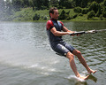
| 08/16/2006 01:43:25 PM |
Feet!by BakerBugComment: Hello from the Critique Club,
I remember thinking when I voted on this image that it would fit better in the Action Shot II category then it did Transportation. The reasoning behind my thinking was that the boat pulling the skier had more to do with the mode of transportation than the fact that the skier wasn't using skies. With that in mind, I still liked the shot and considered the image as meeting the challenge, but just not strongly. I would guess from the number of 1, 2, and 3 scores you received that not all of the voters were as liberal in interpreting the challenge as I.
As for the image itself, there are a couple of technical shortcomings that may have had a negative affect on your score as well. First, the skier is placed a little too close to the center of the image. If the image had more of the towrope showing and less of the water behind the skier, the rope would have been a much stronger leading line to the main subject, the skier. Second, the image is a bit flat and could use more contrast and saturation to give it more depth and pop. With the red tonality of the skin, you might need to do some selective saturation to boost the pop factor. I would start with boosting the blue saturation then try green and maybe magenta.
Feel free to PM me if you have any questions regarding this critique.
Tim
Edit: Typo Message edited by author 2006-08-16 14:06:42. |
| Photographer found comment helpful. |
| 08/16/2006 06:00:41 AM |
|
| Photographer found comment helpful. |
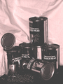
| 08/15/2006 07:15:10 PM |
Good Ole' Peas!by Candi20Comment: I can tell you put some effort into the planning and staging of this image. First, the image suffers a little from the black and white conversion performed. You did a nice job of keeping the lettering on the cans from blowing out but the image has mostly darks and lights with very little grey in between. If you have Photoshop or Paint Shop Pro, I would suggest your read Fotomann�s B&W tutorial (Learn menu � Tutorial link). I also think the image would have benefited from a smoother background. This type of photo works well when you use a single piece of poster board or heavy card stock for the base and background. |
| Photographer found comment helpful. |
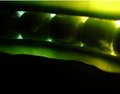
| 08/15/2006 07:06:26 PM |
Peas that glowby Trumpeteer4Comment: Back to comment: I had some difficulty figuring out where to score this entry. I can see that the left side of the image is nicely in focus; however, the brighter lighting on the right side keeps drawing my eyes to the peas that are not as sharply focused. I think if you cropped about a peas width off the right and 1/2 a peas width worth of negative space off the bottom, the focal point for the image would shift to the peas that are in focus. I do like the lighting, contrast, and the color saturation and I have decided to give this a bump from my first impression. |
| Photographer found comment helpful. |
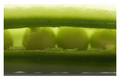
| 08/15/2006 06:59:15 PM |
peas.in.a.podby syko_lanaComment: A nice subject for the challenge but I�m not really thrilled with the focus being on the front lip of the pea pod instead of on the peas themselves. It does make the peas appear to be a secondary subject in this image. |
| Photographer found comment helpful. |
| 08/15/2006 06:56:03 PM |
My Old Pea-anoby HoochieComment: I like your play on words but the image has a couple of technical shortcomings. First, my eyes had trouble finding a place within the image to settle on, as the image has a soft focus and nothing really presents itself as the prime focus point. The sharpest focus appears to be towards the back part of the piano on the folding cover for the piano keys. Did you sharpen the image after reducing the size? I�m also kind of curious as to why you converted this into black and white. Did you have a color balance issue? I would think that the black and white piano keys would have contrasted nicely with the green peas. But as a black and white, the image could stand a bit more contrast to help the peas look like they were a richer, darker, green color before the conversion. |
| Photographer found comment helpful. |
| 08/15/2006 06:42:45 PM |
|
| Photographer found comment helpful. |
Home -
Challenges -
Community -
League -
Photos -
Cameras -
Lenses -
Learn -
Help -
Terms of Use -
Privacy -
Top ^
DPChallenge, and website content and design, Copyright © 2001-2025 Challenging Technologies, LLC.
All digital photo copyrights belong to the photographers and may not be used without permission.
Current Server Time: 08/24/2025 12:09:07 PM EDT.