| Image |
Comment |
| 10/01/2010 12:01:08 PM |
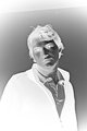
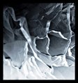
Piercing Glareby mohoytComment: Back to comment: I actually like the positive of this image better than the negative. You did a very nice b&w conversion that gets lost when converted to a negative. As a negative, the subject is hoe-hum. |
| 10/01/2010 11:57:44 AM |
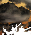
Sky Dancersby andresedComment: Back to comment: The building in the background really takes away from the shape of the statues. I'm sure you choose this perspective because of the building but there is way too much sky, which makes the composition look unbalanced. |
 Photographer found comment helpful. Photographer found comment helpful. |
| 10/01/2010 11:53:53 AM |
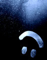
Reflection of a Dancerby Love6Comment: Back to comment: A very nice capture but converting to a negative added nothing to the image. I actually like the positive better. |
| 10/01/2010 11:53:48 AM |
Dare to Stareby ke5milComment: Back to comment: An interesting subject and the conversion to a negative provided some fun colors.
On the technical side:
a) The image needs to be straighten a little. It is leaning to the left
b) The image is smaller than allowed in the challenge
c) You need to sharpen your image after you downsize it for the challenge. Almost ever image gets softer when downsized. |
| Photographer found comment helpful. |
| 10/01/2010 11:52:42 AM |
Parachute from the Starsby colorcarnivalComment: Back to comment and bump: I'm not sure if I like the negative or positive of this image better. That in itself tells me that the subject matter may be a little weak in wow factor. I'm giving you a bonus point for the uniqueness of your concept. |
| Photographer found comment helpful. |
| 10/01/2010 11:50:19 AM |
Blacklightby GeneralEComment: Back to comment: I'm not sure if I like the negative or positive of this image better. That in itself tells me that the subject matter may be a little weak in wow factor. |
| Photographer found comment helpful. |
| 10/01/2010 11:44:05 AM |
The Tuileriesby katenlowComment: Back to comment and a bump: I'm not sure if I like the negative or positive of this image better. That in itself tells me that the subject matter may be a little weak in wow factor. The best images in this challenge have something that surprises the viewer when seen as a negative. I don't see that here (Maybe because it is b&w). Overall, the technicals are good and the composition is pleasing. |
| 10/01/2010 11:37:44 AM |
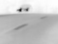
cARby bvyComment: Back to comment and bump: This is a very interesting concept and I think you did a good job with the execution. However, the image lacks depth, as the fading of the road into the night doesn't translate as well when converted to a negative. I also imaging that you are getting a lot of comments about the noise/grain. I like it but I'm sure it is hurting your score. |
| Photographer found comment helpful. |
| 10/01/2010 11:30:09 AM |
Zebra by matoComment: Back to comment: My favorite zebra shot of the challenge. For me, this is one of the best negatives of a B&W in the challenge. I think the negative ended up looking better than the positive (yes I switched it back to see what the contrast was before turning into a negative). Nice job. |
| Photographer found comment helpful. |
| 10/01/2010 11:25:44 AM |
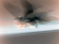
flightby tph1Comment: Back to comment and give a major bump. The more I look at your image the more I love the motion. I also think the colors look better as a negative than your original image (yes I did a print screen and ran a "Make negative" action). Nice job. 10 |
| Photographer found comment helpful. |
Home -
Challenges -
Community -
League -
Photos -
Cameras -
Lenses -
Learn -
Help -
Terms of Use -
Privacy -
Top ^
DPChallenge, and website content and design, Copyright © 2001-2025 Challenging Technologies, LLC.
All digital photo copyrights belong to the photographers and may not be used without permission.
Current Server Time: 12/19/2025 08:38:54 PM EST.