| Image |
Comment |
| 09/12/2006 07:13:04 AM |
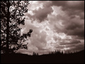
It's gonna rainby snowleopard10101Comment: Hello from the Critique Club.
Technically, your image has been captured and processed extremely well. The silhouette is sharp and solid black and the sky is very dramatic. However as stated in your own comments, the clouds are the main focus of this image and although they are technically in silhouette, most voters will not recognize that fact. Compounding the issue, the tree silhouette used for framing is very strong and in this challenge, competes with the clouds for attention. With the challenge description presented, most voters were looking for the silhouette to be the main subject. Without this predisposition, your score could have easily been a six or greater.
Feel free to PM me if you have any questions regarding this critique.
Tim
|
 Photographer found comment helpful. Photographer found comment helpful. |
| 09/11/2006 02:21:49 PM |
|
| Photographer found comment helpful. |
| 09/11/2006 02:14:22 PM |
Surpriiiiiiise !!!!by SimpaComment: Back to comment: Sorry to be so blunt but this image doesn't really convey Simple Pleasures to me. On the technical side, your image has a couple of compositional issues that could be improved. First, the cropping is a little tight to the scarecrow's hat at the top of the image. Second, the placement of the scarecrow should be more to the left so it is looking into the negative space in the image instead of away from the negative space. I suggest you review the winning images in the Rule of Thirds challenge to get a better feel for subject placement. |
| Photographer found comment helpful. |
| 09/11/2006 02:11:11 PM |
My sweet simple pleasure!by KelliComment: Back to comment: Sorry to be so blunt but this image has several technical issues that will negatively affect your score. First, the sucker sticks blend into the white background and would not even be visible if it wasn't for the shadows. I would suggest using a light colored background next time (Light blue or green maybe). Second, it looks like you arranged the candy in a pattern but the image wasn't cropped symmetrically. Third, the candy wasn't really arranged in a manor that makes the voter's wish they had thought to enter this image. |
| Photographer found comment helpful. |
| 09/11/2006 02:11:06 PM |
Phone talking is my life!by theseeaComment: Back to comment: Although this subject fits the challenge well, there are a couple of technical issues that hurt your score. First, it appears that the subject has considerable red-eye. Second, the image is much smaller in size than the rules allow you to post. This makes it difficult to judge the image and most voters will automatically vote low on small images. |
| 09/11/2006 02:02:15 PM |
straight up tomatoby DoubledizzleComment: Back to comment: Sorry to be so blunt but this image comes across as harsh and not as pleasurable. However, I didn't factor this into my scoring. On the technical side, the focus for this image appears to be misplaced. The fingers are in sharper focus than the tomato itself. Plus, the hand and tomato are a bit on the dark side. It looks like your camera metered on the light in the background instead of your intended subject. Next time you might want to use a fill flash to solve this problem. Finally, the person in the background is distracting. You will find with practice that you need to look at the background as much or more than the main subject itself. Especially in challenges where you cannot clone objects out. |
| 09/11/2006 01:55:01 PM |
HER PIERCING BLUE EYESby POLOComment: Back to comment: Sorry to be so blunt but without the title, I wouldn't know how this image related to Simple Pleasures. Overall I like the cropping, the pose, and the expression on the model's face very much. The colors do look like they could use a bit more saturation. |
| 09/11/2006 01:51:47 PM |
Sky Terraceby perotyComment: Back to comment: Sorry to be so blunt but I don't see anything related to Simple Pleasures in this image. Your image also has no focal point to hold the viewer's attention. Plus, the horizon is tilted very badly. |
| 09/11/2006 01:49:14 PM |
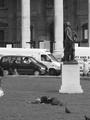
lying watching the world go byby dinocarnationComment: Back to comment: Sorry, an image of what looks like a homeless person doesn't convey Simple Pleasure to me. Even if he isn't homeless, he looks like he could be. Your image suffers from a couple of technical issues as well. First, the person on the left edge of the image should be cropped out. Second, the statue looks tilted to the left. Third, your black and white conversion looks flat and could use more contrast. |
| 09/11/2006 01:44:34 PM |
Every child should have a teddy bear!by cvhs99Comment: Back to comment: You choose a very lovely subject for this challenge; however, your image suffers from a couple of technical issues. First, the focus needs to be sharp on the girl's eyes. In your image the legs of the bear are in sharper focus than the girls eyes. Second, the backdrop should be free of folds and wrinkles or so wrinkled that it looks intentional. |
Home -
Challenges -
Community -
League -
Photos -
Cameras -
Lenses -
Learn -
Help -
Terms of Use -
Privacy -
Top ^
DPChallenge, and website content and design, Copyright © 2001-2025 Challenging Technologies, LLC.
All digital photo copyrights belong to the photographers and may not be used without permission.
Current Server Time: 08/25/2025 07:45:03 AM EDT.