| Image |
Comment |
| 09/13/2006 12:09:47 PM |
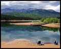
Fishing Before the Stormby v5planetComment: Hello from the Critique Club.
You captured a very lovely image that has a painting like appeal to me. As stated in your own comments, this image has no clear main subject and thus, left the voters little to lock onto emotionally. Because of that, the pile of sand at the bottom left becomes a substitute main subject to the viewer's eyes for a short period of time due to its size and brightness. This might have scored better if you had cropped out the beach at the bottom portion of the image and placed the dock and the finger of beach next to it about 1/3 up from the bottom of the image. This would have given the image a focal point of the fishermen on the dock and the beach finger with the dock and beach finger acting as leading lines. You might also consider darkening the clouds just a bit to portray the storm aspect of your title better. As is, the clouds have about the same hue as the mountains and don't look all that threatening.
Feel free to PM me if you have any questions regarding this critique.
Tim
|
 Photographer found comment helpful. Photographer found comment helpful. |
| 09/13/2006 10:01:02 AM |
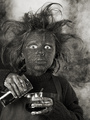
New idea!by DjabordjaborComment: This image is better than the other image with the same model. Even so, this is a weak subject for this challenge, as it doesn't relate to chemistry very well. In a more subject appropriate challenge, I would have given this image a 6 or 7 for the lighting and other technical merits. |
| Photographer found comment helpful. |
| 09/13/2006 10:00:28 AM |
I have an idea!by tumitumiComment: I like the other image with this model better than this one because the hand over the head looks really lame. This is also a weak subject choice for a chemistry challenge. In a more subject appropriate challenge I would have given this image a 6 or 7 for the lighting and other technical merits. |
| Photographer found comment helpful. |
| 09/13/2006 06:59:45 AM |
The Apprentice by scalvertComment: The make-up looks a bit overdone but the expression is worth a couple of extra points. Excellant lighting and composition. Bumping to a 7. |
| Photographer found comment helpful. |
| 09/13/2006 06:45:50 AM |
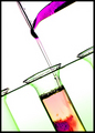
Emulsionby h2Comment: Excellent lighting, nice mixture of colors, and the composition is wonderful. Bumping to a 9. |
| Photographer found comment helpful. |
| 09/13/2006 06:43:47 AM |
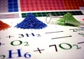
Pure Substanceby GunnsiComment: Nice arrangement of subjects, good colors, exposure and lighting are execellent, but I don't care for the two partial piles of powders on the edges. Bumping to an 8. |
| Photographer found comment helpful. |
| 09/13/2006 06:41:50 AM |
The Secret of the Oozeby escapetoozComment: Great colors but I would have liked to have seen the finger tips in better focus. I'm surprized you were the only one to make ooze for the challenge. Bumping to a 9. |
| Photographer found comment helpful. |
| 09/13/2006 06:40:16 AM |
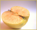
Oxidationby snowleopard10101Comment: I would have loved to have seen the whole face of the apple and the stem in focus. However, since this is a personal preference, I won't mark you down. The lighting and post processing are both well done. Bumping to a 8. |
| Photographer found comment helpful. |
| 09/13/2006 06:37:37 AM |
Oxidation of Iron: Fe » Fe²+ + 2e¯by DrAchooComment: Actually, the oxidation of iron is 2Fe + O2 = 2FeO. Nice to see someone recognized that rust is a chemical reaction. Love the tight crop and the coloration is spot on. Bumping to a 10. |
| Photographer found comment helpful. |
| 09/12/2006 02:05:49 PM |
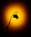
Parchedby jonnieComment: Hello from the Critique Club.
On technical merits, there is nothing I can suggest to improve this image. The silhouette is well defined, sharply focused, and the lighting behind the flower is very creative and pleasing. I do agree with the one commenter that the black around the edges appears to be a little excessive. I do think that the black is necessary for this image and should not be cropped too tightly, as it provides an anchor for your wonderful lighting affect. However, as presented it tends to overpower the silhouette of the flower.
Feel free to PM me if you have any questions regarding this critique.
Tim
|
Home -
Challenges -
Community -
League -
Photos -
Cameras -
Lenses -
Learn -
Help -
Terms of Use -
Privacy -
Top ^
DPChallenge, and website content and design, Copyright © 2001-2025 Challenging Technologies, LLC.
All digital photo copyrights belong to the photographers and may not be used without permission.
Current Server Time: 08/25/2025 09:22:01 AM EDT.