| Image |
Comment |
| 11/19/2006 10:29:58 AM |
Moonlit Pathwayby morg002Comment: Hello from the Critique Club:
Looking at the shutter speed used for this shot, it clearly was a long exposure and meets the challenge. You did a nice job with your composition, as the pathway provides a strong leading line to the most appealing part of the image, the sky. However, the blue looking sky with clouds doesn�t help communicate the moonlit mood of your title. The post processing of this image is pretty good. This image is unique, as it has three distinct features you could have played with, the sky, the path, and the ground. It would be interesting to play with the post processing of ground to see how it changes the look either darker or lighter. Darkening it would have made the pathway more dominate and provide another feature to look at. Lightening it would have almost made the image look like it was taken at sunset instead of with moonlight. As is, there is some detail in the grass but not enough to hold the viewer�s attention. With 41% of your votes being a 5, that indicates that the voters looked for literally 2-3 seconds and concluded �this picture isn�t bad but it doesn�t have a lot of wow�. Without some object or feature to capture their interest, they just clicked the 5 and moved on.
Tim
|
| 11/06/2006 11:00:36 AM |
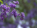
Lotsa Flowers...and Bokehby WildcardComment: Hello from the Critique Club,
First, let me thank you for the details you provided in the Photographer's Comment section. This was a big help on what to discuss in this critique. The bokeh in this image is very nice and enhances the main subject very well. So why didn't this score better? Although you used USM twice in post processing, the image still lacks sharpness. You may want to recheck your USM settings and try reducing the radius and increasing the strength. I also found the parts of the image touching the left and top borders of the image less than desirable. This is a minor nitpick but still, it pulled my eye's away from the main part of the image.
Feel free to PM me if you have any questions regarding this critique.
Edit: Congratulations on your new Personal Best.
Tim Message edited by author 2006-11-06 11:02:12. |
 Photographer found comment helpful. Photographer found comment helpful. |
| 11/06/2006 10:45:03 AM |
Listen to the Bandby ClickNSeeComment: Hello from the Critique Club,
My first impression when I voted on this image was that it met the bokeh requirement of the challenge but the bokeh didn't really enhance the main subject. You will notice that the light and dark areas of the background align very closely to the dark and light areas of the main subject. This makes the main subject blend into the background instead of helping it to stand out. Contributing to this effect is that the light is coming from behind the main subject, casting shadows on her face. These shadows cause the facial features most voters naturally look towards to blend into the background as well.
Feel free to PM me if you have any questions regarding this critique.
Tim
|
| 11/06/2006 10:36:10 AM |
Cold as Iceby kristofersComment: Hello from the Critique Club,
First, let me welcome you to DPC and congratulate you on entering your first challenge. Now for the critique. My first impression when I voted on this image was that it met the Bokeh requirement of the challenge but it was a very busy looking image. What I mean by busy is that my eye kept looking all around the image to find a place to focus on. Although there is a sharply focused object in the front of the picture, the size of the out of focus object in the background is much larger and kept pulling my eyes away from the in focus object. What this means is that the bokeh in background causes a distraction instead of enhancing the main subject, which was part of the challenge description. This really hurt your score, as the voters were really looking for a soft, pleasing bokeh in this challenge.
Your black and white conversion is nicely done and provides a good range of contrast in this image. If you enjoy black and white images, I suggest you read the B&W tutorial under the Learn drop down menu. It shows several ways to convert to B&W and discusses the pro's and con's for each.
Feel free to PM me if you have any questions regarding this critique.
Tim
|
| 11/06/2006 08:00:16 AM |
.:Romantic Views:.by TristeLeucosiaComment: Back to comment: You have some nice colors in this image but the overall image would have been nicer to look at if the sun had been below the horizon. As is, the sun is a bit harsh to look at and with only sky and water as subject, this is an average looking sunset at best. |
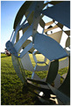
| 11/06/2006 07:58:03 AM |
JK Memorialby hudsondiasComment: Back to comment: Not what the voters will be looking for subject wise in this challenge. Although the perspective is somewhat interesting, the subject itself has little appeal visually. I would be interested in knowing if the person in the upper right is real or part of the exhibit. |
| Photographer found comment helpful. |
| 11/06/2006 07:55:09 AM |
Tugging the Heart Stringsby rkligmanComment: Back to comment: Not what the voters will be looking for subject wise in this challenge. This image also looks a bit out of focus. You may want to sharpen more after down sizing an image for a challenge. Most people use Unsharp Mask to bring back the sharpness lost because of down sizing. |
| Photographer found comment helpful. |
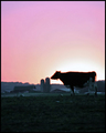
| 11/06/2006 07:53:12 AM |
Moolar Eclipseby BugzeyeComment: Basck to comment: Not sure what to say about this image. There is considerable noise and the focus looks a bit soft. You may want to sharpen more after down sizing an image for a challenge. Most people use Unsharp Mask to bring back the sharpness lost because of down sizing. This image might have more impact if it were post process such that the cows and silo were completely in silhouette. |
| Photographer found comment helpful. |
| 11/06/2006 07:50:45 AM |
The beauty of fallby photom1946Comment: Back to comment: Nice colors but the image looks a bit out of focus. You may want to sharpen more after down sizing an image for a challenge. Most people use Unsharp Mask to bring back the sharpness lost because of down sizing. I also find the subject matter to hold little interest for me. A tree centered in an image shows little creativity. |
| Photographer found comment helpful. |
| 11/06/2006 07:49:01 AM |
Whispersby AtlantisComment: Back to comment: I'm betting your score is prettly low on this entry, as the subject matter does not really align with the expectations for a landscape challenge. The post processing work does give it an artsy kind of look but I wonder if you shot the image with this in mind or if you were forced to process it this way to fix an image with blown highlights. |
| Photographer found comment helpful. |
Home -
Challenges -
Community -
League -
Photos -
Cameras -
Lenses -
Learn -
Help -
Terms of Use -
Privacy -
Top ^
DPChallenge, and website content and design, Copyright © 2001-2025 Challenging Technologies, LLC.
All digital photo copyrights belong to the photographers and may not be used without permission.
Current Server Time: 08/24/2025 05:56:15 PM EDT.