| Image |
Comment |
| 07/07/2006 09:26:44 AM |
Joyful Cardby TheStickComment: I like the arrangement of the card in the composition but the colors here just don't work. The flower needs to be whiter so it doesn't fight with the colors in the stationery. |
 Photographer found comment helpful. Photographer found comment helpful. |
| 07/07/2006 09:26:39 AM |
Breakfast in Bedby sabrizzComment: Nice compostion. The vase really should have flowers in it or it shouldn't be there. The lighting leaves this image looking flat. Wish I could tell you how to improve the lighting more. |
| 07/07/2006 09:26:24 AM |
pinnedby ordinaryangelComment: Nice design and color but the image isn't as tack sharp as it should be. |
| Photographer found comment helpful. |
| 07/07/2006 09:26:15 AM |
|
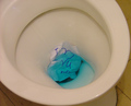
| 07/07/2006 09:26:11 AM |
~ Bathroom Stationery! ~by buzzrockComment: The lighting isn't very effective in this photo. The side of the TP roll is trying to blend into the background when it is really an important part of the composition. |
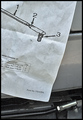
| 07/07/2006 09:26:07 AM |
drag link memoby undieyatchComment: I like how you included the actual component with the schematic. The lighting is a little flat and I would have liked to have seen the paper a little whiter. |
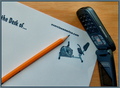
| 07/07/2006 09:26:03 AM |
Stationary Bike Stationeryby tfarrell23Comment: This image has a stock photo quality to it. I would have liked to have seen the paper a little whiter and the phone rotated 180 degrees. |
| Photographer found comment helpful. |
| 07/07/2006 09:25:56 AM |
Goodbye, my Love...by pikwolComment: The stationery appears to be taking a back seat (Pun intended) in this photo. Technically the photo is well executed butt (intended also) there isn't much there that appeals emotionally or to the eye. |
| Photographer found comment helpful. |
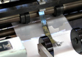
| 07/07/2006 09:25:37 AM |
Stationery in Motionby GeneralEComment: Great title and solid execution of the concept. The out of focus section in the front left corner is very distracting and takes away from the overall appeal of the photo. |
| Photographer found comment helpful. |
| 07/07/2006 09:25:29 AM |
Syntaxby rubienneComment: The transition from the white base to the dark background gives the impression that the photo is not level. Cropping the transtion out might help. The colors, textures, and shadows work well together. |
| Photographer found comment helpful. |
Home -
Challenges -
Community -
League -
Photos -
Cameras -
Lenses -
Learn -
Help -
Terms of Use -
Privacy -
Top ^
DPChallenge, and website content and design, Copyright © 2001-2025 Challenging Technologies, LLC.
All digital photo copyrights belong to the photographers and may not be used without permission.
Current Server Time: 08/20/2025 11:57:31 PM EDT.