| Image |
Comment |
| 07/07/2006 12:06:00 PM |
|
 Photographer found comment helpful. Photographer found comment helpful. |
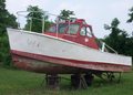
| 07/07/2006 12:05:06 PM |
Dry Dockby RochesterGalComment: I really think this would have been a stronger image in B&W. However, a little tweaking in levels or curves to bring out the green and the sky would have helped as well. |
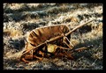
| 07/07/2006 12:03:35 PM |
Death by Swatby avsfan123Comment: The picture quality leaves something to be desired but the sentiment is appreciated. |
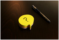
| 07/07/2006 11:42:02 AM |
Nothing to Sayby redmoonComment: Good colors and composition. I would have liked a black background instead of the wood grain from the table it is sitting on, as it tends to draw my eyes away from the question mark. |
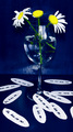
| 07/07/2006 11:41:03 AM |
Love Notes...by SavannahComment: Cute play on words. A different background (non-textured) would really help this image. The cropped petal at the bottom right side looks a little weird. Either show more of it or remove it. |
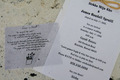
| 07/07/2006 11:40:10 AM |
Did you read the directions!?!by quackquackComment: An interesting shot but a little weak in subject matter for this challenge. This doesn't convey the feeling of stationery you would use personally, which will probably hurt your score a little bit. |
| Photographer found comment helpful. |
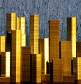
| 07/07/2006 11:40:00 AM |
Staple Cityby MarstonComment: Wonderful idea and great lighting. A black background or a print of a night sky for the background would have made this image complete. |
| Photographer found comment helpful. |
| 07/07/2006 11:39:41 AM |
|
| Photographer found comment helpful. |
| 07/07/2006 11:39:36 AM |
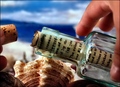
Captivating Correspondenceby maestroComment: The composition of this image is very busy looking. The shell in the center is competing with the message in the bottle for my attention. The backround going from light to dark to light at the top also distracts from the main subject. The choice of font size for the message is spot on. |
| Photographer found comment helpful. |
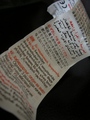
| 07/07/2006 11:39:29 AM |
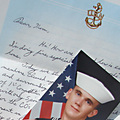
a letter to homeby san62910Comment: A very nice image. The background being whiter than the top of the letter is somewhat distracting. A black background might help considerably. |
| Photographer found comment helpful. |
Home -
Challenges -
Community -
League -
Photos -
Cameras -
Lenses -
Learn -
Help -
Terms of Use -
Privacy -
Top ^
DPChallenge, and website content and design, Copyright © 2001-2025 Challenging Technologies, LLC.
All digital photo copyrights belong to the photographers and may not be used without permission.
Current Server Time: 08/21/2025 02:55:54 AM EDT.