| Image |
Comment |
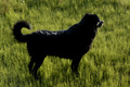
| 07/10/2006 08:18:11 AM |
Momentary Pauseby mosallComment: I really like the feel and texture of this image. It has the look of a painting. Glad I came back to comment on this one, because it deserves a bump from my first score. |
 Photographer found comment helpful. Photographer found comment helpful. |
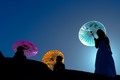
| 07/10/2006 08:16:11 AM |
Three Colorsby tinhmocnamComment: The colors and lighting are perfect. The composition would be perfect also if more of the two girls on the left could be seen in silhouette. You might want to crop this as vertical around the girl on the right hand side of the image. I think it would be stunning. |
| Photographer found comment helpful. |
| 07/10/2006 08:13:40 AM |
What are YOU looking at?by Mochrie99Comment: A very nice macro entry. The detail you captured in the eyes are lost to the viewer due to the blown highlights in the face. |
| Photographer found comment helpful. |
| 07/10/2006 08:11:10 AM |
Reloj de solby MilacroftComment: This is a very nice image but it just doesn't come across as strongly as it should. You might want to consider cropping about half of the negative space off the left. Something about the way the shadows end on the left side draws my focus away from the clock. I might also suggest playing with the contrast, levels or curves to darken the shadow just a touch and maybe lighten the sky. The sky being darker than the shadows makes the image look a little unbalanced. |
| Photographer found comment helpful. |
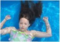
| 07/10/2006 08:03:05 AM |
Stillby Shea927Comment: This image would probaly have bette appeal to the masses if the girl was floating on the water instead of being submerged under the water. You might want to consider croping the right side of the image to mirror the crop through the elbow on the left side of the image. As presented, the negative space on the right gives this image an unbalanced feel. There are three water related anomalies (air bubbles or components of the main subject breaking through the surface of the water) that distract from the main subject. One by the hair on the right. One by her mouth. And one by her right thumb. |
| Photographer found comment helpful. |
| 07/10/2006 07:56:46 AM |
Braced Against the Windby mcraelComment: What a wonderful image. I had to look really hard to see that both feet were actually on the twig. Only a couple of things could have improved this image. If the bird would have provided a profile view and a bit more detail in the sky (Tough to do with basic editing). |
| Photographer found comment helpful. |
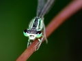
| 07/10/2006 07:54:13 AM |
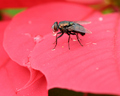
drink-stationby striveComment: This image is very well done and I love the detail visible on the fly. You might consider cropping a little off the top, as the vertical line produced by the plant in the background takes away from the visual effect of the curves from the plant the fly is sitting upon. |
| 07/10/2006 07:49:51 AM |
Dragonflyby polar1012Comment: I'm amazed at the tremendous amount of detail you captured in the wings. However, the catch light in the eyes draws my attention to that area and the focus is a little soft in the eyes for my taste. |
| 07/10/2006 07:48:15 AM |
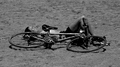
stationary and bicycleby zarzoComment: This image is perfect for this challenge. I'm not sure if B&W is the best choice for this image, as the girl's torso and upper legs tend to blend into the sand. Maybe if you played around with the contrast or levels you could bring these details back. |
| Photographer found comment helpful. |
| 07/10/2006 07:43:22 AM |
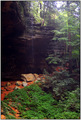
Over 10,000 yearsby JeileenComment: A lovely image that is well composed. The colors and light balance do suffer from the restrictions of basic editing. |
| Photographer found comment helpful. |
Home -
Challenges -
Community -
League -
Photos -
Cameras -
Lenses -
Learn -
Help -
Terms of Use -
Privacy -
Top ^
DPChallenge, and website content and design, Copyright © 2001-2025 Challenging Technologies, LLC.
All digital photo copyrights belong to the photographers and may not be used without permission.
Current Server Time: 08/21/2025 08:37:21 PM EDT.