|
|
|
Showing 111 - 120 of ~305 |
| Image |
Comment |
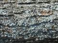
| 05/01/2003 08:36:06 PM | Barkby KimInNBComment: I think it's quite difficult to make the bark of a tree interesting to the people who view a photograph with just the bark. You've used some modeling effects of the light and managed to do a fairly good job!
It's not difficult to see why "Bark" was your choice for Flora given the winter you mentioned. Certainly it fits that category, so you're safe there.
In my opinion, there are some things you might try to improve this picture. Again, these are just thoughts I've had as I viewed your creation.
You might have tried a vertical format so that it doesn't look like it's from a dead tree which has fallen in the forest. (It might have been but I generally think of flora as currently living items. You want your viewers to think so too even if it isn't true.)
The contrast is, to me, a little too much. You might try to diffuse the light in some way or use a reflector to help fill in the dark areas.
The highlights are a bit too bright. Note that some of the detail is lost in these highlights.
The picture lacks a "wow" factor. It's just a record of some bark. This is fine if you're conveying information in, for example, a field or reference manual about tree bark. It doesn't work very well in a DPChallenge contest (unfortunately, even if it's a "Flora" challenge).
The picture seems slightly "cold" (too blue) which might be from having the highlights too bright. You could try a warming filter or a gel over the lens or might correct the tone in your photo editing software.
For what you had to work with, this is probably a pretty good choice of subjects. Someone suggested going macro for the lichen and that might have worked too. Or, if there was anything else of a "flora" nature in the area, the tree might have been used to frame that.
You've done a very good job with sharpness and depth of field. This is something I'm usually quite critical of in my own photos and you've done well there. The texture IS quite nice.
Finally, I hope your weather is getting better now and you can get out for some more pictures.
Regards ... for the Critique Club,
Bob Mahan
(rmahan)
|  Photographer found comment helpful. Photographer found comment helpful. |
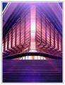
| 04/26/2003 03:31:26 PM | Come forth to carry me home.by GeocideComment: This is a really nice image showing the rays of the sun. I like it. I think I might like it better if it didn't have the tower in it but I not sure that wouldn't remove a focal point and the balance you have. Colors are quite remarkable and there is some differentiation between the dark clouds and the dark land. (I wouldn't want to be able to turn the photo upside down and have it look almost the same.) I have always liked crepuscular sun rays and you've captured them nicely. Overall, you've done a very good job of conveying an interesting moment for "Weather". In other words, I can't find much to critisize about your picture!
Regards ... for the Critique Club,
Bob Mahan
(rmahan)
| | Photographer found comment helpful. |
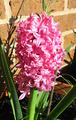
| 04/19/2003 05:02:46 PM | Pink & Greenby Geo_GriffinComment: You've got a really beautiful and colorful flower here and you're submitting to the "Color" challenge. You've definitely met the challenge because the color is a major element in your picture (it certainly wouldn't be the same without that bright color!)
You've picked a difficult subject to photograph, though, because of its location and the time of day when you took the picture. While the brick does, indeed, add texture to the photograph, it's not really what (I think) you want since it competes for the viewer's attention both as a subject and as additional colors the viewer must deal with. It's not like you can move your subject to another location, either. I see that someone mentioned using a shallow depth of field to blur the background but you indicate that is not possible with your camera. There are two other solutions which I can think of - 1.) use something behind your subject as a neutral and non-distracting background or, 2.) use something to block the sun from the background and place it into heavy shade. Either of these might have made the background less distracting and throw more emphasis onto your subject.
The lighting is obviously from the sun. The angle of the lighting is nice --- I don't think it could be better, in fact. However, it's difficult to get a good range from light to dark in a photograph taken when the sun is anywhere near its peak. The blooms have a "hot spot" and the shadows are almost black. To get a really good photograph from this situation, you probably should try to diffuse the light (my favorite is simply a white bed sheet held between the sun and the subject) so that the light is softer and the difference between the brightest point and the darkest point is not quite so severe. This would have been a good shot to make on an overcast day. Your photograph named "Camellia", which I like a great deal, takes advantage of that softer light.
As someone mentioned, the water droplets are nice. Don't know whether they were natural or you added this but either way, I think it adds to the photograph.
Thanks for submitting this photograph. Good luck in future Challenges!
Regards ... for the Critique Club,
Bob Mahan
(rmahan)
|
| 04/17/2003 08:42:42 PM | Time Wounds All Healsby ska120sComment: This is quite a nice photograph. The warmth is very nice and I can imagine a sadness in the model's eyes. The challenge is "Color" and the color in your photograph is certainly an important element use to evoke feelings in the viewer.
This looks as if there is a texture applied to the image but I suppose it's just some form of pixelation. The texture enhances the moodiness of the picture when applied to the face and clothing but it is very distracting on the wall especially to the left side. The pixelation would generally not do well with most subjects so I suggest that you grab a copy of NeatImage to see whether it would help enhance your other photographs.
The butterfly lighting helps to show all the features of the lady's face. If it were less of a "moody" picture, I would probably object to the multiple catchlights in the each eye but they don't distract me from enjoying the image. The focus is soft, but, again, under these conditions that doesn't distract and seems to add to the moodiness of the picture.
The darkening toward the edges helps to concentrate the eye on the subject. Because of the tilt of the head and the shadows in the lower left corner, I tend to think that the photograph isn't actually straight. The one white spot to the left of the subject draws the eye away. (Too bad we can't spot edit!)
You've accomplished very nice composition leaving enough room to the side of the your model in the direction her body is facing. Also, there is enough room above her to keep from feeling that she's crowded.
I see your note which says, "A photograph of a broken heart. The lighting and the color capture the warmth that was once present." I might have tried to interpret this with a "blue" color for feelings of sadness rather than "the warmth that was once present". Your interpretation is still excellent and, especially with the note, conveys what I think you wanted to convey. Thanks for submitting it and I look forward to seeing your future work.
Regards ... from the Critique Club,
Bob Mahan
(rmahan) |
| 04/17/2003 01:02:41 PM | Loves Me, Loves Me Not...by KazComment: Hi Kaz -
My first impression is that this is a very simple, clean photograph and I'm impressed! The composition is excellent. You've used the stem and the stem shadow to lead the eye into the main subject and the detached petals to frame that subject. The "rule of thirds" fits your composition quite well and I don't think you could have improved it by breaking that rule. The color is beautiful although I would have liked it a little darker. Just an opinion, but I think a darker rendition of this subject would have added some "WOW" to the photograph. I like your border; you've chosen a nice color to complement your subject's color. I seem to detect some slight pixelation/grain as I view your submission so maybe, if possible, a higher resolution might help if you can still stay within the Challenge submission size limits. Considering that pixelation, sharpness is good with a little bit of out-of-focus on the petal closest to the camera but that doesn't distract my eye. There is a white line in the flower which might just be a gap between the petals. That is slightly distracting but I don't find that to be a serious flaw.
Overall, I think this is an excellent, well composed, and well lit photograph. Thanks for entering it!
Regards ... for the Critique Club,
Bob Mahan
(rmahan) |
| 04/16/2003 11:04:13 PM | Little Pink Housesby Rosie20Comment: What I like most about this photograph is the subject matter. "Color" is certainly the first thing that comes to mind so you've certainly met the challenge. ("Garish" happens to be the second thing that comes to my mind!) I'm glad you found this subject and that you shared it with us.
Some ways to improve the photograph ... first, as many people have mentioned, try to turn off the date feature of your camera or compose your pictures so that you can eliminate the date when you crop and resize the picture. (I assume that you've got the date format set to European format of day-month-year.) If you have trouble doing this, I'm sure that asking a "how-to" in the forums would quickly find an answer from others who have the same camera.
Next, cut down the exposure some so that the picture, overall, is slightly darker. I think this would have brought the colors out even better and kept some of the areas from being pure white when we should be seeing detail. Although it's hard to say without having been there myself, a vertical format might have worked better in order to include the chimney and to eliminate the distractions to each side of the house. I would also have tried to shoot this straight-on although architectural photography is quite difficult with SLR cameras.
Finally, although it isn't always possible to choose the time of day when we get our best shots, I would have tried this either early morning or late evening. Can't say that it would have improved it but the generally warmer lighting found at those times might have helped.
Looks like you're fairly new to DPChallenge so I'll just add a "Welcome" and I hope to see more photographs from you in the future.
Regards ... from the Critique Club,
Bob Mahan
(rmahan) |
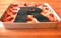
| 04/16/2003 10:10:04 PM | My Pi(e) are squared.by camelotnorthComment: This is quite a creative idea for the interpretation of "Pi". Almost every school kid knows "Pi R Squared" and there have been many jokes made about it. You created a picture to match the words. I often find it hard to say that someone doesn't meet a challenge because the idea is that each photographer produces THEIR interpretation ... the question is whether a viewer can connect to that interpretation or not. In this case, I think your communication is loud and clear and, in my opinion, this meets the challenge quite well.
Now for some things which, in my opinion, could improve your photograph:
Composition: I personally would have cropped this picture differently. The left-to-right cropping is slightly unbalanced and the top-to-bottom cropping makes me feel that I'm bumping up against the top of the picture. I would like to see centered cropping left-to-right and to have some more "breathing room" at the top and sides of the photograph even at the expense of making the subject slightly smaller.
Technical: I see a focus problem here or maybe more like a depth of field problem. It looks like a delicious pie and I would like to relish it from front to back. I would like to see every flake of that crust and that requires a much greater depth of field. The right-hand side of the pan is "blown out" as well as the left, front corner. The "R" appears to be made of felt and I would like to see less detail in the material. These are distracting elements which generally can be corrected by exposure control. I have to agree with some of the comments, too, that the angle of the shot might have been better had the camera been at a higher angle to the subject. Notice that the "R", when viewed as a flat object (which it is in a photograph) is smaller at the top than at the bottom. A steeper angle would have moderated this effect.
Lighting: I don't know what your lighting source was but you might have used something like a white sheet to diffuse the light and make it more even. Except for the two hot spots I mentioned, it is pretty good.
So now that I've drooled over this photograph so long, I'm off to the kitchen to see what I can scrounge up ... I don't think I'll find anything as delicious as what you've portrayed, though. Thanks for sharing it with us.
Regards ... for the Critique Club,
Bob Mahan
(rmahan)
| | Photographer found comment helpful. |
| 04/14/2003 05:21:35 PM | | | Photographer found comment helpful. |
| 04/14/2003 05:17:54 PM | After the stormby vcosmaComment: Nice shot but I would like to see the horizon as a straight line. You've captured a nice scene here. | | Photographer found comment helpful. |
| 04/01/2003 08:20:21 PM | Balanceby andrewlrComment: Very striking image and the colors are magnificent! | | Photographer found comment helpful. |
|
Showing 111 - 120 of ~305 |
Home -
Challenges -
Community -
League -
Photos -
Cameras -
Lenses -
Learn -
Help -
Terms of Use -
Privacy -
Top ^
DPChallenge, and website content and design, Copyright © 2001-2025 Challenging Technologies, LLC.
All digital photo copyrights belong to the photographers and may not be used without permission.
Current Server Time: 08/05/2025 01:06:33 PM EDT.
|