| Image |
Comment |
| 06/18/2003 10:10:57 PM |
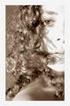
Me, myself and Iby kengurinnComment: Interesting concept. The type of "portrait lighting" you've used here is known as "horror lighting" --- the nose shadow projecting upward --- and is rarely used. It DID, however, show off your eyes to a nice advantage. |
 Photographer found comment helpful. Photographer found comment helpful. |
| 06/18/2003 10:09:11 PM |
Some of meby InnaNComment: Good detail and DOF. I think the face comes up too light which blocks detail but it's still a very good job. |
| Photographer found comment helpful. |
| 06/18/2003 10:07:58 PM |
"SELF Matter"by tfarrell23Comment: Interesting concept for a self-portrait. I like the lighting in the background --- can't judge the portrait lighting, though. |
| Photographer found comment helpful. |
| 06/18/2003 10:07:04 PM |
|
| 06/18/2003 09:53:04 PM |
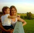
See the Sunset?by LeahStephenComment: Nice photo. Your little girl seems to be touching the landscape as if in wonderment! (I'm assuming that the adult is the one who submitted the picture!) Good composition but the board takes up a lot of room ... might have been better to use a tripod if you have one. |
| Photographer found comment helpful. |
| 06/18/2003 12:54:55 PM |
|
| 06/18/2003 12:53:19 PM |
|
| Photographer found comment helpful. |
| 06/18/2003 12:50:55 PM |
Through the disco ballby lordrichComment: I don't see the "self-portrait" in this photo ... unless you consider your thumb as a representative of yourself. |
| 06/10/2003 08:28:54 AM |
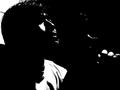
Like Father, Like Sonby buck4freeComment: In poor taste, in my opinion. Vertical lines need to be straight so the viewer doesn't feel as if he's tipping over. |
| Photographer found comment helpful. |
| 06/10/2003 07:58:44 AM |
Gaurding the Neighborhoodby PHOTOCHlXComment: Although some didn't feel that it met the challenge, I disagree with them. To me, this embodies the essence of "Home, Sweet Home". What else is "Home" about than our pets who are always there when we get home and love us unconditionally.
From a composition standpoint, I would like to see the dog looking into the frame. When he looks out of the picture, it leads the viewer's eye away and we don't stay with the picture for very long. The colors are nice and your exposure is pretty good although I would like to see a little more detail in the white fur on the top of the snout. While the focus is on the dog, I don't think that it's as sharp as it might be --- either from camera movement or subject movement --- and could be improved. DOF is sufficient and keeps the focus on the main subject.
Maybe I'm a sucker for dog pictures but I like this one quite a lot. When I viewed it, I felt right "at home" so I thought it met the challenge and the doggie looks "good enough to pet!". BTW, I had given this one an 8 in the scoring.
Regards ... for the Critique Club,
Bob Mahan
(rmahan)
|
| Photographer found comment helpful. |
Home -
Challenges -
Community -
League -
Photos -
Cameras -
Lenses -
Learn -
Help -
Terms of Use -
Privacy -
Top ^
DPChallenge, and website content and design, Copyright © 2001-2025 Challenging Technologies, LLC.
All digital photo copyrights belong to the photographers and may not be used without permission.
Current Server Time: 08/03/2025 08:39:24 AM EDT.