| Image |
Comment |
| 09/12/2006 04:04:41 PM |
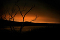
Bareby HaakonComment: you've closed it off quite a bit, but what's left is interesting to look at. the part I like the best is flat that just has a little color and the whispy grass silhouette. hope your not getting killed with this photo. |
 Photographer found comment helpful. Photographer found comment helpful. |
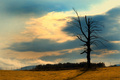
| 09/12/2006 03:55:29 PM |
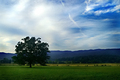
Solitudeby PhilComment: interesting sky, nice framing, good greens on grass....good but not great. I think the exposure and time of day hurts a little. |
| Photographer found comment helpful. |
| 09/12/2006 03:52:52 PM |
|
| Photographer found comment helpful. |
| 09/12/2006 03:49:05 PM |
|
| Photographer found comment helpful. |
| 09/12/2006 03:47:05 PM |
You'd Be Alone Tooby WannaBe_80zComment: the tree silhouettes well against the cloud, but the rest of the picture is just OK. it looks like had to overcompensate with PP in the sky top left. unfortunately that fence kills your natural landscape. |
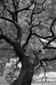
| 09/12/2006 03:44:59 PM |
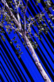
Contortionistby Links 2 3 4Comment: with the coloring you chose, the leaves are lost in the sky. the bark stands out well though. I like the contrast in the pic. |
| Photographer found comment helpful. |
| 09/12/2006 03:43:59 PM |
A simple tree...too much soonby Rino63Comment: typo in the title...ideas OK for the challenge, but for a great photo you overdid the accessories. the tree is lost. the quality is also hurt by the droppings and stuff at bottom of pic. |
| Photographer found comment helpful. |
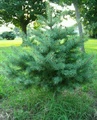
| 09/12/2006 03:38:52 PM |
Little Pineby collie65Comment: nice little tree but its really hurt by a lot of other elements. the blownout background, the small trunk in the background right, and the grass. definetly a different time of day would be better. |
| Photographer found comment helpful. |
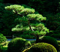
| 09/12/2006 03:37:10 PM |
Zen Garden Pineby Dr.ConfuserComment: like the lighting and greens you've achieved. your subject tree easily stands out from the bushes but not really well to the background. |
| Photographer found comment helpful. |
| 09/12/2006 03:33:15 PM |
Oasisby GermaineComment: like the processing, tree and rigth side of building. I don't like seeing the rooftop on the left. I think the comp would be improved if the two vertical pieces were closer together (different POV?) but as it is they look lost with so much space between them. |
| Photographer found comment helpful. |
Home -
Challenges -
Community -
League -
Photos -
Cameras -
Lenses -
Learn -
Help -
Terms of Use -
Privacy -
Top ^
DPChallenge, and website content and design, Copyright © 2001-2025 Challenging Technologies, LLC.
All digital photo copyrights belong to the photographers and may not be used without permission.
Current Server Time: 08/01/2025 07:53:21 PM EDT.