| Image |
Comment |
| 11/01/2006 03:02:07 PM |
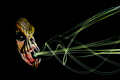
Night Breathby MarkComment: I consider a portrait as a representation of some aspect of the subject (which I would expect to be living but I suppose doesn't have to be). While this is an interesting picture, I do not feel that I am learning anything about the subject. |
 Photographer found comment helpful. Photographer found comment helpful. |
| 11/01/2006 02:56:57 PM |
|
| Photographer found comment helpful. |
| 11/01/2006 02:56:02 PM |
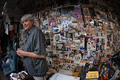
Artist's Studioby RiderGalComment: Great shot. I feel like this just isn't a photo but a window into this artist's life. If I could make a few changes, I would remove the white notepad in the center bottom of the image and have the artist just a little more centered. The fisheye distorts the subject just a little too much for my taste. |
| Photographer found comment helpful. |
| 11/01/2006 02:52:09 PM |
reflectionby mrezaComment: Excellent composition (except for the thick tree? coming out of the top of the subjects head). I would also try to get more light on the subjects face. Maybe a reflector would help here. |
| Photographer found comment helpful. |
| 11/01/2006 02:48:46 PM |
The Gentle Giantby BlackNewfsComment: I like your creativeness in choosing black and white for this photo. It shows the two tones of the dogs fur very well. However, I find the background too light and distracting from the subject. I would try to use a different location that has a darker background or place a filter (a digital one would work here) that darkens the background. |
| Photographer found comment helpful. |
| 11/01/2006 02:45:32 PM |
Look Back Without Angerby unicumComment: Too much negative space. With the subjects right ear off the edge, it almost looks like the negative space is pushing her off. Also seems like a bit too much post-processing. The skin color doesn't look right. But I do really enjoy the gaze. It looks very natural. Good job capturing that with this photo. |
| 11/01/2006 02:42:43 PM |
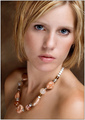
Size Mattersby alifeinexileComment: I find the model has too many shadows on her face and neck. I also find the close foot to be too distracting. My eye always ends up wandering over to it and I don't find the bottom of the shoe is visually appealing. But on the plus side, I very much like the idea - keep working on it. |
| Photographer found comment helpful. |
| 11/01/2006 01:25:22 AM |
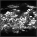
'Heaven'by FyzarlComment: I love this shot. I find Ansel Adams minimized the clutter in his photos and yours has none. I think it should have done much better than it did. I would give it a 9. Well done. |
| 10/01/2006 01:38:46 AM |
Gazeby elsapoComment: I love the lighting on the subject except I'm thrown off by the two sparkles I see in the eyes. I somehow expect to one see one. |
| Photographer found comment helpful. |
| 09/27/2006 01:39:38 AM |
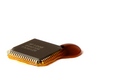
The Ooze!by jrdawsonComment: For those who don't quite get it, I was trying to portray how modern electrical devices cause pollution by leaking toxic chemicals into our environment. |
Home -
Challenges -
Community -
League -
Photos -
Cameras -
Lenses -
Learn -
Help -
Terms of Use -
Privacy -
Top ^
DPChallenge, and website content and design, Copyright © 2001-2025 Challenging Technologies, LLC.
All digital photo copyrights belong to the photographers and may not be used without permission.
Current Server Time: 08/16/2025 10:30:42 AM EDT.