| Image |
Comment |
| 02/03/2007 10:20:46 PM |
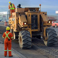
Day 3: 2010 Winter Olympicsby jrdawsonComment: Yes, the background is blurred using photoshop. I know it looks fake, but at one photo a day, quick and dirty is the only way to go. It's just good enough to get the effect I wanted (making the machine pop out) so I stopped playing with it and sent it in. Glad you like it. Message edited by author 2007-02-03 22:21:05. |
| 02/02/2007 04:19:57 PM |
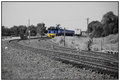
Palace Theatreby ValdoComment: Awesome! I find it hard to capture good street scenes, especially when there are lots of neon lights around. You did a great job! |
 Photographer found comment helpful. Photographer found comment helpful. |
| 02/01/2007 06:35:20 PM |
My Little Girlby SweetlittlepixieComment: Couldn't help but notice that no one has answered your question in the photo notes.
Resizing a photo always seems to result in a loss of sharpness. I'm no expert, but I'm willing to believe it's due to the sampling process. For example, if you had a section of the image that was:
lots of white... 'white' 'white' 'black' 'black' ... and more black
and you resized your image to 1/4 it's original size, the new, smaller image might consist of something like:
lots of white... 'grey' ... lots of black
That sharp contrast that used to exist between the white and black is now gone.
So, the generally accepted practice on this site (and even allowed in the 'Minimalist' ruleset) is to apply a sharpen filter AFTER you resize the image.
Other than the slight lack of sharpness, this image is amazing! Awesome job on the lighting, composition, and greyscale conversion. Keep up the good work.
|
| Photographer found comment helpful. |
| 01/31/2007 08:02:54 PM |
|
| Photographer found comment helpful. |
| 01/29/2007 01:03:45 PM |
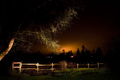
Forgotten Boundaryby UbersteinyComment: What I like:
The way your subject(s) stand out from the dark background. It gives the whole image a very moody feel to it.
The exposure is great, especially for your first light painting attempt.
What I would work on:
There are too many conflicting subjects in the photo. I see the fence as one, the tree as another, and the distant sky as a third. None of them seem to relate to one another nor enhance one another.
While visually pleasing, I don't get a sense of a story from the image. I'm wondering what you saw in this image that made you take it? If there wasn't a 'fence' theme, would you have taken this image anyway? Your title seems to allude to a story, but I don't see how this fence is 'forgotten'.
Overall, good job. |
| Photographer found comment helpful. |
| 01/25/2007 03:35:09 PM |
|
| Photographer found comment helpful. |
| 01/14/2007 01:38:52 PM |
Early Morning Surferby cp5140Comment: This looks like a great image but it's hard to tell because it's so small (I know you did max out your width). I would love to see this printed at full size to really appreciate it. I hope it doesn't get too punished for being too hard to see details. |
| Photographer found comment helpful. |
| 01/14/2007 01:32:57 PM |
|
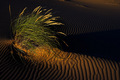
| 01/14/2007 01:23:00 PM |
Oregon Dunesby BaldurTComment: My eyes keep drifting off the top of the frame... I don't know if it was possible but I would rather have seen this photo taken from a bit lower angle to let the eye follow the lines of the sand more. But I do think the lighting on the grasses is awesome! Good job. |
| Photographer found comment helpful. |
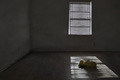
| 01/13/2007 04:38:00 PM |
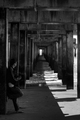
Too Little Too Lateby njsabsComment: Great idea but too dark for me. Let me see more detail, especially in the light spot on the floor. |
| Photographer found comment helpful. |
Home -
Challenges -
Community -
League -
Photos -
Cameras -
Lenses -
Learn -
Help -
Terms of Use -
Privacy -
Top ^
DPChallenge, and website content and design, Copyright © 2001-2025 Challenging Technologies, LLC.
All digital photo copyrights belong to the photographers and may not be used without permission.
Current Server Time: 08/16/2025 08:57:46 AM EDT.