| Image |
Comment |
| 07/25/2006 03:22:10 PM |
White Sails Unfurled, The Ships of Heaven Embarkby modurnComment: Great job! One of the prettiest clouds that I've seen in this challenge, and you did great to capitalize on it. Colors are intense, and has no flat feel to this photo. Upping original score from a 4 to a 6. |
 Photographer found comment helpful. Photographer found comment helpful. |
| 07/25/2006 03:20:18 PM |
A Candid Kissby btuckComment: Great job@ Nice use of deliberate color. Raising original score from a 4 to a 6. |
| Photographer found comment helpful. |
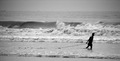
| 07/25/2006 03:19:47 PM |
A Fisherman at the Beachby balmikiComment: Great job! A nice photo, great movement and mood in the waves as they crash in on shore. Just not extremely interesting. Might have been better in color. |
| 07/25/2006 03:19:11 PM |
The IDAHO'IN Wayby chad_ecComment: Great job! A very clear shot, nice clarity and movement of the water. Would have been better had she not been so much in the shadow. Raising my original score from a 4 to a 6. |
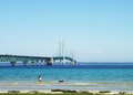
| 07/25/2006 03:17:34 PM |
The Mighty Macby TG73Comment: Great job! The color in this one is very nice. I love the subject matter, but I think the girl and the dog are too small to make any real impact in this photo. I'm raising my original score from a 4 to a 5. |
| 07/25/2006 03:16:41 PM |
"Send Hope"by Blue MoonComment: Great job! Very nice use of color and perspective. Not extremely interesting however, although pretty. Raising original score from a 4 to a 6. |
| Photographer found comment helpful. |
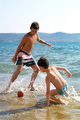
| 07/25/2006 03:16:00 PM |
The Beach Football No.1by the PljucComment: Great job! The use of color and light is very nice in this shot. The movement in the boys and the water where they play is also very nice, as they just don't look 'planted' there. Good job keeping with the theme of the challenge. Raising the original score that I gave you from a 4 to a 6. |
| 07/25/2006 03:14:40 PM |
Papatowai Beachby ScottjComment: Great job! This is very pretty, although not extremely interesting. Nice use of light and color and perspective though. Good job keeping with the theme of the challenge. Raising my original score from a 4 to a 5, definately is not below average. |
| 07/25/2006 03:13:24 PM |
Study in Greyby ZygoteComment: Great job! I really like the use of the chosen color in this one. I love the silhoutted figure standing above some very strong and solid looking rocks. It is also a contrast between the unfailing and imperfect. Nice tones and movement in the sky. I'm upping the score because originally, I did not see the beach aspect of it, but now I know it's a jetty or breakwater, and can see the beach. Going from a 4 to an 8. |
| Photographer found comment helpful. |
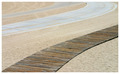
| 07/25/2006 03:11:23 PM |
Boardwalkby canon78Comment: Great job! This photo, although nice, is just not very interesting. The wooden boardwalk would have been better alone, without the other roadway looking things. Maybe you could have taken this from a different angle with better perspective. I do like the way the wooden planks curve from the bottom corner upward. Nice job keeping with the challenge's theme. |
Home -
Challenges -
Community -
League -
Photos -
Cameras -
Lenses -
Learn -
Help -
Terms of Use -
Privacy -
Top ^
DPChallenge, and website content and design, Copyright © 2001-2025 Challenging Technologies, LLC.
All digital photo copyrights belong to the photographers and may not be used without permission.
Current Server Time: 08/26/2025 04:57:00 PM EDT.