| Image |
Comment |
| 10/30/2003 11:20:40 PM |
Dew Shadowsby ellamayComment: The color and details are very sharp, as are the leaf and shadows. The grass seems a little dark in the foreground but I think that helps with the contrast of the nicely rich green. It's a nice capture and likely one we walk past every day (at least during fall), and it's nice to be able to see a close-up, low-down shot to see just how pretty it can be. |
 Photographer found comment helpful. Photographer found comment helpful. |
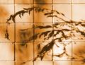
| 10/30/2003 11:16:04 PM |
nature's canvasby JasperComment: The tone is a nice warm color and I think it works well with the texture of the tiles. I also like the softness of the shadows. The lines seem straight and do not show any distortion, which is good. I like the gradient color and the exposure looks good. Nicely captured. |
| Photographer found comment helpful. |
| 10/30/2003 11:12:08 PM |
Innocenceby inspzilComment: This is a good low-key portrait. The light isnt too bright on the face and her expression is still captured, cheeky as it is. Part of me would like to see her be more fuller frame and lose the darkness/shadow on the left, or else have more negative space on the right to follow the path of her eyes. |
| Photographer found comment helpful. |
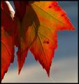
| 10/30/2003 12:29:42 PM |
Spider's Final Shadowsby adineComment: The coloring of the leaves is simply wonderful, and the fine details are nicely sharp. The choice of dof does well to isolate the leaves, and I love the sun-lit spider thread leading out of the frame. It's almost a shame the spider shadow is there! It meets the challenge and has a wonderful autumn feel to it. Well captured. |
| Photographer found comment helpful. |
| 10/27/2003 09:13:37 AM |
Shades of Autumn by moodvilleComment: Thanks for all the comments! This was a last minute entry that I almost never entered because I saw some flaws I didnt have time to fix, but I liked it enough to enter thinking I would score mid 5's. Wow, what a surprise to get second! I guess sometimes you never can tell. Thanks again to all who voted (except the 2, boohoo!) |
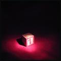
| 10/25/2003 01:03:24 PM |
And Now, The Star Of Our Show ...by GeneralEComment: The highlight on the block is good, I could see this as being something seen on a stage, however, I'm not a fan of the carpet/fabric beneath it. It has texture but I think that distracts a little, making it look a lot more softer than it probably is, also the red blends in. I think a slightly different angle and a white or black 'background' would helped the image immensely. The concept itself is great. |
| Photographer found comment helpful. |
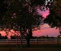
| 10/25/2003 12:59:03 PM |
Sunset Lightby sherryk471Comment: The color of the sunset is good, although I think there is a little too much tree on the left that masks the sunset. I would have liked to have seen a little more sky. The image also seems a little out of focus, possibly due to camera shake. In low light conditions it's best to use a tripod, assuming you didnt. |
| Photographer found comment helpful. |
| 10/25/2003 12:55:42 PM |
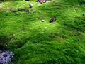
Lillipution Landscapeby shareinncComment: Are those mushrooms? I understand the reference and the dappled light over the ground is good, but I dont feel there is enough of a focal point to keep attention. The hue of green is good, I just dont really know what I'm suppose to be looking for or seeing. |
| 10/25/2003 12:53:23 PM |
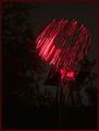
Magic Windmillby ChrisW123Comment: I've seen some really interesting photographs done with a laer/light pen, but I think in this instance the subject doesnt really work well. On my monitor the background still shows up as a very faint image, and there are quite a number of stray red dots floating around too. The idea was good, the execution not bad, the subject matter probably not the best. |
| Photographer found comment helpful. |
| 10/25/2003 12:45:48 PM |
The Faded Rose of Loveby NeuferlandComment: The candle seems very over exposed and the rose appears pixelated. It almost looks like photoshop effects have been added to it. Compositionally it is fine, and the folds in the fabric are a nice touch. |
| Photographer found comment helpful. |
Home -
Challenges -
Community -
League -
Photos -
Cameras -
Lenses -
Learn -
Help -
Terms of Use -
Privacy -
Top ^
DPChallenge, and website content and design, Copyright © 2001-2025 Challenging Technologies, LLC.
All digital photo copyrights belong to the photographers and may not be used without permission.
Current Server Time: 08/07/2025 04:23:47 PM EDT.