| Image |
Comment |
| 11/05/2003 02:09:59 PM |
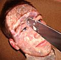
AHHHHHHHH!!!!!!!by timboydwhiteComment: Not sure what to say about this one. It's rather gross in a pus-covered way. You seem to have forgot to add the effect on the other eye and cheek beyond the knife. |
 Photographer found comment helpful. Photographer found comment helpful. |
| 11/05/2003 02:08:12 PM |
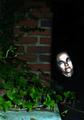
Evil and Ivyby jbruno1397Comment: Had it been a less edited face I think it would have looked better. I liked the foreground with the ivy and the brick, but I'm not sure about the head. Is it suppose to be a small troll-like creature? If so the perspective/size of the head is too big. If the person is suppose to be full-size and standing near a wall then the foreground gives the illusion of it being the ground and thus the person standing there seems at odd height. I think I can see what you were aiming for, I just think it could have been tweaked a little more to attain it. |
| 11/05/2003 02:04:43 PM |
|
| Photographer found comment helpful. |
| 11/05/2003 02:01:24 PM |
An Evil Eyeby jab119Comment: This probably would have been much better had it been sharper, and possibly having the eye a little further back from the opening. The catchlight in the eye is good, as is the composition. |
| 11/05/2003 01:59:37 PM |
A Scary momentby trainComment: The image looks quite blurry, probably due to the low light conditions. It's also fairly dark with a yellow cast. |
| 11/05/2003 01:58:10 PM |
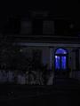
Your "Nightmare" Birde is Still Waitingby vtruanComment: The image is a little dark and the roof seems tilted. I'm not sure if it's the blue window or what looks like two beady eyes or a mixture of both that's the focal point. It also seems a little blurry, probably due to the low light conditions. |
| Photographer found comment helpful. |
| 11/05/2003 01:56:43 PM |
|
| Photographer found comment helpful. |
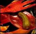
| 11/05/2003 12:30:38 AM |
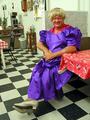
Still Life with Pickleby fleenkComment: The reds and yellows are a nice tone, although the green stands out as being different. The focus on the pickle is not the best and as such I think the droplets dont really add anything other than something for the light to reflect in. This certainly has a mexican fiesta flavor to it. |
| 11/05/2003 12:26:34 AM |
a quiet kind of ironyby MiahComment: Not the usual still life image. Hrm, not really sure what to say about this. It's clear, the choice of black and white could have been a good one. Not sure I'm a fan of the cropping, though. It's certainly different. |
| Photographer found comment helpful. |
| 11/05/2003 12:24:29 AM |
Wine is A Gracious Creatureby vrphotosComment: Nice background, wonderful tones, the lighting is good, no obviously bad reflections. The barrel, I think, as a table top goes well with the rest of the theme. Only negative is the crop of the corkscrew. Nice classic still life. |
| Photographer found comment helpful. |
Home -
Challenges -
Community -
League -
Photos -
Cameras -
Lenses -
Learn -
Help -
Terms of Use -
Privacy -
Top ^
DPChallenge, and website content and design, Copyright © 2001-2025 Challenging Technologies, LLC.
All digital photo copyrights belong to the photographers and may not be used without permission.
Current Server Time: 08/08/2025 03:33:03 AM EDT.