| Image |
Comment |
| 11/20/2003 09:23:42 AM |
Flying south for the winterby AV8RComment: Good composition, nice colors, slightly soft but I think that goes with the mellow feeling of the scene. One suggestions, though, is to have flipped the image so the letters N and S are the right way around. The plane would still be flying to the south, but the viewer's eyes wouldnt be drawn so much to the backward letters. |
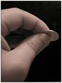
| 11/20/2003 09:15:58 AM |
Penny Pincherby vonautschComment: Interesting idea and I like how the fingers are framed in such a way as to lead the eye over to the coin. After looking at it for a while I find the inside finger in the center of the fingers to be a little distracting and would have rathered the center 'hole' be completely black. |
 Photographer found comment helpful. Photographer found comment helpful. |
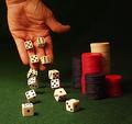
| 11/20/2003 09:12:04 AM |
Going For Brokeby GolferDDSComment: The hand and furthest die are a little OOF but I'm not sure if that is because of DOF or motion. My eyes seem to go to the hand more than the chips so I think I would have liked to have seen it more in focus. The lighting is good, a little bright on three of them, but not overly so. I'm not sure if you have the 12 die there in those positions hoping to come across like there are only two being rolled, or you only used 2 and a long exposure, although they seem a little solid with no obvious motion if you did the latter. If your attempt was the former then as I said above they seem a little too solid. Nevertheless, a good shot. |
| Photographer found comment helpful. |
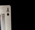
| 11/20/2003 09:05:13 AM |
Blacker than the ace of spadesby christyrackComment: The card seems slightly tilted, not sure if that was your intention of not. It's very minimalistic, conveys the phrase well, and the card isnt blown out, although there seems to be uneven color tones if you look at the lower left compared to around the A. It's good, just doesnt have much wow factor for me. |
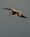
| 11/20/2003 09:01:44 AM |
Your Mileage May Varyby ellamayComment: This is a very good shot. Having recently tried some wildlife photography I can appreciate how difficult it is to get a shot like this. The negative space is good, complimenting the feeling of flying. The image is sharp with good color and light. Contrasts are also good. I dont really see anything that could be improved on. Well done. |
| Photographer found comment helpful. |
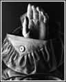
| 11/19/2003 06:30:11 AM |
Handbagby ShelleyComment: You managed to capture the nice textures of the bag, and I think the lighting/shadows leant themselves well to the black and white. The partly mirrored reflection is a nice touch too. Although it's not really a common phrase, it still is a literal representation. The lighting seems just a tad too harsh on the thumb. Overall a good shot. |
| Photographer found comment helpful. |
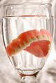
| 11/19/2003 06:26:10 AM |
BITE ME!!!by joannadivaComment: Cute in a funny kind of way! You did well with the reflections on the glass. The lighting is good as is the crop. The only things I dont really care for are the water droplets/splashes on the side of the glass. |
| Photographer found comment helpful. |
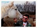
| 11/19/2003 06:23:37 AM |
He Heard It Straight From The Horse's Mouthby ShannonComment: The look in the horse's eye suggests s/he was not very happy with this shot! Probably the only glaring thing I dont really like is the fencepost and wire/fence in the bottom right. Other than that it's a fairly humorous shot. |
| Photographer found comment helpful. |
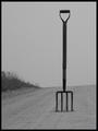
| 11/19/2003 05:56:49 AM |
Look for the fork in the road!by ColeyComment: This is good and very funny. I can just imagine someone giving directions and actually meaning this type of fork in the road and yet our conceived notion assumes the other. It's very simplistic and stark, not sure if you added the grain/noise or it's natural, but I like it. Contrasts are good, composition is good, I like the addition of the grass bank on the left. Good idea! |
| Photographer found comment helpful. |
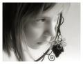
| 11/19/2003 05:49:42 AM |
I heard it through the grapevineby ursulaComment: The tone is good, I like the focus, it has a nice soft feel to it. I realise the thing on the side of her face is the grapevine, but it kinda looks odd in the shot. The lighting is also good. It's an odd photo to vote on. Without the grapevine it would be a very pretty portrait but off topic, and yet with the grapevine it's on topic but has a fairly large distraction. I like it anyways! |
| Photographer found comment helpful. |
Home -
Challenges -
Community -
League -
Photos -
Cameras -
Lenses -
Learn -
Help -
Terms of Use -
Privacy -
Top ^
DPChallenge, and website content and design, Copyright © 2001-2025 Challenging Technologies, LLC.
All digital photo copyrights belong to the photographers and may not be used without permission.
Current Server Time: 08/08/2025 06:45:33 AM EDT.