|
|
|
Showing 811 - 820 of ~1214 |
| Image |
Comment |
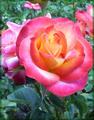
| 12/02/2003 01:57:40 PM | Last Winter Roseby StewanComment: The petal is a little close to the right edge and with your choice of border it actually overlaps and gives the same feeling as if it that been cropped out completely. The green gives it a sense of depth on the bush, but I think with it being slightly off center in a vertical shot that it may have been better to lose the green and get really close in on the rose. Another reason a closer angle would be better is because I think the greens are a little washed out color-wise. The petals are a little soft, but I think that adds a mood, and I do like the mix of colors of the rose itself. |  Photographer found comment helpful. Photographer found comment helpful. |
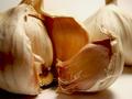
| 12/02/2003 01:50:33 PM | Garlicby HavokComment: Ewww garlic! The dof is good, as is the lighting. Exposure is excellent. Composition is wonderful, and I like the background bulb filling up the space in the background. The texture is good, and the image is nicely sharp where it needs to be. Professional-looking shot, well done. | | Photographer found comment helpful. |
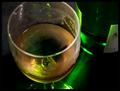
| 12/02/2003 01:47:08 PM | Pleasantly fruity with interesting floral overtoneby DBoyComment: I like the angle on this, it really lets the aroma float up as if I was about to sniff and taste the wine. At first I thought that it seemed an odd composition, but it has a great feeling of familiarity and a natural look, if that makes sense. The colors are good, the lighting is atmospheric with no obviously bad reflections. I was wanting the label facing rather than being away, but I think I prefer it this way now as it doesnt become a distraction. I like it. | | Photographer found comment helpful. |
| 12/02/2003 01:42:30 PM | Hopeby moymarquezComment: This meets the challenge, sure, but I think the main focus of the flower/scent is kinda lost by the fact it seems it's an image of two friends smiling at the camera. By that i mean when I look at this I dont immediately associate it with the flower or any scents/aromas. The shot itself is ok, it doesnt grab me but I dont dislike it either. |
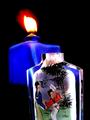
| 12/02/2003 01:35:27 PM | Chinese Snuff Bottleby MichaelsComment: I'm not sure what it is but it looks interesting. I like how the foreground bottle is well lit and the details can be seen clearly. The blue bottle adds some color and interest, not sure if they are connected or not, but they go well together. Not a fan of the flame, but they are so difficult to photograph well. I'm not sure what I dont like about it, probably because it looks like a big white blob. Even so, it's a good image. | | Photographer found comment helpful. |
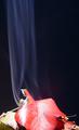
| 12/02/2003 01:32:25 PM | The smell of fall...by wetlandComment: I havent seen this type of setup with fall leaves before (and there have been a lot of falls leaves recently), and so I think that adds a refreshing change and interest to the shot. The smoke is good, nicely thick, clearly seen, and with a nice texture, almost like silk. I feel the leaves are cropped a little too tightly and dont show the 'whole' picture, as it were. The small pile is good and the crop on the sides to make it a vertical shot is good, but the big red leaf has lost the tip and that's what I'm referring to concerning the crop. It's different so I like it. | | Photographer found comment helpful. |
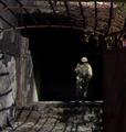
| 12/02/2003 01:28:37 PM | Sunrise did not diminish the burning smell of fuel, metal and flesh...by genmpComment: I'm assuming from the title that this is a soldier, perhaps. The image itself is a little small and so a lot of the details are lost. It is always good to use the full 640 pixels on the longest side. I'm not really sure what to make of it. I can tell it's a person, but other than that not much. I do like the shadows on the floor. I also, thankfully, do not have a personal reference for the smell in the title. |
| 12/01/2003 02:15:18 PM | . . . Imperfect Roseby ladpupmoeComment: The top part of the rose petals are good, they are lit well, slightly soft and delicate. It looks like you probably only used one light source on this, coming from the top left. Because of this the stem and leaves are darker and as such slightly blurry/OOF or far more soft focus and has some noise. The foreground petal also shows a shadow, which is a little distracting. Softly lighting it from the lower right as well as the upper left may have helped with the foreground petals and leaves. There is also a strip of green in the lower right corner that's a little distracting too. Compositionally it's ok, it's in a classic center position, but for a more dramatic image you could try playing around with different angles. | | Photographer found comment helpful. |
| 12/01/2003 02:09:06 PM | Dancing Softlyby paganiniComment: The sun seems to dominate this a little too much to the point I find myself looking at that rather than the birds. The fact that you have three of the birds cropped out also leaves me feeling a little incomplete. And the horizon is also a little tilted. I do like the glow in the wings of the birds on the right - the warm color is great. |
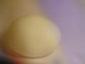
| 12/01/2003 02:04:01 PM | I want you soft-boiledby ursulaComment: Hrm, I'm not sure about this one. In some ways I like it, in others I dont. First thing I dont like is the black corner in the lower left - it ruins the flow and I dont see the need to have it there, but I can also see how you couldnt crop it either. It looks like a set-up studio shot so a reshoot could have been done. The two bands of colors - the yellowish white and the purplish white - I'm really not sure what purpose that serves. I kinda like it in a 'that's different' way, but on the other hand it looks like a white balance problem. Had the entire image been the yellowish white then it could have been an almost 'high-key' shot in that the subject blended into the background but could still be seen - camouflage of sorts. The connection with the title is cute, but that also makes it seem like the soft focus and egg is for humor rather than mood, but I suppose humor is a mood too. It's not horrid, but it's different for sure. | | Photographer found comment helpful. |
|
Showing 811 - 820 of ~1214 |
Home -
Challenges -
Community -
League -
Photos -
Cameras -
Lenses -
Learn -
Help -
Terms of Use -
Privacy -
Top ^
DPChallenge, and website content and design, Copyright © 2001-2025 Challenging Technologies, LLC.
All digital photo copyrights belong to the photographers and may not be used without permission.
Current Server Time: 08/08/2025 07:29:04 PM EDT.
|