| Image |
Comment |
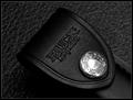
| 02/16/2004 08:51:51 AM |
Buck - An American Classicby orussellComment: Good diagonal, excellent lighting, the texture in both the foreground item and the background compliment each other well. The chrone is well lit and shiny without losing any details. Would make a great advertising shot. |
 Photographer found comment helpful. Photographer found comment helpful. |
| 02/16/2004 08:49:39 AM |
In The Theaterby alternaruleComment: Not really my type of thing so I cant really judge it good or bad with any decree of knowledge or taste. It's very abstract/impressionistic. |
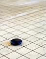
| 02/16/2004 08:45:41 AM |
Koby dsrayComment: The floor looks dirty and old but in some ways that seems to add to the mood. I like the highligts on the side of whatever that is. It almost reminds me of kitchen hockey. It also seems like you thought about the placement of the item and the direction of the lines too. |
| Photographer found comment helpful. |
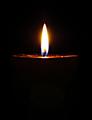
| 02/16/2004 08:40:54 AM |
Black wax candle... lightby DrakeComment: Flames are hard to photograph and you've done fairly well. The triangular top of the candle also adds interest. The flame here seems to be the focus point with the black candle part almost non-existent due to the background, which unfortunately is what a lot of voters are going to be judging on. |
| Photographer found comment helpful. |
| 02/16/2004 08:36:47 AM |
|
| Photographer found comment helpful. |
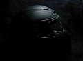
| 02/16/2004 08:34:22 AM |
Black Hatby C_Steve_GComment: Not really a fan of the placement, other than the top it is surrounded by a lot of negative black space. I think a tighter crop would have helped and also brought more attention to the detail of the helmet. It also looks like it may have been too close to the backdrop as the black has some texture along the beam of light. The helmet itself is interesting - it has a distinct futuristic feel to it. The lighting is good with no bad reflections or bright spots. |
| Photographer found comment helpful. |
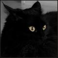
| 02/16/2004 08:30:00 AM |
Seeing Blackby lilnukeeComment: Black is really hard to exposure. You have the wisps on the 'outer' part of the cat, and certainly the eyes, but the details of the fur and his/her face is mostly lost. There is some, but not significantly enough to break up the mass of black. |
| Photographer found comment helpful. |
| 02/16/2004 08:24:06 AM |
Lonesome eyesby JasonComment: I like the hair over the eyelid, and the catchlight on the eye is good. Only negative is the vast amount of negative black space on the right. |
| Photographer found comment helpful. |
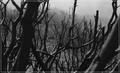
| 02/16/2004 08:20:01 AM |
Black Saturdayby melongrindComment: I like the harsh mood from the black, stripped bark. The seeming mist in the background adds a nice layer to it too. I dont normally complain about borders, but this one seems to invade the picture too much, it's almost like it's in the way of me seeing more of the limbs. |
| Photographer found comment helpful. |
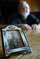
| 02/11/2004 01:57:25 PM |
age 2 to 78by camelotnorthComment: This has a great photojournalistic as well as a family memoir mood to it. It's certainly something I would expect to see in a newspaper/magazine article about the person. The in-focus baby photograph is sharp and clear, and the OOF person is enough to bring the focus to the front but not enough that the person is completely out of the picture either. I like it! |
| Photographer found comment helpful. |
Home -
Challenges -
Community -
League -
Photos -
Cameras -
Lenses -
Learn -
Help -
Terms of Use -
Privacy -
Top ^
DPChallenge, and website content and design, Copyright © 2001-2025 Challenging Technologies, LLC.
All digital photo copyrights belong to the photographers and may not be used without permission.
Current Server Time: 08/12/2025 04:07:59 AM EDT.