| Image |
Comment |
| 02/18/2004 07:17:17 AM |
"Black Magic"by casualguyComment: Hrm, almost looks like lipstick. It's an interesting idea, very abstract, slightly phallic, and I like the light on the 'metal' rings. |
 Photographer found comment helpful. Photographer found comment helpful. |
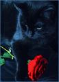
| 02/16/2004 01:23:56 PM |
The Roseby MarjoComment: Black is hard to expose right and you've managed to retain a lot of the details in the cat's fur. In contrast the red of the rose looks a little oversaturated. |
| Photographer found comment helpful. |
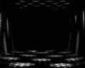
| 02/16/2004 12:05:05 PM |
The Black Boxby jrs915Comment: Hrm, looks like a cheese grater with light shining through the top. Nice play between light and shadow, enhanced with the use of textures. Being fussy I would personally have liked to have to seen another 'wall' of light/shadow/texture at the back instead of just the empty space. |
| Photographer found comment helpful. |
| 02/16/2004 12:02:08 PM |
Teapotby maelmsComment: A little on the bright side on the lower left, but I like it. Very simplistic, not a full silhouette so it doesnt look like a cardboard cutout, but the light at the bottom and along the spout gives it a good three-dimensional look. If I was to nitpick I may have suggested a little light on the top right side so it didnt look so flat and give it the same 'body' as the rim on the left. |
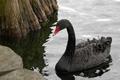
| 02/16/2004 11:59:20 AM |
Black Swanby qnjtComment: A little soft, especially around the head, but the composition is ok, and here is good detail in the black feathers. I like the texture of what looks like a tree in the top left, though! |
| Photographer found comment helpful. |
| 02/16/2004 09:06:48 AM |
Celestial Warriorby ImagineerComment: I like the halo over the hill and the trees framing the left side is interesting. The red 'planet'? certainly stands out amidst all the stars. A very peaceful image. |
| Photographer found comment helpful. |
| 02/16/2004 09:04:47 AM |
Woolen Hillsby GeneralEComment: Interesting idea - the texture is good but the dof seems a little off with the focus on the middle 'hill'. Being oof has given the front 'hill' more texture, but I think it may have just had a stronger impact if they were all in focus and had a uniform look with the lines and curves as the strong point. |
| Photographer found comment helpful. |
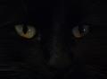
| 02/16/2004 09:00:57 AM |
Magicby dr rickComment: Good color in the left eye but they both seem a little dim. Black is hard to expose right, and the majority of the details of the fur/nose etc seems to be lost or not as strong as they probably should be. |
| Photographer found comment helpful. |
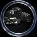
| 02/16/2004 08:59:04 AM |
10D: a Self-Portraitby kirbicComment: The lighting is good, it's nicely sharp, but I really dislike the frame. Not sure if it's a mirror frame or a filter frame but it distracts from the image quite a bit. |
| Photographer found comment helpful. |
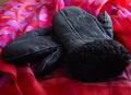
| 02/16/2004 08:54:38 AM |
Mittensby amsmythComment: The texture and the lighting on the mittens are good, even some details in the fur at the top, but the background does not really compliment them well. It's far too busy and almost taking away the focus from the mittens, and there is an uncovered spot on the top left. Something plain or with texture would likely have helped it a lot. |
Home -
Challenges -
Community -
League -
Photos -
Cameras -
Lenses -
Learn -
Help -
Terms of Use -
Privacy -
Top ^
DPChallenge, and website content and design, Copyright © 2001-2025 Challenging Technologies, LLC.
All digital photo copyrights belong to the photographers and may not be used without permission.
Current Server Time: 08/12/2025 06:00:00 AM EDT.