| Image |
Comment |
| 08/02/2004 02:06:41 AM |
The Blue Moon Rose.by cathysappComment: Good lighting, depth of field, and sharpness. The details are wonderful as are the textures in both the green stem and the blue petals. A very pretty shot. |
| 08/02/2004 02:05:18 AM |
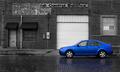
Drivers Wantedby tyt2000Comment: I like the tonal range in the black and white and it has interesting elements composed well too. The selective desat is effective and the blue stands out very nicely against the black and white. I like the blue reflection on the cobblestones too. Good shot! |
 Photographer found comment helpful. Photographer found comment helpful. |
| 08/02/2004 02:02:42 AM |
My Blue Jean Tornadoby toddheadComment: Normally I'd say a background like this is a little busy and leaning toward 'snapshot' but I think it works. The selective desaturation is good too. What really makes the image is the hair and her expression, both are great and add to the title. You just have to smile at the obvious fun she is having. Not sure about all that negative space at the top although I can understand why you have it there. Cropping some of it off put a little more emphasis on the blue dungarees. |
| Photographer found comment helpful. |
| 08/02/2004 01:58:52 AM |
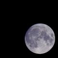
Wisconsin Moonby Links 2 3 4Comment: I guess there had to be a shot of the moon in here somewhere! Slightly bluish, a little soft, but good exposure and composition. |
| Photographer found comment helpful. |
| 08/02/2004 01:53:32 AM |
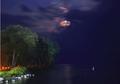
blue herron under a blue moonby koolaid26Comment: Because you exposed for the trees the moon is overexposed and is basically a white blob in the sky that doesnt really add that much to the image. The heron is also so far distant that it looks like a white blur. The horizon looks slightly tilted too, although the darker gradient on the right doesnt make it look so obvious. The areas that are lit on the left look quite blurry too. For night shots like this it is quite important to use a tripod. The elements are there and to some degree the composition is good, but it lacks a lot technically. |
| Photographer found comment helpful. |
| 08/02/2004 01:48:01 AM |
authentic blueby GinaRothfelsComment: The texture and color of the jeans is good and the golden button compliments it well. The composition is simple but effective. Good shot. |
| Photographer found comment helpful. |
| 08/02/2004 01:47:11 AM |
blue diamond ??by gaurawaComment: The background looks like it could probably do with being a little brighter but the light on the ring isnt bad. The light reflection on the left is a little distracting but the streak on the right seems fine. The colors are fairly muted and lack impact - jewelry photography is usually very bright and flashy. |
| Photographer found comment helpful. |
| 08/02/2004 01:11:28 AM |
Mountain Gatewayby blemtComment: Composition and natural framing is good as is the layers of the grass and the mountain between the rocks. The light looks a little harsh and even but the color is good and complimentary to the blue sky. |
| Photographer found comment helpful. |
| 08/02/2004 01:06:29 AM |
Blue Fireby pmichaudComment: The centered composition works for this image and I like the subtle color of the blue. Exposure looks good too. Doesnt really have the 'wow' to it but it's a good shot. |
| Photographer found comment helpful. |
| 08/02/2004 01:04:59 AM |
First Kissby ruffianComment: Ceramics are quite difficult to photograph because of the light. You've done a fairly good job keeping down the reflections and the ones still present arent that distracting. The background is blurred nicely and doesnt detract from the foreground elements. Another problem with ceramics is getting it so the image doesnt look out of focus. The edges look fairly sharp but the details are not really there and so it suffers from looking like it is OOF. |
| Photographer found comment helpful. |
Home -
Challenges -
Community -
League -
Photos -
Cameras -
Lenses -
Learn -
Help -
Terms of Use -
Privacy -
Top ^
DPChallenge, and website content and design, Copyright © 2001-2025 Challenging Technologies, LLC.
All digital photo copyrights belong to the photographers and may not be used without permission.
Current Server Time: 08/08/2025 06:40:28 AM EDT.