| Image |
Comment |
| 05/22/2003 11:23:43 AM |
P O W E R under C O N T R O Lby bosniakComment: I like the perspective and the depth in this image. It does an excellent job of making the viewer seem almost overwhelmed with the amount, and the way it continues out of the frame suggests there are a lot more too. I believe it adequately meets the challenge. |
 Photographer found comment helpful. Photographer found comment helpful. |
| 05/22/2003 11:20:41 AM |
There is no spoon!by The KidComment: Simple, uncluttered, related to the movie, and meets the challenge. I like the reflection in the spoon, but is that a head in there? Perhaps less hand and more spoon may have had more impact, but it works as it is. |
| Photographer found comment helpful. |
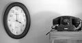
| 05/22/2003 11:18:23 AM |
Time to go.by jonrComment: The b&w with the old fashioned phone makes the image appealing to me. It's a simple, uncluttered image that meets the challenge well. The only things I dont like are the reflections in the clock, they are a little distracting - I am almost trying to work out what they are, which is bad. The clock also seems a little tilted on the wall, or maybe just in relation to the phone, not sure, but it seems odd. The concept of a futurisitc movie being shown in an "old fashioned" theme is interesting, and I like it. |
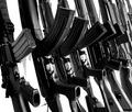
| 05/21/2003 11:25:57 AM |
We Need Guns, Lots of Guns...by AnachroniteComment: I'm not a fan of guns but in the context of the challenge and what is represents, this works. The choice of b&w has more of an impact and it is in keeping with the 'loading room'. The few background shadows are a little distracting, but not overly so. The tight crop with the guns continuing out of the frame helps give the illusion that there are many many more of them. |
| Photographer found comment helpful. |
| 05/21/2003 11:15:01 AM |
See it for Yourselfby KonadorComment: This certainly has the matrix feel and meets the challenge. The negative space on the right is good. Not meaning this in a bad way or attacking the model, but I think the 'blotchy' skin is a little distracting. The forehead line above the glasses is a little washed out/over exposed as well. I'm curious to know how it would look with the entire matrix 'lettering' filling the glasses frame, but this way gives it the 'white room' look. |
| Photographer found comment helpful. |
| 05/21/2003 11:01:53 AM |
The Matrix - A Wireless Worldby ChezComment: I dont seem to know what that is, but that could be a good thing. It looks futuristic, and the colors/curves are appealing. It's simple and clean. The shadows add something too. Only negatives are the two 'spots' - one in the top right and the other just below the curve. And the background white seems a little dull. |
| Photographer found comment helpful. |
| 05/21/2003 10:58:08 AM |
The Hungerby TarbiniComment: This is a great futuristic-style image. If the 'lightning' is real then I'm suitably impressed as it really gives the image a spark (no pun intended!). I'm curious to know what and how it was done, though. |
| Photographer found comment helpful. |
| 05/21/2003 10:53:05 AM |
Bent Spoon or Bent World?by K-RobComment: Not a bad concept. It certainly meets the challenge. I'm not sure about the light flares on the spoon handle, and probably would have liked the handle to be a bit more in focus. |
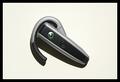
| 05/21/2003 10:49:13 AM |
Neck Plug: Interface Detail by GordonComment: I have no idea what it is, but I like it. The curves are appealing, the lighting is good and gives it the appropriate chrome-esque shine of metal (or it seems to). The matrix 'lettering' is a nice addition and punctuates the futuristic feel of the image. In some ways, it almost reminds me of an eye. |
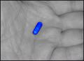
| 05/21/2003 10:46:26 AM |
Why, Oh Why...by rickhd13Comment: The concept is a little predictable, but out of all the 'pill' images this one is by far the best. It's simple, the choice of a b&w hand with the very vibrant blue pill has impact. The central composition of the pill makes it demand your attention. |
| Photographer found comment helpful. |
Home -
Challenges -
Community -
League -
Photos -
Cameras -
Lenses -
Learn -
Help -
Terms of Use -
Privacy -
Top ^
DPChallenge, and website content and design, Copyright © 2001-2025 Challenging Technologies, LLC.
All digital photo copyrights belong to the photographers and may not be used without permission.
Current Server Time: 08/01/2025 02:24:06 PM EDT.