| Image |
Comment |
| 06/11/2003 12:56:20 PM |
ELLEby jenaromComment: Good tonal skin colors, although there is some light on the top right of her face that is causing a few shadows, but I think that adds a more natural feel and it doesnt distract. The background choice/colors are bright and clean. The pose is somewhat odd but it adds a good negative space on the left for the usual magazine blurbs. The model is very pretty and certainly a face I'd expect to see on Elle. The image looks very professional. Well done. |
 Photographer found comment helpful. Photographer found comment helpful. |
| 06/11/2003 12:50:41 PM |
Sports Illustrated by RiderGalComment: Wow, an amazing shot! Clean, sharp, the sport action is well captured. The expressions on the players' faces tell a story, which would certainly encourage me to read the accompanying feature article. Plenty of space at the top for the mag title. This is certainly something I'd expect to see on the cover of sports illustrated. A professional-looking shot. |
| Photographer found comment helpful. |
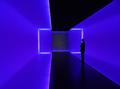
| 05/27/2003 02:01:29 PM |
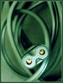
The Light Insideby xertionComment: This almost reminds me of a matrix shot. It's strange and surreal and I like it! I have no idea what it is, but the colors are appealing, the lines are intriguing, and the person in the middle just makes me curious. All good elements to me. The only slight negative I see is the slight purple tinge on the upper/lower left 'wall' |
| Photographer found comment helpful. |
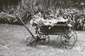
| 05/27/2003 01:50:07 PM |
That Old Wheelbarrowby nathaliedooComment: I like the subject matter - the wheelbarrow. The image has some grain to it, which I'm not sure if it's intentional or not. The image also seems a little flat, which causes the top of the wheelbarrow to blend in with the background too much. More depth of field and contrast would probably bring the wheelbarrow out more and give the image more impact. |
| Photographer found comment helpful. |
| 05/27/2003 01:37:31 PM |
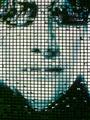
Behind the Screenby PaigeComment: The expression on her face is good and the skintones are complimentary. I'm not a fan of the screen, at least not with the white flecks that show up in it. Because the boy's face is slightly cropped out it makes it more of a distraction to me, as does her arm. My eyes are drawn naturally to the little girl, and also wondering at what they are looking at. Either having both faces completely in the shot or just the girl's (and not the screen) would have had a better impact in my opinion. |
| Photographer found comment helpful. |
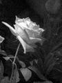
| 05/27/2003 01:31:17 PM |
Rose an artistic interpretationby EJComment: I normally like grain in some images when used for impact, but I think the grain in this image is a little too excessive. I think this may have been better with a more plain background, or a textured one, but some of the leaves are little distracting - mostly the top right and on the left near the flower. More contrast and less grain on the petals would have really enhanced it more too. |
| Photographer found comment helpful. |
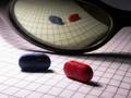
| 05/22/2003 11:44:34 AM |
Red Pill/Blue Pillby dsa157Comment: I like the set up of this image, and the grid background really adds to it. The blue pill seems adequately lit in the reflection, but the foreground blue pill seems a little dark. In contrast, the left side of the image is very bright, which is likely why the pill is dark, and changes the balance of the image a little. I would have also liked the entire grid to be reflected in the glass frame instead of having it terminate on the right hand side. I think if the lighting was a little different then it would have made a much more dramatic impact, |
| Photographer found comment helpful. |
| 05/22/2003 11:37:48 AM |
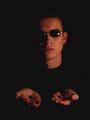
Into The Rabbit Holeby GreggeNComment: The half shadow on the face is good, adds a nice mood, although the slight shine of the glass rim on the left appears in the shadow making it detached and thus distracting. I probably would have liked the shadow to be more centered down the face, or at least as far as removing the light flare on the left glass lens. In contrast, I think the hands and the pills needed more light. They are a little too dark and so do not stand out as well as they should seeing as they are the main focus - the choice. The mood is good, the composition is fine, I just feel the lighting could really bring out the best in the image. |
| Photographer found comment helpful. |
| 05/22/2003 11:32:11 AM |
The Matrix is Watching...by tfarrell23Comment: This is kind of unnerving, which means you did a great job of protraying the title. The position of the 'plug' is great, and I like the dof/tone of the rest of the image. There appears to be some graininess with the background, not sure if it is intentional or not, but either way I like it. The only other thing is my disappointment in not being able to get the entire image on my screen at one time, but that's my fault for having a small screen size! |
| Photographer found comment helpful. |
| 05/22/2003 11:27:44 AM |
Matrix ReSquaredby sahkoComment: I assume it's the movie poster with a grid of water droplets above/in front of it? I have mixed feelings about this. On one hand it's relying too much on the poster, on the other it is an interesting visual display that has similarities to a lot of digital art nowadays. The impact is strong and appealing, and it meets the challenge. |
| Photographer found comment helpful. |
Home -
Challenges -
Community -
League -
Photos -
Cameras -
Lenses -
Learn -
Help -
Terms of Use -
Privacy -
Top ^
DPChallenge, and website content and design, Copyright © 2001-2025 Challenging Technologies, LLC.
All digital photo copyrights belong to the photographers and may not be used without permission.
Current Server Time: 08/06/2025 09:31:58 AM EDT.