|
|
|
Showing 2871 - 2880 of ~3441 |
| Image |
Comment |
| 03/06/2006 12:05:26 AM | |  Photographer found comment helpful. Photographer found comment helpful. |
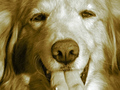
| 03/02/2006 11:00:39 PM | Priceless Expressionsby deanaComment: ::: Greetings from Critique Club :::
Hi, as requested, here is an indepth critique of your submission.
First Impression - the most important one:
It's a cute pet photo, but generally images of pets don't do well in challenges, unless they are super special.
Composition:
It fills the frame, but that's about it. Nothing is strong about the composition.
Subject:
Being that it fills the frame, subject is very clear. We know what we are looking at.
Technical (Color, focus, and light):
Color: For Duotones to be effective, the shot must have been shot with the purpose of making the image duotoned. Not just taking a pic and duotoning it. The duotone doesn't really add any value to this shot.
Focus: Sharp and in focus.
Light: Good, relatively flat, but flattering.
To grow its vote?:
As I stated in my opening, pet shots don't generally do well in challenges. Voters see them as an easy out, just to meet the challenge. Get out and have some fun with the camera, try new things. Have FUN!
Summary:
I hope I don't come across as mean spiritted in this critique. I really don't intend for it to come across that way. But, I'm looking at your other work and you can do so much better than this photo.
Hope to see more from you soon,
Leroy | | Photographer found comment helpful. |
| 03/02/2006 07:06:08 PM | | | Photographer found comment helpful. |
| 03/02/2006 04:12:38 PM | spirits by ursulaComment: Awesome shot! I expect this will ribbon! | | Photographer found comment helpful. |
| 03/02/2006 04:08:12 PM | | | Photographer found comment helpful. |
| 03/02/2006 04:06:46 PM | | | Photographer found comment helpful. |
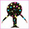
| 03/02/2006 12:45:37 PM | between shotsby nomad469Comment: ::: Greetings from Critique Club :::
Hi, as requested, here is an indepth critique of your submission.
First Impression - the most important one:
This was actually one of my favorites of the challenge. Technically it is well done, the duotones work for it and it's just fun.
Composition:
It's a standard portrait composition, not too terribly strong, but not bad by any means.
Subject:
Subject is clear and stands out well against the white background.
Technical (Color, focus, and light):
Color: Your choice of a warmish duotone works well for this image.
Focus: sharp, but not so sharp that it takes away from the softness of this image.
Light: Relatively flat, but flattering.
To grow its vote?:
Was a hard challenge, with many, many entries. This just isn't what the voters were looking for. While, I think it is under-rated, there would be a very slim chance of pushing a portrait to the front of a "free study" challenge.
Summary:
Nice portrait work, well done and you had fun with it.
Hope to see more from you soon,
Leroy | | Photographer found comment helpful. |
| 03/01/2006 07:33:54 PM | American Dinerby Shiva DasComment: I like the statement you are making here and the photo is well executed. Good luck with it. | | Photographer found comment helpful. |
| 03/01/2006 07:26:39 PM | | | Photographer found comment helpful. |
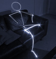
| 03/01/2006 11:45:50 AM | 1983 - Relax (don't do it)by KHoltComment: ::: Greetings from Critique Club :::
Hi, as requested, here is an indepth critique of your submission.
First Impression - the most important one:
It is a good image and stands apart from all the other Rubik's Cube photos in that it is torn apart ... something I quickly learned to do ;-)
Composition:
Pretty strong. I like the fact that the in focus parts are in the positions they are in. However, I think that using two blocks in the foreground has crowded the composition a bit.
Subject:
Clean, clear crisp and stands out welll.
Technical (Colour, focus, and light):
Colour- White balance seems to be a bit warm. But, overall colour is good.
Focus - Sharp and good use of DoF.
Light - No harsh shadows, evenly lit. Pretty good, but somewhat flat.
To grow its vote?:
The Rubik's seems to have been an obvious choice for this challenge. In that, you may have gotten quite a few votes that were low, because voters had seen too many Rubik's Cubes. Also, strenthen up that composition just a little.
Summary:
Pretty good photo, definitely not a bad photo.
Hope to see more from you soon,
Leroy | | Photographer found comment helpful. |
|
Showing 2871 - 2880 of ~3441 |
Home -
Challenges -
Community -
League -
Photos -
Cameras -
Lenses -
Learn -
Help -
Terms of Use -
Privacy -
Top ^
DPChallenge, and website content and design, Copyright © 2001-2025 Challenging Technologies, LLC.
All digital photo copyrights belong to the photographers and may not be used without permission.
Current Server Time: 06/24/2025 09:22:02 AM EDT.
|