| Image |
Comment |
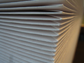
| 07/07/2006 11:31:43 AM |
Envelopesby FromacComment: What I like: light is great!
What might improve it: I think that more of an angled POV would help. |
 Photographer found comment helpful. Photographer found comment helpful. |
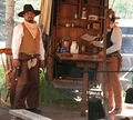
| 07/07/2006 11:30:17 AM |
Our Write'n Paperby cyanComment: What I like: Earthy picture with the earthy tones.
What might improve it: I think the stick in front of the second cowboy is detracting from the image. |
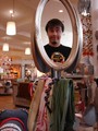
| 07/07/2006 11:28:54 AM |
Goofy Reflectionsby javakillsComment: What I like: it's goofy, and has alot of color.
What might improve it: Sorry, but I can't see how this meets the challenge, so having the stationery more obvious would have helped it's vote with me. |
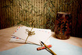
| 07/07/2006 11:25:51 AM |
Dejavuby shalrathComment: What I like: haha, composition and color! Big surprise there, right?
What might improve it: Might have got a higher score with a solid background, but I sort of like the one it has now. Something doesn't seem quite right with the focus and I can't put my finger on it. |
| Photographer found comment helpful. |
| 07/07/2006 11:23:25 AM |
Zen Correspondenceby bvoiComment: What I like: The background and the shadow of the pen on the envelope.
What might improve it: possibly brightening up some of the edges of the image (like behind the vase) |
| Photographer found comment helpful. |
| 07/07/2006 11:21:34 AM |
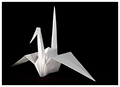
Stationery - Japanese Styleby QikiComment: What I like: I like the minimalist look. Light is well done.
What might improve it: Not sure if the tail was a tad out of focus or if the light was just too close to it, Trying to soften the tail a bit might help. |
| Photographer found comment helpful. |
| 07/07/2006 11:19:58 AM |
Joyful Cardby TheStickComment: What I like: The light angle is very good.
What might improve it: The background is very rough-looking and I think that detracts from the image. |
| Photographer found comment helpful. |
| 07/07/2006 11:16:41 AM |
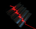
Laser Red Staplesby daz311xComment: What I like: Almost looks like an escalator, original idea.
What I think might help it: Perhaps positioning the light higher so that all of the staples have some light on the top? |
| 07/07/2006 11:15:13 AM |
From the desk of...by dockieComment: What I like: Blue on the white background is pleasant.
What I didn't like: I don't see anything that stands out in the composition. |
| 07/07/2006 11:13:55 AM |
|
| Photographer found comment helpful. |
Home -
Challenges -
Community -
League -
Photos -
Cameras -
Lenses -
Learn -
Help -
Terms of Use -
Privacy -
Top ^
DPChallenge, and website content and design, Copyright © 2001-2025 Challenging Technologies, LLC.
All digital photo copyrights belong to the photographers and may not be used without permission.
Current Server Time: 08/27/2025 06:01:44 AM EDT.