|
|
|
Showing 161 - 170 of ~361 |
| Image |
Comment |
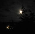
| 07/16/2006 12:10:11 PM | Electricity ruins the night view in the countryby hysmorComment: Technical: Focus - 1
Exposure - 1
Quality - 0
Aesthetic: Comp. - 1
Light - 1
Color - 1
Wow factor: 0
Personal tilt: 0/3
What I liked: The effect of the lights at night, the moon compared to the tungsten light makes an interesting comparison.
What might improve the image, IMO: The electric light in this image improves it, IMO. Because of this, it's hard to take the title literally.
NOTE: I'm trying this system of giving comments on all images I vote on, my score of the photo, and what I did and did not like. Please, I'd like feedback on whether or not this is helpful, so feel free to give me a PM with any feedback - positive and negative are welcome. Also, my profile has more about what all of the terms in my grading system mean to me. |  Photographer found comment helpful. Photographer found comment helpful. |
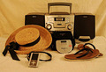
| 07/16/2006 12:06:19 PM | Progressing toward Decayby elipsComment: Technical: Focus - 1
Exposure - 1
Quality - 1
Aesthetic: Comp. - 1
Light - 1
Color - 1
Wow factor: 0
Personal tilt: 0/3
What I liked: The image is technically very well done.
What might improve the image, IMO: Taking a picture of something that carries more impact on people as far as decay is concerned.
NOTE: I'm trying this system of giving comments on all images I vote on, my score of the photo, and what I did and did not like. Please, I'd like feedback on whether or not this is helpful, so feel free to give me a PM with any feedback - positive and negative are welcome. Also, my profile has more about what all of the terms in my grading system mean to me. | | Photographer found comment helpful. |
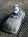
| 07/16/2006 12:02:34 PM | Beach Music - Boombox->Discman->Ipodby sabrizzComment: Technical: Focus - 1
Exposure - 1
Quality - 1
Aesthetic: Comp. - 1
Light - 0
Color - 0
Wow factor: 0
Personal tilt: 1/3
What I liked: Idea is cool, and we have progressed alot in that area.
What might improve the image: Changing the color balance, the image seems too yellow.
NOTE: I'm trying this system of giving comments on all images I vote on, my score of the photo, and what I did and did not like. Please, I'd like feedback on whether or not this is helpful, so feel free to give me a PM with any feedback - positive and negative are welcome. Also, my profile has more about what all of the terms in my grading system mean to me. | | Photographer found comment helpful. |
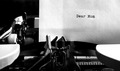
| 07/12/2006 10:54:46 AM | Dear Momby vprndsgComment: This and staples were my favorites in the challenge. Good job. I was one of your tens! | | Photographer found comment helpful. |
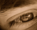
| 07/12/2006 12:27:20 AM | An Eye for Stationeryby Matt414ceComment: Thanks for all of you that liked this picture! I had fun taking it! Message edited by author 2006-07-15 09:56:41. |
| 07/11/2006 10:13:26 PM | staplesby ralphComment: What I like: i love the composition, texture, light, and DOF.
What might improve it: Might be better if it didn't have the junk on the edges of the staples, but in any case, I can see why you didn't remove it, and it might actually help the picture. This is a 10 for me. Great job! |
| 07/10/2006 03:34:16 PM | A Kiss for 10 Toes by SandyPComment: Awesome photo! I wish I could vote on it. I think the DOF on the feet and eyelashes is excellent. Only thing I would think might help would be to remove the veil or fabric that seems to be in the image. But, I'd have to see it without it to know one way or the other. | | Photographer found comment helpful. |
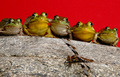
| 07/10/2006 03:30:45 PM | Ten Eyes on Lunchby TransitComment: Can't vote on this one, but I think this is hilarious. It would've got a good score from me!
Just a thought. In an attempt to be helpful, the only thing I'm not sure I like in this photo is the red background. Perhaps a dark blue sky color would have worked? | | Photographer found comment helpful. |
| 07/10/2006 02:38:38 PM | Dessert in Bloomby LucidLotusComment: I love the purple tones in this picture, first of all. I'm not especially big on frames, and IMO, the purple frame isn't really helping the image. And if it's not actively helping, get rid of it. Removing the brown in the lower corner and the caramel would also help the image, IMO. For me, what I love about this picture is the cool colors, and those two sets of warmer browns are detracting from the color composition of the image.
Just what would have helped me like it a little more. As it stands, I do like the image, and if I had voted on this challenge, I probably would have been one of the people raising your avg. | | Photographer found comment helpful. |
| 07/07/2006 12:13:58 PM | | | Photographer found comment helpful. |
|
Showing 161 - 170 of ~361 |
Home -
Challenges -
Community -
League -
Photos -
Cameras -
Lenses -
Learn -
Help -
Terms of Use -
Privacy -
Top ^
DPChallenge, and website content and design, Copyright © 2001-2025 Challenging Technologies, LLC.
All digital photo copyrights belong to the photographers and may not be used without permission.
Current Server Time: 08/25/2025 03:05:36 PM EDT.
|