| Image |
Comment |
| 08/14/2004 05:52:04 PM |
Smootchby JesuispeureComment: First thing I thought of was what in the world did she step in? Not a pleasant way to be greeted by an image and I'm certainly not thinking of romance anymore after seeing this image. |
| 08/14/2004 05:50:26 PM |
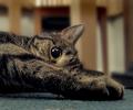
the gratuitous cat foot shotby redmoonComment: I like your use of the wide angle here, but the paw seems to get lost in the rest of the fur and is hard to distinguish. Also, there are two catch lights in the cat's eye. Finally, I find the background, even though blurred, quite distracting with lines coming out of the cat's head. I think you should have cropped out this top part and blurred more what was left. Overall, though, I find this rendition of the cat photos not interesting. Sorry for the harsh critique. I hope it helped. |
| 08/14/2004 05:46:15 PM |
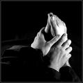
Restby TiberiusComment: This picture does not say "rest" to me. First, it's got high contrast and secondly, the composition is built with an overall diagnal and upwards sweep of line. More energetic that of repose. Technically, you have a blown out area smack in the middle of your main subject, the feet. I do however, like the rich black tone. |
 Photographer found comment helpful. Photographer found comment helpful. |
| 08/14/2004 05:02:12 PM |
Relaxedby jonpinkComment: A little too much glare and overexposure from the feet. |
| 08/14/2004 04:57:33 PM |
Undefeetedby BrennanOBComment: An interesting composition with nice lighting. It appears that it may have been sharpened to excess, though. |
| Photographer found comment helpful. |
| 08/14/2004 04:56:03 PM |
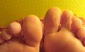
Feetby JiaBobComment: I find the yellow cast unattractive and the background directly behind the toes distracting. Not an interesting composition. Sorry to be so blunt, but I hope this helps. |
| Photographer found comment helpful. |
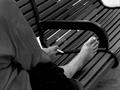
| 08/14/2004 09:41:09 AM |
A bench called home.by BradComment: Focus seems a bit off, either from camera movement or subject movement. I also don't like the white area in the top right and think you should have cropped that out when you took the picture. I'm not sure I like the diagnal lines of the bench slats in this context. Doesn't fit with the homeless theme youi're portraying here. I do, however, like the B&W toning very much. It appears your subject didn't know he was being photographed and this kind of candid photography can be difficult. Really not a bad job overall. |
| Photographer found comment helpful. |
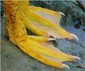
| 08/14/2004 09:15:51 AM |
Corn on the Cobby CamComment: Very interesting feet...makes me wonder what kind of animal this is. I think the reflections off the water and mud weakened the color contrast between the yelllow feet/claws. |
| Photographer found comment helpful. |
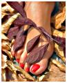
| 08/14/2004 08:58:15 AM |
Eves' right footby ChezComment: Nice composition but it appears to be some blown out highlights on the foot and leaves. Did you meter for the skin tones? |
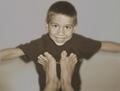
| 08/14/2004 08:44:17 AM |
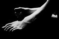
Flyingby bmatt17Comment: I like the blurred softness from movement but would have preferred that you use a portrait format to see more of the young boys body to see that you are pushing him up with your feet. Lighting and toning is good. Nice compelling image. |
| Photographer found comment helpful. |
Home -
Challenges -
Community -
League -
Photos -
Cameras -
Lenses -
Learn -
Help -
Terms of Use -
Privacy -
Top ^
DPChallenge, and website content and design, Copyright © 2001-2025 Challenging Technologies, LLC.
All digital photo copyrights belong to the photographers and may not be used without permission.
Current Server Time: 08/10/2025 06:08:22 PM EDT.