| Image |
Comment |
| 10/21/2005 01:12:59 AM |
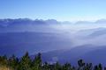
Layeredby aKiwiComment: I like the view a lot, but something seems off. Like maybe there should be a bit more contrast in the nearer mountains and not so much blue overall. Looks too artificial. Also, I don' tlike the way the trees in the foreground have been cut off and the small patch of grass in the lower left is distracting. |
 Photographer found comment helpful. Photographer found comment helpful. |
| 10/21/2005 01:06:26 AM |
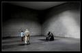
Contemplationby e301Comment: Awesome WA capture of this place as you can really feel the largenss of its dimensions. Tones are very nice and I like the dramatic lighting. However, I find the people to be distracting because you seem to have captured them at a random moment. The man has his back to us and is talking to another person. |
| Photographer found comment helpful. |
| 10/21/2005 12:46:53 AM |
Restingby gisliComment: I like the way the boats are lit up against the dark night sky but think the exposure is a bit off as there is some blown highlights (lower left). Seems that the white balance is also off. |
| Photographer found comment helpful. |
| 10/21/2005 12:39:57 AM |
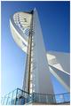
Spinnaker Towerby PixelstateComment: Interesting subject matter and great WA capture, as you really get a good feel of height. I like the white on blue bg, but wish you had chosen to photograph it at another time of the day or at a different angle as I do not like the shadow facing the viewer. |
| Photographer found comment helpful. |
| 10/21/2005 12:35:34 AM |
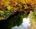
Sereneby woohoopepperComment: Great angle of view and reflection. Colors are a bit too warm and saturated for my tastes. Trees seem a bit too soft, especially in the upper right (too much NR?). However, I really like the composition and the way the water leads the eye from lower left to upper right. Good job. |
| Photographer found comment helpful. |
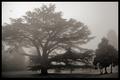
| 10/21/2005 12:30:31 AM |
The Monarch Reigns Onby ImagineerComment: Lovely moody composition. I wish there were a bit more richness to the color tones. Not exactly sure what the title means. |
| Photographer found comment helpful. |
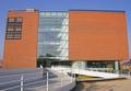
| 10/21/2005 12:27:41 AM |
ARoS // museum of artby visaksenComment: The image appears too flat, in both its spatial and color/tonal dimensions. The building looks as though it's leaning backwards and compositionally I don't think you gave the building enough space in the frame and I don't like the head on angle. Sorry for the harshness. |
| Photographer found comment helpful. |
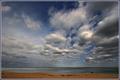
| 10/21/2005 12:23:20 AM |
Clearing Storm — Nantucket Sound, Autumnby Bear_MusicComment: Clouds and sky are equisite and I like the slivery sea, but I find the sand a bit too reddish/brown. The two people walking are a bit too obscure to add impact. Also, I also think you should change your style of title as it gives away the artist. |
| Photographer found comment helpful. |
| 10/21/2005 12:18:29 AM |
On The Lakeby charmayneComment: Colors seem too unnatural and oversaturated for my liking. I wish you hadn't placed the horizon line dead center. |
| Photographer found comment helpful. |
| 10/21/2005 12:11:58 AM |
|
Home -
Challenges -
Community -
League -
Photos -
Cameras -
Lenses -
Learn -
Help -
Terms of Use -
Privacy -
Top ^
DPChallenge, and website content and design, Copyright © 2001-2025 Challenging Technologies, LLC.
All digital photo copyrights belong to the photographers and may not be used without permission.
Current Server Time: 08/08/2025 05:11:09 AM EDT.