| Image |
Comment |
| 06/11/2010 12:23:41 AM |
|
 Photographer found comment helpful. Photographer found comment helpful. |
| 06/11/2010 12:22:49 AM |
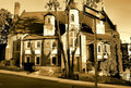
One Way To Heavenby J-MeComment: Here are the problems I see: color cast, objects blocking my view (street sign, 3-limbed tree, and electrical cables. Perhaps a different view point would have been a better choice. |
| Photographer found comment helpful. |
| 06/11/2010 12:17:29 AM |
|
| Photographer found comment helpful. |
| 06/11/2010 12:14:59 AM |
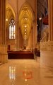
St. Patrick Cathedral by Kathy_GCComment: Assuming your intention was to capture that person walking at slow shutter speed I think you caught him/her at an unfortunate position in the image because he blends into the background too much and is barely noticeable. Also, I would have corrected the color cast. |
| 06/11/2010 12:10:00 AM |
|
| Photographer found comment helpful. |
| 06/11/2010 12:09:14 AM |
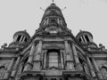
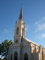
Churchby E450Comment: I dislike the framing (church cut off at the bottom) and the perspective distortion (leaning). |
| 06/11/2010 12:07:30 AM |
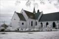
Ghostly churchby LonnieDComment: I like IR effects with churches, but I think it goes to waste in this setting because of the lack of any meaningful foliage to show it off. Also, it appears you did not completely convert to B&W as the roof to the left of the steeplechase looks to be in color. |
| Photographer found comment helpful. |
| 06/09/2010 12:26:18 AM |
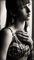
Wishing Waitingby ScooterMcNuttyComment: I love this portrait for it's pose and expression. Very evocative and very classic too. I agree with what others said about the dark thick line on the right as being problematic, but I'm going to add a couple of things I see that I believe should be improved upon. First, the lighting is a bit too harsh and contrast too strong to the point where you've blown out the highlights near your left cheeck and eye resulting in a fusion of your skin and background. Equally, you've plugged the shadows on the opposite side of your face and I wish there were a bit more detail in your hair. For me, you've also cropped the top of your head a bit too much and while you don't have to see your entire head, I wish there were more head room. That and the side crops also being too tight give the feeling of an image that is too cramped. Still, this is a GREAT effort and one you should be very proud of. Keep up the great work. |
| Photographer found comment helpful. |
| 06/07/2010 04:51:07 PM |
|
| Photographer found comment helpful. |
| 06/07/2010 04:49:08 PM |
|
| Photographer found comment helpful. |
Home -
Challenges -
Community -
League -
Photos -
Cameras -
Lenses -
Learn -
Help -
Terms of Use -
Privacy -
Top ^
DPChallenge, and website content and design, Copyright © 2001-2025 Challenging Technologies, LLC.
All digital photo copyrights belong to the photographers and may not be used without permission.
Current Server Time: 08/05/2025 07:41:09 AM EDT.