| Image |
Comment |
| 06/06/2003 05:49:58 PM |
|
 Photographer found comment helpful. Photographer found comment helpful. |
| 06/06/2003 05:48:58 PM |
|
| Photographer found comment helpful. |
| 06/06/2003 05:47:23 PM |
|
| Photographer found comment helpful. |
| 06/06/2003 05:46:23 PM |
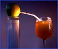
Transfusionby moodvilleComment: I think you've made the point too empatically with your lighting on the orange. I'm not crazy about the spot on the orange without much diffuse lighting to illuminate other parts of the photo. |
| Photographer found comment helpful. |
| 06/06/2003 05:44:32 PM |
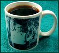
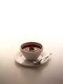
Coffee with Milkby STEINRComment: I like this simple composition and the mug and pitcher are interesting to look at as is the shaded background. I do however, wish your colors were more saturated and brighter. The liquid itself, which should be prominent is uninteresting and lackluster. |
| Photographer found comment helpful. |
| 06/06/2003 05:40:30 PM |
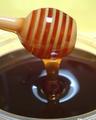
Honey, Smooth and Sweetby sunflowerComment: Lighting is too harsh and creates an overexposed upper half and underexposed lower half of the image. The specular highlight is distracting and needs to be diffused, IMO. |
| Photographer found comment helpful. |
| 06/06/2003 05:37:14 PM |
|
| Photographer found comment helpful. |
| 06/06/2003 05:35:48 PM |
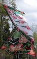
gently flowing(liquid)in the afternoon breezeby camelotnorthComment: I guess wind is technically and scientifically speaking considered a liquid, but I think it's a stretch in this challenge. I do find that your capture of the flag without any apparent blurring is good but also find the colors to be lacking in luster. |
| Photographer found comment helpful. |
| 06/06/2003 05:30:46 PM |
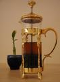
tea timeby apriceComment: Simple but classy shot. I like the tones of gold and tan but find the specular highlight in the gold to be distracting. |
| Photographer found comment helpful. |
| 06/06/2003 05:25:42 PM |
Liquid Tomato...aka..Tomato Soupby Girl from OZComment: Beautifully clear photo with good focus and I like the way the foreground fades into the background. I just wish there was more of an interesting background to look at as there is so much empty space in the top half of the image. In addition, I find the red of the tomato soup to be lacking pizzazz. Maybe a spot light on the soup alone would have brought that out some more or some increased saturation in an image editor. Well done. |
| Photographer found comment helpful. |
Home -
Challenges -
Community -
League -
Photos -
Cameras -
Lenses -
Learn -
Help -
Terms of Use -
Privacy -
Top ^
DPChallenge, and website content and design, Copyright © 2001-2025 Challenging Technologies, LLC.
All digital photo copyrights belong to the photographers and may not be used without permission.
Current Server Time: 08/07/2025 03:03:30 PM EDT.