| Image |
Comment |
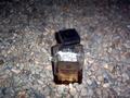
| 06/08/2003 05:47:45 AM |
Amaretto on the...by qachykComment: I don't like the composition or viewpoint of this shot and the specular hightlight on the top of the bottle is very distracting. I think it would have been more effective had the bottle been laying on it's side with maybe some seaweed around to suggest it had been washed up on shore. I also think a close up of the bottle would have been better so that you don't see all those rocks. You've also lost detail in the top of the bottle which is as distracting as the highlight below it. |
 Photographer found comment helpful. Photographer found comment helpful. |
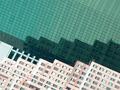
| 06/08/2003 05:33:59 AM |
Go with the Flowby marinajoeComment: Very nice abstact design, I like the picture alot but I think it's a stretch to say it satisfies the challenge. |
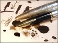
| 06/08/2003 05:31:54 AM |
Ink Blotby justineComment: Nice detail in the pen. I think this could have been more effective if the pen were lying next to, instead of on top of, the ink blots, which kind of blends in with the dark blue of the pen. |
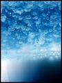
| 06/08/2003 05:18:51 AM |
Milk Bubbles in Oilby ElizaComment: I like the effect you've gotten here with the white milk on bottom and the blue bubbles on top. Also like the blue cast you've achieved but am not crazy about the way the milk is lit with it being bright on the left side and in dark shadow on the right. Maybe more diffuse lighting would have been better. |
| Photographer found comment helpful. |
| 06/08/2003 05:15:01 AM |
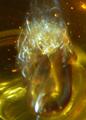
Refracted Honeyby shareinncComment: Nice abstract and I like the different yellow/gold tones here. Lots of noise but it doesn't detract from the shot. |
| 06/08/2003 05:11:57 AM |
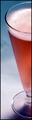
Less Fillingby rickhd13Comment: I like the back lighting here and the gradient background here. Composition is not all that interesting though. |
| 06/08/2003 05:10:22 AM |
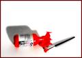
Paintby loz1Comment: The shadow really makes this shot for me along with the red color of the paint, and I like the way the brush, bottle and shadow are all laid out here in an interesting arrangement of composition. I just think the lighting is too bright and the shadows should be darker. You may have been able to accomplish both by moving the light further from the bottle. |
| Photographer found comment helpful. |
| 06/08/2003 04:58:24 AM |
|
| 06/08/2003 04:56:13 AM |
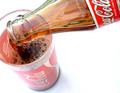
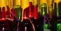
Sealing Liquidby snowleopard10101Comment: Very nice colors and I like the cropping of the composition so that you can't see the tops of the bottles which creates a semi-abstract. Lighting may be a bit too harsh but it works here and I do find the lone label in the bottom right to be a little too distracting. But fine capture overall. |
| Photographer found comment helpful. |
| 06/08/2003 04:51:56 AM |
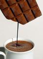
liquid chocolateby miss parkerComment: You've really captured the color of the chocolate well and I like your idea here, but just find it not to be very convincing. |
Home -
Challenges -
Community -
League -
Photos -
Cameras -
Lenses -
Learn -
Help -
Terms of Use -
Privacy -
Top ^
DPChallenge, and website content and design, Copyright © 2001-2025 Challenging Technologies, LLC.
All digital photo copyrights belong to the photographers and may not be used without permission.
Current Server Time: 08/07/2025 05:40:05 PM EDT.