| Image |
Comment |
| 07/12/2003 11:54:14 PM |
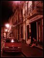
Sidewalk readingby jjbeguinComment: Absolutely gorgeous, rich, and smooth red tones. Just wish the cars weren't there, and find the reflection in the windshield to be very distracting. Also, would have liked the building on the far left to have been cropped out. |
 Photographer found comment helpful. Photographer found comment helpful. |
| 07/12/2003 11:48:45 PM |
|
| Photographer found comment helpful. |
| 07/12/2003 11:38:58 PM |
Open all nightby joannadivaComment: Your subject does not look like he's enjoying having his picture taken, but you look to be having a grand time, in three different places in the photo! In addition, the right side of the picture is muddled with the outside reflection of cars. I at least hope the food was good at this dinner :) |
| Photographer found comment helpful. |
| 07/12/2003 11:33:19 PM |
|
| Photographer found comment helpful. |
| 07/12/2003 11:30:57 PM |
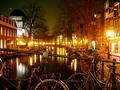
Amsterdam by nightby pedroviegasComment: I find the railing and bikes leaning against it to be distracting and obscure the whole bottom half of the image, which greatly detracts from my view of this beautiful town and canal. I don't find the bikes or railing add anything to the picture. In addition, I find the lights a bit too bright. |
| 07/12/2003 11:22:09 PM |
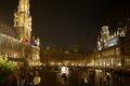
Brussel's "Grand Place" 2 AM Mondayby rhipsterComment: Wonderful festive mood here. You've exposed really well and I like the wide angle composition giving a nice broad view. The only improvement I would have made would be to level out the image...it appears to be slanting right. Very well done, anyway. |
| Photographer found comment helpful. |
| 07/12/2003 11:18:24 PM |
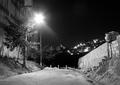
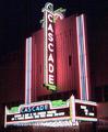
Old Cascade Theater, Renovatedby sunflowerComment: I would sure like to see the entrance way and ticket booths to this theater. Also, focus could be better and I think had you exposed less it would have been in better focus so that you could read the lettering. |
| 07/12/2003 11:11:04 PM |
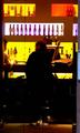
Lime Barby PaulkComment: I think this photo has a lot of potential, but it's execution wasn't carried out well. Compositionally, I think the picture would be more effective with the bottom third cropped out so that you don't see the stools or the men below their waistes.
As it stands now, the man in the middle of the photo presents mostly as a black blob and merges with the dark areas below. Alot of that would have been ellimated had you cropped out the bottom part of the picture.
Also, it's too bad the man on the right has what appears to be the beer tap coming out of his head. In addition, I find it very distracting that the man on the left has been cut in half and mostly croppped out...You should have included him in his entirety, especially with the man on the right looking his way. Had you been able to change your viewpoint to the left some more, or even to the right, so that you could have included both patrons in their entirety, as well as, the bartender positioned between them. that would be much more interesting to look at.
I don't mean to pick your picture apart, but just provide constructive criticism. |
| Photographer found comment helpful. |
| 07/12/2003 10:47:00 PM |
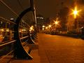
Bayshore Promenade by roleychiuComment: Wonderful perspective to this picture and focus and exposure are excellent. The yellow/golden tones are just sooooo rich and smooth. Compositionally, I find it very interesting to look at and I like the slightly off center division of the picture into left and right halves. The only thing I can think of that it may lack is some people presence...maybe strolling or sitting on the benches. Very well done! |
| Photographer found comment helpful. |
| 07/07/2003 11:19:36 AM |
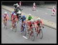
Dutch championship cycle-racing femaleby jajoneComment: Color and clarity are really good, but I don't get the feeling of speed here as it's more implied. I think had you used the panning technique with a slower shutter speed the background would have been more blurred and would have conveyed speed better. You can even see the spokes in the wheels suggesting to me they were going fairly slow at the time you exposed the shot. |
| Photographer found comment helpful. |
Home -
Challenges -
Community -
League -
Photos -
Cameras -
Lenses -
Learn -
Help -
Terms of Use -
Privacy -
Top ^
DPChallenge, and website content and design, Copyright © 2001-2025 Challenging Technologies, LLC.
All digital photo copyrights belong to the photographers and may not be used without permission.
Current Server Time: 08/08/2025 06:21:22 AM EDT.