| Image |
Comment |
| 07/27/2003 11:25:36 PM |
Financial Trendsby caroleeComment: Great idea that I think could have been carried out better. For instance, I think the dollars should have been placed so that they go down, and not up. Also, would have liked to have seen a more appropriate background to add additional clues that what we're looking at is a graph and to add visual interest. Maybe graph paper? |
 Photographer found comment helpful. Photographer found comment helpful. |
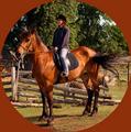
| 07/21/2003 01:59:16 PM |
Canada's Horseby MorganComment: I really don't find that this photo meets the challenge theme despite you putting it in a round border, and that's too bad cause this image is just wonderful. I love the colors and the DOF is very good. |
| Photographer found comment helpful. |
| 07/21/2003 01:54:59 PM |
Be gentle -- first subby sn4psh07Comment: I"m going to be very blunt about this photo...It's just plain good! Very good, as a matter of fact. Your focus is right on and I like the duotones as well. Could use a little more contrast, but still a good shot nonetheless. I also really like the contrasting curves and lines and the viewpoint you have taken is very interesting. You can' t really tell if you are looking down or up at the subject. Very good abstract...keep up the good work! |
| Photographer found comment helpful. |
| 07/21/2003 01:45:24 PM |
found meby augustusComment: Two round heads...very good interpretation of the challenge theme. Your focus is right on and I love the DOF so that both fore, and backrounds are blurred. You really isolated your subject. Also, you've really captured an excellent expression on this kid's face. Very well done. |
| 07/21/2003 01:42:11 PM |
18 inch rimsby shutterflyComment: I like the viewpoint of this photo and the way you've fit in both wheels into the frame. However, I find that underexposure of the car has obscured detail...there is just too much negative space. I think had you exposed properly, your choice of B&W would be perfect. Unrealized potential. |
| Photographer found comment helpful. |
| 07/21/2003 01:37:24 PM |
Ready to Rollby barahooComment: Although this meets challenge theme, lack of visual interest and/or artisitic value will limit it's score. In addition, I find the exposure to be off as it appears the subject to be underexposed and the background to be overexposed. |
| 07/21/2003 01:26:13 PM |
round diceby KAOSComment: I like the composition very much and the contrasting geometric shapes and colors. I wish, however, that you had uses softer lighting as the shadows that are cast confuse the foreground. Also, I don't think it necessary to use such a narrow DOF as I'd like to see all the squares in focus. |
| Photographer found comment helpful. |
| 07/21/2003 12:55:35 PM |
Well Used...by smellyfish1002Comment: You've taken a very simple subject and made it into a work of art! Though I think the image could use some thing more of interest in it, such as a baseball glove or cap, I like the close up and detail you've been able to capture and also like the DOF and the color of the background goes very well with the ball. Nice job. |
| 07/21/2003 12:38:51 PM |
Going for all the marblesby snsComment: I like this image and the colors of the marbles. I just wish the DOF was more deep so that all the marbles would be in focus and also find the bag/cloth on the left hand side serves no purpose in the image and distracts. The colored marbles contrasts nicely with the texture and grey color of the sand. |
| 07/21/2003 12:35:11 PM |
Round Midnightby pupparazzoComment: I like the composition very much and think it's a great idea for this challenge. Technically, I find the focus a bit too soft and wish you had been able to bring out the luster and shine out a bit more in the silver and gold pieces. Maybe a good cleaner would have done it. In addition, I wish the background detail and lighting would have been better. I would like to see some more of it's color. It appears to be a dark blue, but I can't tell for certain. |
| Photographer found comment helpful. |
Home -
Challenges -
Community -
League -
Photos -
Cameras -
Lenses -
Learn -
Help -
Terms of Use -
Privacy -
Top ^
DPChallenge, and website content and design, Copyright © 2001-2025 Challenging Technologies, LLC.
All digital photo copyrights belong to the photographers and may not be used without permission.
Current Server Time: 08/08/2025 09:17:55 AM EDT.