| Image |
Comment |
| 01/19/2004 01:18:22 PM |
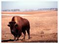
Home on the Rangeby ShannonComment: Hi S :) Another great shot of Nebraska and these beautiful Bison! I love these creatures, especially thieir colors.
Your horizon is a bit slanted and I don't like the way you've positioned the animal in the frame. First, his/her head gets lost in the rest of it's body and it's dark there, so it's even harder to see detail there. Secondly, I would prefer to see it facing in towards the center of the frame, rather than out, as you have it.
Glad you decided not to use a narrow DOF as I like to see the environment the animal is in. Also, something seems strange with the exposure, as the bison is too dark and in places, and exposed right in others, and your background is washed out looking. Plus, there seems to be a glare coming from center top.
Anyway, I like the shot alot and wish you luck. 7 |
 Photographer found comment helpful. Photographer found comment helpful. |
| 01/19/2004 10:49:27 AM |
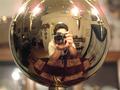
Escher's Point of Viewby linoserranoComment: This is a neat idea which I like very much, but I think it could have been carried out better if you had been able to hide the camera behind a curtain in the kitchen and zoom into this reflective ball. |
| Photographer found comment helpful. |
| 01/19/2004 09:46:50 AM |
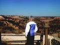
Momby Frank BeckmanComment: Nice scene, but your mom is too centered within the frame. Plus, her head gets lost in the horizon line. If you had been able to crouch down a little to isolate her head in the sky and yet show the beautiful landscape that, to me, would have made a picture with more impact. |
| Photographer found comment helpful. |
| 01/18/2004 02:29:10 PM |
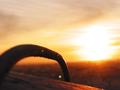
Looking Across the Bridgeby AlbertmdhComment: Really neat concept, except that anyone not familiar with guitars will not recognize that the bridge you are referring to in the titel resides on the guitar. They are out of focus but your focus is on the speaker. Other issues with this image are the stray strings coming off the guitar pegs and the table in the background. Great idea, that needs some work. |
| Photographer found comment helpful. |
| 01/18/2004 02:15:31 PM |
Electric Elementby YugiohComment: I like this very much as a photograph of modern art, and I guess it relates to the challenge theme as having been made into something else other than the function it was meant for, which would be a POV of the photographer. |
| 01/18/2004 02:12:29 PM |
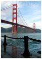
Sea Levelby ChrisW123Comment: Love the composition ! Great colors and the contrast between the bridge and fence really do it for me. Nicely done. |
| Photographer found comment helpful. |
| 01/18/2004 02:04:16 PM |
Sky Highby AntithesisComment: This certainly is abstract. Looks like you shot through some thin clouds that obscure the scape below. Is that a skywriter I see on the left? Color is interesting. |
| 01/18/2004 02:01:02 PM |
pipeby takethatComment: Not sure what to look at here. There doesn't seem to be anything to focus on. I have no idea what that is in the forground, and the background is equally an enigma to me. The highlight is way too blown out and nothing is really intelliglble. |
| 01/18/2004 01:56:57 PM |
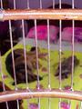
… and I have to rough it on this mo-o-o-o-ost uncomfortable perch!by basia03Comment: hahaha...great concept! I love the idea. Very original...a bird's eye view. It does appear to have been heavily post processed. I don't like the colors at all and find the lighting to be too harsh. Also, I would have preferred the focus to be on the sleeping dogs rather than on the bird cage bars. |
| Photographer found comment helpful. |
| 01/18/2004 09:14:00 AM |
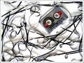
rewind...by AesculapiusComment: Composition is very appealing but lighting is too harsh, or maybe not harsh enough. The shadows lack in solidity and weaken the image. Not sure I get the connection to the challenge theme. |
| Photographer found comment helpful. |
Home -
Challenges -
Community -
League -
Photos -
Cameras -
Lenses -
Learn -
Help -
Terms of Use -
Privacy -
Top ^
DPChallenge, and website content and design, Copyright © 2001-2025 Challenging Technologies, LLC.
All digital photo copyrights belong to the photographers and may not be used without permission.
Current Server Time: 08/12/2025 02:46:38 AM EDT.