| Image |
Comment |
| 06/04/2008 01:04:15 PM |
He Needs Herby starrliteComment: The crooked door frame in the background distracts, as does the bright window corner. The contrast is not quite right for a monochrome presentation. It looks like you simply removed the color. There is a good emotional feel to it, but the lack of good framing, hidden faces, and poor contrast hurt the overall effect of the image. |
 Photographer found comment helpful. Photographer found comment helpful. |
| 06/04/2008 01:01:17 PM |
Hand in Handby timfythetooComment: Wonderful lines! I love the soft background with the crisp, sharp subjects! Beautifully done! |
| Photographer found comment helpful. |
| 06/04/2008 01:00:34 PM |
|
| Photographer found comment helpful. |
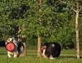
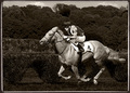
| 06/04/2008 12:59:33 PM |
Winning Teamby bubeltrubelComment: Wonderful definition in the horses muscles, but I think it is over-sharpened a bit. The horse and rider look almost like they were dropped in. I'm not sure what the reason for doing this as monochrome is either. The greenery in the background would be very nice. |
| Photographer found comment helpful. |
| 06/04/2008 12:57:46 PM |
All This Beauty and You Picked Meby lobomomComment: The bee is a bit soft. It looks like the focal point is on the green behind the flower and not the bee. The lighting at the top of the frame is to bright. The placement of the bee in the frame is too close to the edge. |
| 11/14/2007 11:14:42 AM |
|
| 11/14/2007 11:14:04 AM |
Province Gazeboby stillhere21Comment: This looks like a long DOF shot. There is no obvious bokeh. Also, the top right is entirely too blown-out, the gazebo and horizon are not straight, and the gazebo is cut-off on the right site. 1 |
| 11/14/2007 11:11:13 AM |
Street rallyby LawrenzComment: With only the foreground bystander out of focus and long DOF for the rest of the shot this doesn't look like intentional foreground bokeh for an effect but more like the photographer should have moved over two steps to the left. |
| Photographer found comment helpful. |
| 11/14/2007 10:57:59 AM |
|
| Photographer found comment helpful. |
| 11/14/2007 10:57:20 AM |
November Windsby lkn4truthComment: With the long DOF for the rest of the picture the blurry leaves just look like mistakes or distractions intead of "Foreground" bokeh. This would be really nice without the leaves though! 5. |
| Photographer found comment helpful. |
Home -
Challenges -
Community -
League -
Photos -
Cameras -
Lenses -
Learn -
Help -
Terms of Use -
Privacy -
Top ^
DPChallenge, and website content and design, Copyright © 2001-2025 Challenging Technologies, LLC.
All digital photo copyrights belong to the photographers and may not be used without permission.
Current Server Time: 08/24/2025 05:01:57 PM EDT.