| Image |
Comment |
| 06/04/2008 01:36:57 PM |
|
| 06/04/2008 01:36:02 PM |
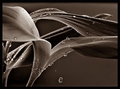
New Parentsby kris9899Comment: The contrast and sharpness could use work. All three look a bit washed out. It looks like a "remove color" without tweaking the contrast to make an effective B&W portrait. Pretty good composition, thought it would be nice to have more of the top of the woman's hairline and the whole baby. |
 Photographer found comment helpful. Photographer found comment helpful. |
| 06/04/2008 01:33:26 PM |
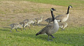
Wild friendsby MaggyeComment: A little soft around the eye on the back one. the composition is uninspiring. The fetheres are a bit blown-out. |
| Photographer found comment helpful. |
| 06/04/2008 01:32:35 PM |
|
| Photographer found comment helpful. |
| 06/04/2008 01:32:16 PM |
Vocals Don't Cut It Aloneby Matten25Comment: The lighting is way to harsh. The high-key look is a bit overdone. The shadows on the faces distract and the noses and hands are completely washed out. The little dot on the top right is distracting. The singer's arm and hair being cut off doesn't help either. |
| 06/04/2008 01:30:01 PM |
|
| Photographer found comment helpful. |
| 06/04/2008 01:29:27 PM |
|
| Photographer found comment helpful. |
| 06/04/2008 01:28:29 PM |
Team Work In Beautyby shaecoonComment: The selective color on the eyes looks almost creepy here and there is a bit of bluishness to the lower eyelids on the girl on the left. The faces are washed out. Some levels/curves adjustment would help. I think it would be better in color or all sepia. |
| 06/04/2008 01:25:15 PM |
Partners for lifeby jockdocComment: Poor contrast and focus. Some levels adjustment and sharpening could make this pop more. The composition is uninspiring as well. |
| Photographer found comment helpful. |
| 06/04/2008 01:22:41 PM |
|
| Photographer found comment helpful. |
Home -
Challenges -
Community -
League -
Photos -
Cameras -
Lenses -
Learn -
Help -
Terms of Use -
Privacy -
Top ^
DPChallenge, and website content and design, Copyright © 2001-2025 Challenging Technologies, LLC.
All digital photo copyrights belong to the photographers and may not be used without permission.
Current Server Time: 08/22/2025 09:29:10 AM EDT.