| Image |
Comment |
| 04/28/2006 05:02:02 PM |
|
 Photographer found comment helpful. Photographer found comment helpful. |
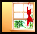
| 04/28/2006 04:58:36 PM |
Air Dryby JutildaComment: I shouldn't, but I really like this one. I especially like that way you have a sharpened red bra and soft focused the rest of the image. There is even some barrel distortion making the window itself "non-level" which should seriously hurt this image in voting. I don't care. I like it! It says more about us as humans than it does about anything actually contained in the composition. That fascinates. |
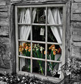
| 04/28/2006 04:56:16 PM |
The Flower Shoppeby ElaineComment: Well done for a selective desaturation image. You've done well with your presentation. |
| Photographer found comment helpful. |
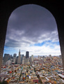
| 04/28/2006 04:55:21 PM |
San Franciscoby bryanbrazilComment: Great composition and use of the arch fro framing. Excellent coor in buildings and interesting perspective. The overly smoothed area on the building tops and sky and the slight haloing along the arch are a little distracting. |
| Photographer found comment helpful. |
| 04/28/2006 04:51:12 PM |
|
| Photographer found comment helpful. |
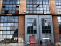
| 04/28/2006 04:48:43 PM |
Windowed historyby PainielComment: Good lighting and color. Decent composition. Looks to have a touch too much noise reduction applied to the image that makes it look a little artificial. Of course, that could be intentional. Overall, a nicely done image. |
| Photographer found comment helpful. |
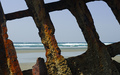
| 04/28/2006 04:43:54 PM |
Room with a Viewby talmyComment: I'd recognize the the wreck of the Peter Iredale no matter how closely you crop! :) |
| Photographer found comment helpful. |
| 04/28/2006 04:43:01 PM |
|
| Photographer found comment helpful. |
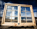
| 04/28/2006 04:40:42 PM |
Windowsby ZenjohnComment: Decent picture, excellant sharpness and you handled leveling with lense distortion as good as it could be done. You may have got just a bit sloppy with the blue gradient over the top windows. The center one looks like you overlayed the top of the window frame. The left one looks a little crooked at the top. The black overlay on the bottom windows look artificial. I would have tried to do something to bring out the detail in the blown out areas of the building on the upper left of the frame. |
| Photographer found comment helpful. |
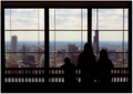
| 04/28/2006 04:39:24 PM |
Enjoy the Viewby flip89Comment: Like the concept of this image a lot. Good silhouette creates a thoughtful, reflective mood. The background might be a little too soft focused. It has an artificiality to it that almost distracts from the composition. You might try working on the sky a bit with dodge and burn to tone down the brightness of the sky some and make the clouds more dramatic. |
Home -
Challenges -
Community -
League -
Photos -
Cameras -
Lenses -
Learn -
Help -
Terms of Use -
Privacy -
Top ^
DPChallenge, and website content and design, Copyright © 2001-2025 Challenging Technologies, LLC.
All digital photo copyrights belong to the photographers and may not be used without permission.
Current Server Time: 08/12/2025 10:02:04 AM EDT.