| Image |
Comment |
| 03/14/2007 02:10:35 PM |
Artanis Arcamenelby ShauryaComment: Originally posted by Shaurya:

Thanx |
Positives:
Nice solid black background. (There is a vocal subgroup of DPC voters who may call this a fault and will vote this down because of it, but ignore that). The choice of minimalism is nice.
Technicals:
As a minimalist composition it is critical that the technicals have no faults. Unfortunately this image is slightly oversharpened and suffers from digital "jaggies" in all the arched, narrow parts.
The challenge:
This choice of imagery and minimalism can do very well at DPC and DPC for this particular challenge but it has to be perfect techically. The technicals held it back more than anything else. "Jaggies" is a serious technical flaw, even in a non-technical challenge but despite that it scored above average. In thumbnail this image is not at all impressive and that probably affected some voters.
Low-key imagery, perhaps, works best with a lot of tonality that yours lacks and that could have affected it in voting. Your choice using strong highlighting is not wrong, it can and does work well, but the technicals held it back.
Suggestions:
By far, correcting the "jaggies" would be the single most important improvement that would get this a higher score. Unfortunately, since this is a basic challenge you would have to do that at the cost of softer focus on the rest of the image and that might not work either. It might be this image composition was not the best for this particular challenge. |
 Photographer found comment helpful. Photographer found comment helpful. |
| 03/14/2007 01:44:45 PM |
Frozen Fish (Icicle!)by NeilComment: Originally posted by nshapiro:
 |
Positives:
Great choice of blue tones. General overall technical quality is good. Tonality is nice.
Technicals:
The image contains a few white specks that should be cloned out. Unsure but think that would be allowed in basic editing now. It is slightly oversharpened, but not much. The interior of the 'porpoise' has some oversharpened spots. Lighting is OK.
The challenge:
Meets the challenge. That is no problem. Your assumption that voters would see the 'porpoise' and vote it higher as a result is probably in error and explains why it scored lower than you thought.
Suggestions:
Clone out the white specks. The brightest areas of the interior of the 'porpoise' should be toned down. Unsure if this is possible in basic but reducing overall sharpness would help with this. Overall composition is not bad, but you might want to experiment with other framing to see if it 'looks better'. |
| Photographer found comment helpful. |
| 03/14/2007 01:26:10 PM |
Softby darnokComment: Originally posted by Raziel:
 |
Positives:
Reds work very well against the black. Tones are generally very, very good. The effect of this image is absolutely dependent on attention to detail and it is obvious you did that.
Technicals:
Technicals are generally good, though not spectacular. There is a question in my mind, and perhaps the mind of voters, as to whether it should be sharper or not. I can't figure it out myself.
This image has a lot of dark space and I'm sure this is by design, but is it good? Again, I don't really know for sure.
One thing I am sure of is that that the technicals are not bad in any way shape or form.
The challenge:
Red floral images composed like this are cliche at DPC and that affected voting on this one. I remember a very fine image by jmsetzler that easily outperformed my own submission in the soft focus challenge:

In order to pull off this type of image you must include something special about it to set it apart from the others. Your choice of a low detail imagery might not have worked as well as another choice might have with voters. There were a number of images like yours in this challenge.
To be honest, by average DPC scoring standards I am a bit surprised it scored as high as it did.
Suggestions:
Perhaps the detail, or lack thereof, in this image ultimately hurt it in voting. Either increase the exposure time or increase the f/stop to include more detail would garner a higher score (Or do it in post.). Study jmsetzler's "Pianissimo" image. It is an excellent example of this particular type imagery. That will teach you far, far more than any critique of mine. |
| Photographer found comment helpful. |
| 03/14/2007 12:26:37 PM |
Unmadeby quiet_observationComment: Originally posted by quiet_observation:
 |
Positives:
Tonality is the strength of this composition. Duotone light blue works well. It is obvious that you took care deciding how to compose the image and deciding to include the ribbon. You really did a great job with the use of natural and/or natural looking lighting. Nicely done. It is a good try.
Technicals:
Again, tonality and lighting are what makes this a good image. The main technical fault is digital "jaggies" on the edges of the ribbon in various places. That always acts as a distraction. Composition, though not really bad at all, is not strong. Perspective is kinda 'average'. ;)
The challenge:
DPC voters want to be hit over the head with dazzling technicals, a strong unmistakable connection to the challenge topic and/or strong message. Your image fails in that because voters cannot figure out why you included the ribbon. Though it is obviously a bed, voters are not strongly associating your image to the challenge topic.
Suggestions:
There are a couple things you might consider for a better score with this image. Try a different perspective. Add another element to the composition to better explain the inclusion of the ribbon. And, of course, redo sharpness to eliminate the digital "jaggies". |
| Photographer found comment helpful. |
| 03/14/2007 12:01:52 PM |
Cosmotiniby pamelasueComment: Originally posted by pamelasue:
 |
Positives:
Simple and to the point. Center framing works with this image and theaddition of the color with the lime is a nice touch.
Technicals:
Lack of digital artifacts is a strength. The background is not solid white but the amount of detail it does have works. Exposure is average with a slight bit of edge loss on the lower stem and base. Though not a hard and fast rule you almost always want to have a discernible edge all the way around your main subject.
Though it has no digital artifacts the image comes across as slightly soft focused which affected its score. There is a curved band-like reflection in the red liquid that confuses the viewer since they want to know what it is but cannot figure it out. It acts as a distraction.
In an image like this being level is critical. It needs to be rotated clockwise slightly.
The challenge:
This type image has become cliche at DPC and you certainly suffered scorewise from that. Not to say you should not submit this type of image, but when you do you have to be 100% certain that it has absolutely no technical defects whatsoever. It has to be PERFECT! |
| Photographer found comment helpful. |
| 03/14/2007 11:47:59 AM |
Banditby zaflaboutComment: Originally posted by zaflabout:
 |
Positives:
Model capture and intense flesh tones suit this image well. Has a nice middle eastern feel to it. Flesh tones have an intense strength to it. Well done with the eyes and upper facial expression which gives the viewer reason to care to know more about your subject.
Technicals:
In this image the eyes are most important and you nailed that capture very well. Focus, color and exposure are generally OK but not exceptional.
This will sound like nit picking but there are some small technical faults that collectively affect the score. There is white haloing around red wrap's edge. The image is just a smidge oversharpened as shown as in the model's hair and a slightly overly mottled look to the skin. There wrap below and to the left of the model's face is out-of-focus. The DOF of this image is high enough to warrent having the whole image sharp. Lighting from the left is great but the depth of shadow on the right side detracts from your overall effect. You might consider another light from the upper or lower right to brighten the right side slightly.
The Challenge:
Ironically, gender may have played a role in your score. Females done in this style do better. This well-known DPC kiwiness image sets the standard for this particular image style:

You will want to study and cross compare this image to your own. You'll see all the things that make it better than yours. You will want to note what those are and emulate them. It is possible that a collective memory of this image negatively affected your score. |
| Photographer found comment helpful. |
| 03/12/2007 08:01:16 PM |
Time Lapsingby karmatComment: Very clever idea... I'll remember this one and copy it for use in another challenge sometime. |
| Photographer found comment helpful. |
| 03/12/2007 07:50:44 PM |
Enduring the Test of timeby albc28Comment: Looks like it isn't 'enduring' all that well in this case. LOL!!! Very nice the way you vignetted the edges to direct more attention to the flag. |
| Photographer found comment helpful. |
| 03/12/2007 07:48:39 PM |
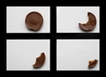
Times of solitudeby wisieComment: Like this idea and it is very creative but it takes a few moments to figure out just what it is. Perhaps starting closer to the camera on the first shot to show more of your subject and/or cropping out more of the black negative space would make this an even better image. |
| Photographer found comment helpful. |
| 03/12/2007 06:12:43 PM |
|
Home -
Challenges -
Community -
League -
Photos -
Cameras -
Lenses -
Learn -
Help -
Terms of Use -
Privacy -
Top ^
DPChallenge, and website content and design, Copyright © 2001-2025 Challenging Technologies, LLC.
All digital photo copyrights belong to the photographers and may not be used without permission.
Current Server Time: 08/05/2025 02:55:05 PM EDT.