| Image |
Comment |
| 03/24/2007 02:06:16 PM |
|
 Photographer found comment helpful. Photographer found comment helpful. |
| 03/23/2007 01:32:26 PM |
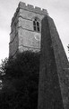
Obelisk at St Peter and St Paul Church Cosgrove Englandby jonfrommkComment: Positives:
Good perspective and choice of subject. Well done BW appropriate for the challenge topic.
Technicals:
Overall tone processing in this BW is done well. Good from 'black' blacks to 'white' whites. :) The blacks on the bottom and whites on the top are not well balanced across the image. Not always needed but probably should be in this particular choice. The bit of tree on the far right is a minor distraction.
The challenge:
No real problem in this area, it meets the challenge. It is the degree of meeting that may come into question and have a slight effect on how this image was voted. Grain-wise, yours is VERY similar to my barn image above that I did not submit partly because I did not like how the grain looked 'better' in the sky than it did over the rest of the image. I think I know how to 'fix' that now. :)
Suggestions:
If you were to take this picture further to the left where you would separate the church from the obelisk then you could cure the imbalance of dark on the bottom and light on the top by spreading it out more AND correct the distracting branches on the far right by either including more tree or blocking the tree with the obelisk.
This is not a bad image, it just has a couple minor issues, none of which are really awful. This is probably underrated even by DPC standards. That is probably because viewers were not given a big reason to love it.
For different but kinda similar reasons I think from your image I know the score my barn picture would have got in the grain challenge since ours share so many similarities. Thanks, saved me the irritation of a 5.2. ;) |
| Photographer found comment helpful. |
| 03/22/2007 03:38:25 PM |
|
| Photographer found comment helpful. |
| 03/22/2007 01:15:09 PM |
Wanna Party?by jcapps25Comment: Actually appropriate for the challenge... you did not overdo the sex aspect though made it obvious. Composition and color support your concept. That is always a good thing in photography. Looks like noise reduction was overdone and this will likely hold down its score in voting. |
| 03/22/2007 12:28:56 PM |
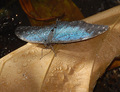
"Morpho Peleides" Birthday Wish!by DrakeComment: This image makes me sad. It has such incredible potential that was not realized because of technical flaws. Most everything in the BG is good but the main subject is oversharpened, improperly focused and poorly color processed. It was ruined as a result.
Since this is advanced rules here is something you can do to improve it. It will not correct the overall focus but will help. Duplicate a flattened image before you sharpen, then sharpen the duplicate layer exactly the way you have here. Then add a layer mask to the sharpened layer and paint with a feathered black brush until you back off the oversharpening of the butterfly(moth?) enough to be acceptable. |
| Photographer found comment helpful. |
| 03/22/2007 11:50:38 AM |
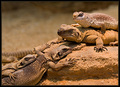
Group Sexby MelethiaComment: Some might qiestion whether or not this is an appropriate gift, but this is a great lizard capture. I like lizard photography a lot. In the Superstition Mountains of southern Arizona USA I had to chase this common collar lizard around for about an hour to capture my favorite of all lizard pictures I took myself...

I'm guessing yours is in captivity, but if in the wild it would be an amazing capture! I've never been able to get more than one lizard in my field of view. |
| Photographer found comment helpful. |
| 03/21/2007 04:27:46 PM |
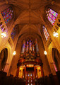
Chapel's Lightby jdannelsComment: Great perspective and framing of your cathedral picture. A bit oversharpened on the stained glass windows and pipe organ but generally a very nicely captured image. |
| Photographer found comment helpful. |
| 03/21/2007 04:23:21 PM |
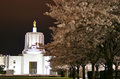
Streetlights, building lights, cars....by zymaraComment: Wow... I did not realize the cherry blossoms are in full bloom at the Capitol! I was there recently taking pictures but there were no blossoms yet. I'm in the Salem area and if you are local and are interested in going on a spring photo safari around here PM me and lets see what we can organize. I particularly want to photograph the Capitol dome inside which I have been meaning to do for some time. Silver Creek and/or other outdoor photography is always nice. |
| 03/19/2007 06:19:03 PM |
Purple, too...by C_Steve_GComment: Positives:
Generally good composition and an OK, if not spectacular, still life image.
Technicals:
Use of the rule of thirds is very good but, in general, the images falls down in technicals. There is lack of detail in the purple flowers, it has a number of overexposed areas on the ribbons and the BG color changes and tonal shifts are weak. A good still life image requires perfect technicals. Strong tones are a must. You want tones to be very smooth and yours are not. For still life images you want to strive to have unique light that highlights some special aspect of the subject.
The challenge:
This image meets the challenge but generally does not offer the viewer much more reason to look at it. Still life images typically do not do well at DPC and your score reflects that both for content and technical reasons.
Suggestions:
Contrary to popular belief, still life images are very difficult because they require perfect technicals to have impact. They are studies in lighting and shadows and you must pay particular attention to lighting and tones issues to get a good result.
I would try another still life keeping in mind lighting and shadows to set it apart from the ordinary, then strive to post process the best it can possibly be to highlight those things.
Some cameras are better suited to some types of imagery over others. Your Coolpix 950 is pretty old technology and that makes still life images more difficult for you. |
| Photographer found comment helpful. |
| 03/19/2007 03:49:27 PM |
Till I'm red in the faceby mambaComment: Positives:
Overal framing is fine. Pose is a good capture.
Technicals:
I can tell you why the teeth are yellow. It's white balance issues that commonly occur in low light level images like this one. DPC is chucked full of images not corrected for color casts and most of those are low light situations. Low light level images have a tendency to have a yellow and/or red color cast. People that argue against post processing and suggest that what the camera captures is the way it 'really is' are... welllll... wrong. ;)
Looks like there is a red color cast in the "black" portions of the image where there shouldn't be. I suspect that is because you, like most people, used PP to increase the amoung to red in their image to better meet the challenge. You should not have done that and it hurt this composition.
In a somewhat minimalist image like this the technicals have to be rock solid perfect. The focus is soft and it has a redish yellow color cast. Both are killers.
The challenge:
I'm not familiar with the video for "Liar" but will take your word for its connection. I suspect few voters will see that connection either and will vote accordingly. This image looks like it was post processed to make it 'redder' and most voters probably saw that and voted lower.
Suggestions:
In the conversion from RAW you can correct the color temperature that will reduce the yellow and/or red color cast you image may have out of camera. In Photoshop's ACR (Adobe Camera Raw) it is the first adjustment on the conversion application's dialog box.
Try to sharpen it more without oversharpening. |
| Photographer found comment helpful. |
Home -
Challenges -
Community -
League -
Photos -
Cameras -
Lenses -
Learn -
Help -
Terms of Use -
Privacy -
Top ^
DPChallenge, and website content and design, Copyright © 2001-2025 Challenging Technologies, LLC.
All digital photo copyrights belong to the photographers and may not be used without permission.
Current Server Time: 08/05/2025 06:20:37 AM EDT.