| Image |
Comment |
| 06/17/2005 05:49:02 PM |
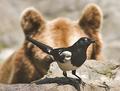
It's a Threatby docpjvComment: Interesting and refreashing twist on the challenge theme. Good use of depth of field to enhance the effect of danger. The bear looms ominous in the background and the bird seems oblivious to it.
There are a couple technical flaws that will hold the score down a little. The image is low contrast and looks washed out. The bird should appear jet black on the dark feathers and bleached white of the light ones. The biird itself and the rock it is standing on is oversharpened. There is a halo around the bird that should be cloned away and the rock has a grainy unnatural appearance. |
 Photographer found comment helpful. Photographer found comment helpful. |
| 06/17/2005 05:43:17 PM |
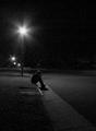
Alone...by cardmaverickComment: I suspect you included a large amount of space to emphasize the isolation of your subject, but this image might be improved by copping much of the bottom nd right side of the image from the composition. They add little that the lights and darkness don't already provide.
Reminds me of a sepia I entered in a challenge a long time ago where I purposely added grain for effect.:
//www.dpchallenge.com/image.php?IMAGE_ID=13029
Hope your does better. :) |
| Photographer found comment helpful. |
| 06/17/2005 05:36:46 PM |
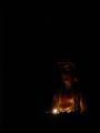
Be A Light Unto Yourselfby tpocComment: Another decent twise on the all black background with a small lighted object in the frame. This is an excellent way to convey a sense of darkness and a lot of photographers rightly chose to use the technique.
Focus seems overly soft and you might have considered blocking the light source from the composition. It is a good use of the rule of thirds. |
| Photographer found comment helpful. |
| 06/17/2005 05:33:49 PM |
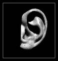
Visionby ace flymanComment: Interesting title for an image of an ear. Many viewers willhave trouble relating this to the challenge topic but they will see the white specks on the black background around it and likely see those as distractions from the image. They should be removed.
Generally speaking the contrast and tonal range on this image is very good, but the couple small spots on the ear are overexposed. The strait line on the left side of the ear leaves open the question why the photographer chose to trim it that way. In any regard the image should be rotated counterclockwise to make it perfectly horizonatal. |
| Photographer found comment helpful. |
| 06/17/2005 05:28:20 PM |
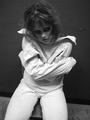
Insanity... Darkness Withinby tmorninglory96Comment: You are to be commended for setting up and photographing it in such a way as to make it very believable. We see images all the time that do not come close with difficult subjects like this.
It is debatable whether or not the indentation in the wall to the right helps or hurts the composition. But the way it draws the eye from the main subject probably means it is a distraction that should be removed.
The angle, expression and flyaway hair all contribute positively to this composition. Hope that is not someone's girlfriend. :) Message edited by author 2005-07-02 17:55:20. |
| Photographer found comment helpful. |
| 06/17/2005 05:23:25 PM |
Sith Lordby stupidcatComment: Very nice black tones. Good use of the rule of thirds and a good quality technical accomplishment. Some voters will find this trite but it is done quite well. Kudos. |
| Photographer found comment helpful. |
| 06/17/2005 05:21:39 PM |
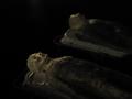
Autopsy Bayby alsatiaComment: Imagesof models and toys traditionally do not score very well in challenges and this image will suffer some scoring backlash for that since these type images have been seen so many times before.
On the technical side the background is not solidly black with is distracting to the viewer who will wonder just what is back there. The DOF is good but the general focus is a little on the soft side for its overall contrast. |
| 06/17/2005 05:19:02 PM |
OH NO ! My camera's broken :(by 3DsArcherComment: This is a lot prettier than a lot of images in this challenge taken with perfectly well functioning cameras. That probably has a sad meaning. :)
This image has an unexplainable attraction. It comes probably from the blue color (blue prominent images frequently score high at DPC) the exceptional clarity of the image and the fact that the lines are perfectly horizontal.
This may score unexpectedly high. There will be a lot of folks with fully functional cameras score lower than this, better than half. |
| Photographer found comment helpful. |
| 06/17/2005 05:14:21 PM |
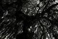
Through the Darknessby dblinkComment: Large, craggy branches make a good source for a darkness challenge entry. The partial desat look to this image does not really work that well with this image and the general poor technical quality will hold this score down for it. The images seems flat, toneless and not in sharp focus. |
| 06/17/2005 05:11:42 PM |
Praying For The Lightby VISUALperceptionComment: The idea is right but you need to give the viewer a reason for why your subject is pryaing. It has to be more than just for it to change from physical darkmnes to physical light. You leave to much to the imagination of the viewer. The grainy and soft focus approach does not give the viewer enough reason to maintain interest in the compostion. It is intersting that the shadow profile is the sharpest part of the image. It may have special meaning but a viewer could not tell what that might be. |
| Photographer found comment helpful. |
Home -
Challenges -
Community -
League -
Photos -
Cameras -
Lenses -
Learn -
Help -
Terms of Use -
Privacy -
Top ^
DPChallenge, and website content and design, Copyright © 2001-2025 Challenging Technologies, LLC.
All digital photo copyrights belong to the photographers and may not be used without permission.
Current Server Time: 08/18/2025 02:40:36 PM EDT.