| Image |
Comment |
| 06/20/2005 09:32:43 AM |
A City of Sinby bobdaveantComment: Fits the darkness theme. The general quality of clarity of the image are the strength of this picture. Composition is OK and you have a level horizon.
Compositionally the dark patch below the line of lights at the bottom of the frame seems empty and unneeded. You might consider cropping that out of the composition. |
 Photographer found comment helpful. Photographer found comment helpful. |
| 06/20/2005 09:27:45 AM |
Look who's coming to dinner!by EricSorenWComment: Excellent B&W image. Very clean composition. The perspective is good and the silhouette is nice. Compositionally it is simple without distracting elements. The tones are perfect and there are no overexposed areas. The clouds are an exceptionally well defined background and the strength of the composition.
Viewers will have trouble figuring out what you are trying to say with this image and it will suffer a little in voting because of it. Your title does not help them.
On the technical side the triangle and support appear to be oversharpened and have distracting digital "jaggies". You will need to apply some type of smoothing as drastic as cloning to remove them. |
| Photographer found comment helpful. |
| 06/20/2005 09:17:54 AM |
Solitude in Blueby colourBlindComment: A simply wonderfully beautiful composition. The blues are great. The lines generated by the blinds are terrific. You have an eye for a great capture.
It is unfortunate that some, perhaps even many, voters will have a tough time relating it to the darkness challenge topic and will vote it accordingly.
On the technical side there are only a couple compositional suggestions. I don't know if there is any way you could have changed things so that you could have lighting on the several darkened blinds near the top of the frame but it would have been more uniform and perhaps more balanced if you could.
There is a small dark triangle in the lower left corner of the image. It just feels like there should be more of it or that it be cropped out of the final image entirely. If you cropped it out completely just above where it hits the rocker shadow it would give much better balence to the bottom of the frame. If you included more of it then it might be best to extend it all the way to the rightmost corner. Whichever way looks best would work.
Kudos to you for a terrific image. |
| Photographer found comment helpful. |
| 06/20/2005 09:05:25 AM |
Prowlerby RistyzComment: Cats are creatures of the night so fit a darkness theme well. The composition and image quality are good. It is properly exposed. You've captured the cat's eyes particularly well.
Though they should not, some voters may mistake this for a "pet picture" and mistakenly score it lower.
On the technical side you might have considered having equal lighting on both eyes. Generally speaking that would work better for most reviewers and give it better balance. The light patch on the lower right of the image is a distraction that should be removed. Curiously, it almost looks as though the cat has no mouth. |
| Photographer found comment helpful. |
| 06/20/2005 08:57:55 AM |
Overtakingby SimonkasprzakComment: Fascinating concept you've captured for this challenge. The perspective and the composition is terrific. Technical quality is excellent. This will finish near the top in voting. |
| Photographer found comment helpful. |
| 06/20/2005 08:53:53 AM |
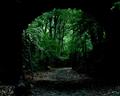
Almost Out of the Woodsby charmayneComment: Deep greens and the arched silhouette work well in this composition. Great deep blacks. Fits the challenge topic well. The clarity of the detail is very nice.
The leafy branch in the upper right side of the frame and the single leaf on the top left are slightly distracting and you might consider removing them. Overall this is a very fine image. |
| Photographer found comment helpful. |
| 06/20/2005 08:37:50 AM |
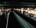
Underground - Interludeby MatthewComment: Nicely captured from an interesting perspective. Fits the dark challenge topic well. The muted color with prominet reds gives the composition slightly surrealistic appearance. The leading curves are terrific. You capture the feeling of a lonely subway station exceptionally well.
You might consider copping the topmost large bright stripe from the composition. Its large size acts more as a distraction than supporting the rest of this fine composition. |
| Photographer found comment helpful. |
| 06/20/2005 08:31:20 AM |
At It Againby RolandBComment: Alchoholism is a 'good' dark theme. The grainy color noise seems to work in this composition. Clarity is nice. Composition and perspective are OK.
Though the color in the bottle works very well the rest of the image might better fit the dark theme if it were B&W. Perhaps even a total B&W image might be considered. B&W works because of the lack of detail in the dark garment worn and the dark background. The yellow cloth just seems to happy.
|
| Photographer found comment helpful. |
| 06/20/2005 08:24:09 AM |
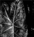
Out of the Shadowsby JutildaComment: Good dark image where B&W works well. The tonal range is good and it has very nice sharp detail. The fine detail in the center of the leaf is its strongest feature.
The detail near the edge of the big leaf appears a bit grainy and more granular than some people may like but it is not terribly bad.
Though photographically a good image viewers will have a tough time strongly relating to it and the darkness theme. Without a strong connection they will not vote it as high as they otherwise might. |
| Photographer found comment helpful. |
| 06/20/2005 08:17:27 AM |
Smokey Moon at Midnightby gothgirl83Comment: A decent idea to meet the challenge. The distribution of smoke accross the frame is wispy and nice.
Technical aspects will keep this image from a high score. The moon, if indeed that is what that is supposed to be, itself is completely overexposed. The smoke is out of focus and grainy. This is probably intentional on your part but most reviewers will see this more as a technical flaw than an intentional expression of art. And if they do see it as art they will likely think that it did not work that well. |
Home -
Challenges -
Community -
League -
Photos -
Cameras -
Lenses -
Learn -
Help -
Terms of Use -
Privacy -
Top ^
DPChallenge, and website content and design, Copyright © 2001-2025 Challenging Technologies, LLC.
All digital photo copyrights belong to the photographers and may not be used without permission.
Current Server Time: 08/18/2025 12:24:23 PM EDT.