| Image |
Comment |
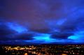
| 06/20/2005 10:49:35 AM |
Summerby ergatesComment: Nice dramatic sky above a decent night cityscape. The blues f the sky play off the yellows of the city lights wel.
Some voters may fault you fro making image colors look unrealistic. They will not think that is the way it really was and voye you lower because of it.
General technical quality is fine and detail good. Highlighting the sky in the crop is correct but you might want to include just a little more town and a little less sky since the sky is least interesting at the top of the frame. It would also fit the rule of thirds which is never a bad thing. |
 Photographer found comment helpful. Photographer found comment helpful. |
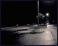
| 06/20/2005 10:43:18 AM |
Boulevard of Broken Dreamsby taterbugComment: The perspective and lines in this composition are excellent. Use of B&W is good.
Your choice of a grainy appearence will trigger thinking in many voters that you did it to mask a poor quality image particularly since the focus is very soft to begin with. This would score higher if it were razor sharp with a little less contrast to show good tonal greys between the lamplight and the black of the sky. |
| Photographer found comment helpful. |
| 06/20/2005 10:37:13 AM |
From within the closet comes...by bhoundComment: General overall photographic quality is OK. The lighting is well conceived and the composition is fine. Nice solid black background.
Some voters may view this as a slightly cheesy setup and not representative of what darkness might REALLY mean to you. Dumb, yes, but will influence how some think and vote. |
| Photographer found comment helpful. |
| 06/20/2005 10:30:06 AM |
Racing Under The Lightsby DrakeComment: Great action capture. Good motion blur and perspective on the vehicle. Including the dust behind the racer in the composition is a good idea. Color and exposure are right and the image has no overexposed areas.
In some cases there will be voters that feel you are "shoehorning" this image into the "darkness" challenge but it really does fit it well if they opened their minds. Unfortunately there are some very narrow thinking voters out there.
On the technical side there is a lot of electronic noise that you should apply noise reduction to if you can. |
| Photographer found comment helpful. |
| 06/20/2005 10:23:46 AM |
My Dark Winter Shirtby morpurgoComment: A very nice abstract composition. Greys are generally good and you have a full tonal range from black to white. Fine detail is grainy sharp without looking oversharpened.
The reflection off some of the metal parts are overexposed.
This is generally a very nice image. |
| Photographer found comment helpful. |
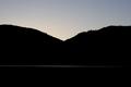
| 06/20/2005 10:19:43 AM |
Sunriseby norcalsnoeComment: The strength of this composition is the thin white reflection below the hills. Simplicity in an image is a virtue. Decent silhouette.
Because of it's simplicity it is paramount that the image is technically perfect. It is good but could be a little better. It would be best if you could make the tiny trees on the horizon absolutely razor sharp. They are a little soft in the composition as it sits.
Try to do something with the sky to add some color. A deeper cobalt blue might be a good choice.
There are three rounded objects in the foreground. They are probably pilings in a pier but the viewer cannot really tell. Because they cannot tell what they are they are more distracting to the image then enhancing. If they could be blacked out of the picture or the picture taken from a differnt place it might be a little better.
Compositionally it might make the image a little more interesting if the dip between the hills were positioned according to the rule of thirds rather than at the center of the frame. |
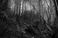
| 06/20/2005 10:08:31 AM |
Misty Forestby fluxnComment: An appealing composition with great mid-tones. Decent B&W.
On the technical side it does look as though this does not have a true black point. This was probably because you wanted to highlight the mid-tones. You could still get both by adjusting the tones with a varity of techniques which depend on the method used to post-process B&W.
The image does not a have a true focal point and might be improved if you chose a particular object in the frame and made it an obvious central focal point. The downward facing tree trunk could be that point but it is too small in the image right now to fit the bill.
If you got closer to make the tree trunk bigger in the frame and looked upward at an even lower angle then you already are then the background trees would be even more pronounced in the image and give it an even more "misty" appearance. The dirt are on the left of the image that adds very little to the composition would be out of the frame entirely.
You should have removed the white object to the right of the tree trunk. It acts as a distraction to this overall wonderful scene. |
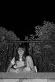
| 06/20/2005 09:57:42 AM |
Childhood Lostby TooCoolComment: Excellent clarity in the fine detail and a good capture of the child's expression. Great tones and B&W works well in this situation.
Most voters will likely "get it" but some may just think it is another kid picture.
You might consider cropping it closer on the child to highlight her. She is the main subject and much that is around her adds little to the composition.
Looks like the lines of the bricks and the top of the fence are slightly off horizontal by a third to a half a degree. In that situation you should rotate the image to make them perfectly level. |
| Photographer found comment helpful. |
| 06/20/2005 09:49:33 AM |
A candle of hope in the darknessby magueroComment: Nice capture of a flame, particular at the bottom wher you can see complete through it. General quality of the image is OK.
Candles are a surprisingly common theme for submissions to this challenge so might be considered boring to some voters.
There appears to be some detail in the darkened areas of the image. It would be better if the background were solidly black or that you could see enough of the detail in the background to be able to tell what it is. When it is in between like this it acts as a distraction.
The candle itself seems a lttle soft focused in front that some vieweers will find distracting as well. When you can you either want to make this image entirely in focus or narrow the DOF so much that only the flame is focused clearly.
The fact the candle is not horizontal on the bottom is also distracting to the viewer. If you could reposition it so that it is perfectly horizontal or just cut it off such that the bottom could not be seen at all then that distraction would be removed. |
| 06/20/2005 09:41:17 AM |
Breaking the darkby guenivere_mensyComment: Capturing rays of sunlight on an overcast day is a worthy concept for this difficult challenge topic. But this is an example of a great idea that gets lost in the generally poor technical quality of the final composition.
You may have left this there intentionally but most viewers will see color and electronic noise in the image as a technical flaw and not an artistic expression.
Focus is exceptionally poor and the open areas through the clouds are excessively overexposed. That is very, very hard to get right in an image of this type.
Compositionally you could increase the drama of the rays by cropping about an inch off the top and right sides of the image. This will extend the influence of the rays across the full frame and give them a more dominent position in the composition. |
| Photographer found comment helpful. |
Home -
Challenges -
Community -
League -
Photos -
Cameras -
Lenses -
Learn -
Help -
Terms of Use -
Privacy -
Top ^
DPChallenge, and website content and design, Copyright © 2001-2025 Challenging Technologies, LLC.
All digital photo copyrights belong to the photographers and may not be used without permission.
Current Server Time: 08/18/2025 05:26:13 AM EDT.