| Image |
Comment |
| 05/10/2006 07:56:17 PM |
Cornered in the Darkby LilhoopComment: Very harsh lighting. I learned here, that flash in the night shots is very rarely useful. Because of the flash, the upper part of the lentern is invisible as well, as the background, so the picture lacks some context. If you didn't want any background, maybe a tighter crop could help. |
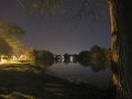
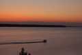
| 05/10/2006 07:53:55 PM |
River Lightsby psquared40Comment: Very grainy. Also there is some dust visible. In night shots you have to be extremly careful with the dust, because it comes out easily. Very nice surrounding. I would advice to crop the tree tighter, to make it more like a frame, not one of the elements of the composition. |
 Photographer found comment helpful. Photographer found comment helpful. |
| 05/10/2006 07:52:04 PM |
dirty habitsby latidaComment: I can see the point in the title. Is it your lens or the glass you were shooting through? It doesn't help the image I'm afraid :( |
| Photographer found comment helpful. |
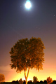
| 05/10/2006 07:50:55 PM |
moonshine and night glowby kunsterComment: I wish the tree was in focus. There is also some dust visible. I guess, using tripod and adding contrast to get rid of colour cast could help a lot. |
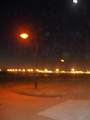
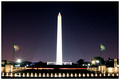
| 05/10/2006 07:49:13 PM |
Monument and Memorialby phreakonComment: Not too much detail. Maybe it has something to do with the resolution or maybe you didn't use tripod. Night shots are very difficult. Centered composition was a good choice. |
| 05/10/2006 07:47:51 PM |
Bora Sunsetby deps_copyComment: Beautiful sky, but it's a pity you didn't use the 640px size. It may hurt your scores. |
| Photographer found comment helpful. |
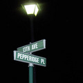
| 05/10/2006 07:46:55 PM |
Under the Spot Lightby GivemeashotComment: Light is quite harsh in this picture, making the tree behind the lamp looking flat. Maybe different perspective could help? I have a feeling the focus is on the tree not on the main subject. |
| Photographer found comment helpful. |
| 05/10/2006 07:42:43 PM |
Sunset Lakeby HedsIcComment: The picture is a bit noisy. Also I think if the tree wasn't visible in the bottom, it would've have very strong minimalistic effect with nice leading lines. Pity for he noise. |
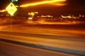
| 05/10/2006 07:30:40 PM |
Racingby lowercasepeopleComment: The main focal point is the pavement. More interesting angle could help. Very shaky, although maybe you wanted it this way. |
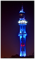
| 05/10/2006 07:29:41 PM |
A Beaconby Aries777Comment: Too much noise.I know it very well from my own experience :( Lonely beacon looks a little out of context here without a sea. Wish there was some view of the sea. |
Home -
Challenges -
Community -
League -
Photos -
Cameras -
Lenses -
Learn -
Help -
Terms of Use -
Privacy -
Top ^
DPChallenge, and website content and design, Copyright © 2001-2025 Challenging Technologies, LLC.
All digital photo copyrights belong to the photographers and may not be used without permission.
Current Server Time: 07/27/2025 10:32:33 AM EDT.