| Image |
Comment |
| 05/11/2006 02:07:13 AM |
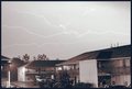
Turned Night Into Day (12:05 a.m.)by espy2Comment: Did you adjust brightness? If yes - I don't think it was necessary. If no - more contrast could help. I bump it a bit for the quite amount of detail in the picture. |
 Photographer found comment helpful. Photographer found comment helpful. |
| 05/11/2006 02:05:21 AM |
|
| 05/10/2006 08:15:36 PM |
No Bordersby phinbobComment: I gave it a 7. I just thought different perspective (closer to the left, and more of plane's tail and wings) could add to the picture. I realy liked the cliche and the whole idea (Doctors without borders). It definately doesn't deserve such a low score. |
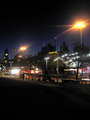
| 05/10/2006 08:12:03 PM |
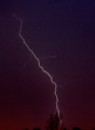
Night's Lightby SpatulaComment: Too noisy :( A bit more of contrast could definately help. It is a nice object, however. I would also suggest different angle. |
| Photographer found comment helpful. |
| 05/10/2006 08:10:37 PM |
Colors of Nightby Miss TaterbugComment: Looks like very interesting abstract picture but I have a feeling it is by acccident. Also the picture is very grainy. Mainly due to the abstract feeling I bump it up with 1 point. |
| Photographer found comment helpful. |
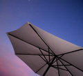
| 05/10/2006 08:10:14 PM |
The shade of the nightby lunixComment: The sky is too bright for the title - it may hurt your scores. Also the composition is a bit unplanned. If you didn't crop the umbrella so heavily, and use different lighting (is it flash?), the picture would've probably scored much higher. Now it looks a bit flat and noisy :( |
| 05/10/2006 08:07:33 PM |
Good nightby FrallComment: The picture is very noisy and there is no single focal point. The big black negative space doesn't help here either. There are many interesting objects in the picture, I wish you concentrated more on one of them. It could help a lot. |
| Photographer found comment helpful. |
| 05/10/2006 08:01:18 PM |
Shadows of Playtimeby photoventurerComment: The slide ends so suddenly. I would suggest either to show it in the whole glory, or to use unusual angle to make it look more like an abstract. The colours are nice, the focus is not bad. Just the whole composition is a bit unplanned. Although for the decent quality, I'm bumping it a bit higher. |
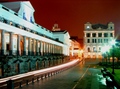
| 05/10/2006 07:59:04 PM |
dowtown lightsby charlievComment: The image is very soft and a bit noisy. Did you use tripod? I like the red sky and the unrealistic colours. |
| Photographer found comment helpful. |
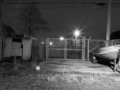
| 05/10/2006 07:57:40 PM |
A lonely place?by hankdatankComment: Unfortunately in this composition, the main focal point is the gate. The "lonely place" is somwhere in both ends of the picture. Wider or different angle could definately add to the mood. |
Home -
Challenges -
Community -
League -
Photos -
Cameras -
Lenses -
Learn -
Help -
Terms of Use -
Privacy -
Top ^
DPChallenge, and website content and design, Copyright © 2001-2025 Challenging Technologies, LLC.
All digital photo copyrights belong to the photographers and may not be used without permission.
Current Server Time: 07/27/2025 01:22:37 PM EDT.