| Image |
Comment |
| 05/22/2008 04:15:19 AM |
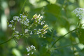
Flowers, almost goneby hajekaComment: The flowers which you focused on are a bit overexposed. Probably mid day light, which is harsh on plants. I think it would've been better to focus on the remaining flowers and try early morning or evening light. Also the part of flower on the right competes with your main subject. Cropping it out would help IMHO. |
 Photographer found comment helpful. Photographer found comment helpful. |
| 05/22/2008 03:57:13 AM |
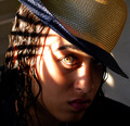
TIGRESSby ALAComment: Picture taken from above her eyes makes her face a bit long. Maybe if you tried to make it on her eye level it will bring back proportions. I think there is to much of hat visible, which competes with her face. Nice dappled light and beautiful golden eye. |
| Photographer found comment helpful. |
| 05/22/2008 03:55:02 AM |
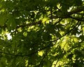
Let's Stay Foreverby cnsComment: Picture looks a bit blury and flat. Higher f number and more saturation would make the leaves stand out. You could also find a nice branch and focus on it. Now there is no main subject in the picture. |
| Photographer found comment helpful. |
| 05/22/2008 03:40:24 AM |
Early Summer Shadesby plimComment: Very nice composition. Soft colours, nice detail. I like the way the viewer has to imagine her eyes behind shades. Nice, soft and natural portrait. No unnecessary posing. Very appropriate for a young, beautiful girl. |
| Photographer found comment helpful. |
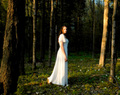
| 05/22/2008 03:37:03 AM |
Standing Tallby Nikolai1024Comment: I like reflections on the wall. The sky is clear and intensive blue, but I would crop it more, as it is not very interesting. In fact the lowest part of the building (with reflections) is the most interesting one. I would'e create nice abstract picture. |
| Photographer found comment helpful. |
| 05/22/2008 03:30:46 AM |
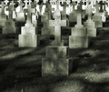
Dappling In Deathby bvyComment: It looks like the fence is pretty close. However, I think you could make this picture lifting camera a bit higher to include more graves in frame and crop out the grass in the lower part. It would give more interesting perspective. Nice dappled light. Maybe more contrast would make it more aparent. |
| Photographer found comment helpful. |
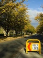
| 05/22/2008 03:15:01 AM |
Light the signby raflimaComment: I hope it's not the direction for scores? Seriously: I like warm tones here. The sign makes the story. The viewer has to ask the question: "Why?" and try to answer it. I like such pictures a lot. |
| Photographer found comment helpful. |
| 05/21/2008 07:07:47 PM |
SOULby Trumpeteer4Comment: Everything is soft in this picture (camera shake?). This blur would add to the picture if her pose wasn't so static. BTW she reminds me Liv Tyler in Lord of the Rings :) |
| Photographer found comment helpful. |
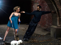
| 05/21/2008 07:05:28 PM |
Come to Meby dsmilComment: I can't see dappled light. It looks even. Nice idea of posing the models this way, but her hip is in a strange place (very high). I don't think it flatters beautiful model. I like the colours and particulafry the light on the male model clothes. Sharp. |
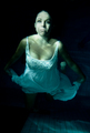
| 05/21/2008 07:00:31 PM |
Bride of the deepby TimComment: It's probably difficult to look relaxed under water. This model looks quite stressed. Good and unusual idea. Dappled light under water is always interesting. Beautiful model, but I'm holding my breath looking at it. |
| Photographer found comment helpful. |
Home -
Challenges -
Community -
League -
Photos -
Cameras -
Lenses -
Learn -
Help -
Terms of Use -
Privacy -
Top ^
DPChallenge, and website content and design, Copyright © 2001-2025 Challenging Technologies, LLC.
All digital photo copyrights belong to the photographers and may not be used without permission.
Current Server Time: 07/22/2025 06:12:31 AM EDT.