| Image |
Comment |
| 10/03/2009 08:41:14 AM |
CONFINEMENTby essayComment: Very nice idea and execution. I like the colour scheme. The picture, however very simple, tells a story at the same time. An emotional story. |
 Photographer found comment helpful. Photographer found comment helpful. |
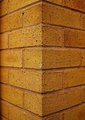
| 10/03/2009 08:37:24 AM |
Brickworkby GemGemComment: Nice detail and colour scheme. It is difficult to create pleasant composition from a brick wall - I like it :) |
| Photographer found comment helpful. |
| 10/03/2009 08:35:33 AM |
Straight to the other sideby mbish7373Comment: Strange light and colours. There are some horizontal shadows in the upper part of the picture. I wonder what is it. The sky looks unreal - it's so intensely blue. Nice leading line, nice subject. Good luck. |
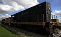
| 10/03/2009 08:32:51 AM |
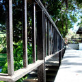
Northern Exposureby outlandComment: For this challenge theme I would choose a detail. There is a lot of nice details in this train, which could give more interesting composition for straight lines. I wonder why did you choose this side of it, which is in a deep shadow? Nice subject, anyway. Good luck. |
| Photographer found comment helpful. |
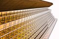
| 10/03/2009 08:30:32 AM |
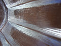
Abstractionby gg3rdComment: Looks like golden glass stairs. Good idea. You have got an eye. This picture has a lot of potential. I imagine it with dark blue sky or at night. Very nice. Good luck. |
| Photographer found comment helpful. |
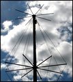
| 10/03/2009 08:28:54 AM |
USS Croakerby AuntRosieComment: The contrast between straight lines and the fluffy clouds is a nice idea. Maybe some negative space could add to the composition. Centered composition makes it a bit boring. |
| 10/03/2009 08:27:40 AM |
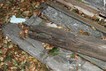
Shipyard Lumberby hmurmurComment: Not very appealing. The white piece of something - you could take it away. Bumping up the colours could help also (adding the autumn feel). Now it looks quite flat - I'm sorry :( |
| 10/03/2009 08:26:17 AM |
Cupby ShaylaComment: Odd crop. I would prefer more contrast or different lighting. It's a matter of taste however. Good luck :) |
| 10/03/2009 08:25:19 AM |
Linesby brittulmerComment: Looks like exposition was too much. The details are lost in the light areas or maybe its just my monitor. I think there is too much of surrounding features (the whole right part of the picture). It distracts the viewer, who doesn't know what the main subject is. |
| 10/03/2009 08:20:06 AM |
Musical Linesby karenkComment: Next B&W picture in the challenge. The contrast could be a little stronger, but by the B&W choice the lines are more prominent. I like it. |
| Photographer found comment helpful. |
Home -
Challenges -
Community -
League -
Photos -
Cameras -
Lenses -
Learn -
Help -
Terms of Use -
Privacy -
Top ^
DPChallenge, and website content and design, Copyright © 2001-2025 Challenging Technologies, LLC.
All digital photo copyrights belong to the photographers and may not be used without permission.
Current Server Time: 07/21/2025 06:59:45 AM EDT.