| Image |
Comment |
| 09/01/2006 05:56:08 PM |
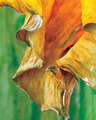
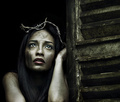
Birdieby matispistaComment: The effect looks good, but I feel there maybe a little too much processing gone into this. The naturalness of the leaf has diminished just past the point of reality. |
 Photographer found comment helpful. Photographer found comment helpful. |
| 09/01/2006 05:34:40 PM |
|
| Photographer found comment helpful. |
| 09/01/2006 05:34:12 PM |
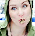
userpic-489359.jpgby AnastasiaComment: Originally posted by nova:
What's that in you mouth (and why)?? |
It's a squid, and why? Cos she is a crazy Russki :) |
| Photographer found comment helpful. |
| 09/01/2006 05:31:34 PM |
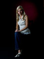
0027 - on black with red highlight BGby KevinRiggsComment: The jeans and the chair are drowning into darkness. The lighting balance, well I wrote it before, although here it is a little better with the right side a touch darker. Can you see the difference compared to the other two photos? Try out some lighting with strip lights, you get some good results by placing them correctly. Also a hair light from an angle behind will bring in a slight aura which is muchly needed here. This would make for a good portrait, but the bottom half doesn't do anything for me. |
| Photographer found comment helpful. |
| 09/01/2006 05:21:28 PM |
|
| Photographer found comment helpful. |
| 09/01/2006 05:19:30 PM |
0175 - Sexy Loungingby KevinRiggsComment: I don't think you will like this critique Kevin but I have never commented on your photos before so just take it as constructive okay. The complete impact is lost in the composition, you've cut it too close on the left side. I know the chair is not falling but this image is giving the impression it is, therefore you need room in the falling direction. The viewer needs to see where she is falling.
The chair at the bottom is cropped in a way you just see unneven parts of the chair wood and chair cushion together. I would have put some more of the front chair legs into it, as it is it just confuses me.
The lighting from the right side is okay, but the lighting on the left doesn't bring in the necessary effect to balance out the image, it should be a lot darker to bring in more contrasts. As it is the total lighting comes over rather flat. You can see it in the eyes, as they are they seem kind of lifeless in that lighting. But would the left eye be more in darkness (and the left side of the face) you would bring out more impact and contrast and therefore boost the complete image quality.
|
| Photographer found comment helpful. |
| 09/01/2006 04:55:59 PM |
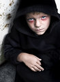
abandonedby librodoComment: If this is not Manny then you have outdone yourself, this is amazing and my favourite so far. But it can only be Manny, such quality can only come out of Bangkok. |
| Photographer found comment helpful. |
| 09/01/2006 12:53:42 PM |
|
| Photographer found comment helpful. |
| 09/01/2006 09:42:25 AM |
|
| Photographer found comment helpful. |
| 09/01/2006 09:22:02 AM |
|
| Photographer found comment helpful. |
Home -
Challenges -
Community -
League -
Photos -
Cameras -
Lenses -
Learn -
Help -
Terms of Use -
Privacy -
Top ^
DPChallenge, and website content and design, Copyright © 2001-2025 Challenging Technologies, LLC.
All digital photo copyrights belong to the photographers and may not be used without permission.
Current Server Time: 08/28/2025 11:05:40 AM EDT.