| Image |
Comment |
| 06/30/2006 10:41:42 AM |
Can't Read Without It...by cardmaverickComment: would have been better if the words were rightside up. I like the concept and compoisition though. Even the focus and ligthing are very nice. just put off by the upside down wording.8 |
 Photographer found comment helpful. Photographer found comment helpful. |
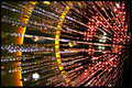
| 06/30/2006 08:28:14 AM |
Exploding Sunby roby21112Comment: I love the background of this is. It looks like a car driving through a tunnel. very cool. 8 |
| Photographer found comment helpful. |
| 06/30/2006 08:26:08 AM |
Blessed Be The Glassby stphqComment: Weird, usually from the sunlight shining thorough you get beautiful amber tones of light coming through stained glass. its odd to me how youve gotten true white through it. makes it look fake. would be much better with truer colors. |
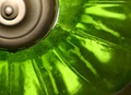
| 06/30/2006 08:23:10 AM |
Blooming Greenby gomathiComment: light fixture? interesting. would be much better if the glass was perfectly smooth and clear. this would be great. i love the composition. the lighting's a tad too harsh on the metal part but it's nothing that cant be fixed with just a little photoshop. |
| 06/30/2006 08:20:30 AM |
Polka Partyby brizmamaComment: the mottled greys in the background really detract from this. also the imperfection in the glass in the lower right hand side. otherwise i think some more sharpness and contrast could give this some real "wow factor". |
| Photographer found comment helpful. |
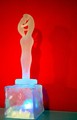
| 06/30/2006 08:18:50 AM |
Loversby sarimiliComment: I would have cropped this directly below the couple. the lower block makes an otherwise good photo and subject look ameturish. the light hitting the block is very distracting ang blown out. i love the top half of this phtoo though. |
| Photographer found comment helpful. |
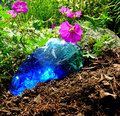
| 06/30/2006 08:17:15 AM |
garden glassby sailjoComment: Nice slightly off centered composition. the cyans in the stone look blown out. the soil looks great though i think your focus was just on the wrong element. |
| Photographer found comment helpful. |
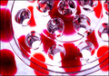
| 06/30/2006 08:08:25 AM |
Phosphorescence (with a twist)by PhotoArtComment: The lighting through it is a little harsh and I'd suggest more light on it from above as it seem dark. the composition is ok. the subject is interesting. This photo just needs some minor adjustments. |
| Photographer found comment helpful. |
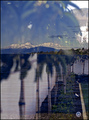
| 06/30/2006 08:06:39 AM |
Lake view reflection.by banditComment: This Photo is just a bit too busy. its hard to tell what to look at. the mountains in the back are Exquisite but they are marred by the trees taking away attention and the thing in the upper right hand corner. i cant figure out what it is. looks like a mountian but has crosshatch marks on it. very odd. I like the vertical line on the right hand side. it draws my eye up to the mountains but that little blue circle down in the right hand corner just keeps distracting me away from the beauty. I hope all of this made sense. Theres just so much going on in this. |
| Photographer found comment helpful. |
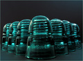
| 06/30/2006 08:01:38 AM |
Insulatorsby aberrationComment: The composition feels just a little too centered. great subject, focus and set up. flawless lighting as well. |
| Photographer found comment helpful. |
Home -
Challenges -
Community -
League -
Photos -
Cameras -
Lenses -
Learn -
Help -
Terms of Use -
Privacy -
Top ^
DPChallenge, and website content and design, Copyright © 2001-2025 Challenging Technologies, LLC.
All digital photo copyrights belong to the photographers and may not be used without permission.
Current Server Time: 06/21/2025 08:49:18 PM EDT.